Have you seen House Beautiful's new look? If you have read the September issue, then you know that House Beautiful has been redesigned, and it looks terrific. HB has long been known for its coverage of color in interiors, and the new design emphasizes this focus. Color now plays a starring role, with the first section of the magazine being devoted to it. Each issue will open with the color that HB loves for that particular month, and for September, that color is Indigo, a shade that "knows no borders and has many different moods."
Blue, with its enticing range of shades, is a particular favorite of mine, so much so that I enveloped my living room in powder blue, teal, and peacock blue. And although I don't currently have any touches of indigo in my home, I do appreciate the shade's attitude. Indigo implies depth, soul, and fortitude, at least to me anyway. I attempted to compile a list of my favorite old and historic rooms where indigo was the defining color, and truth be told, I couldn't think of too many. I expanded the list to include other moody and atmospheric hues of blue, and here is what I came up with:
In the Chinese Pavilion at Drottningholm, this shade of blue is able to stand up to the exuberance of the pavilion's decor. It also frames the Chinoiserie murals, allowing them to come into sharp focus.
Some shades of blue are stately-looking, thus making them appropriate for architecturally formal interiors. This photo shows how the Entrance Hall at Monticello appeared in the late 1960s. Today, the walls of the Entrance Hall are painted a historically accurate Whitewash, while the dado is painted in a shade of yellow-orange. Nonetheless, I find this shade of Wedgwood Blue to be attractive.
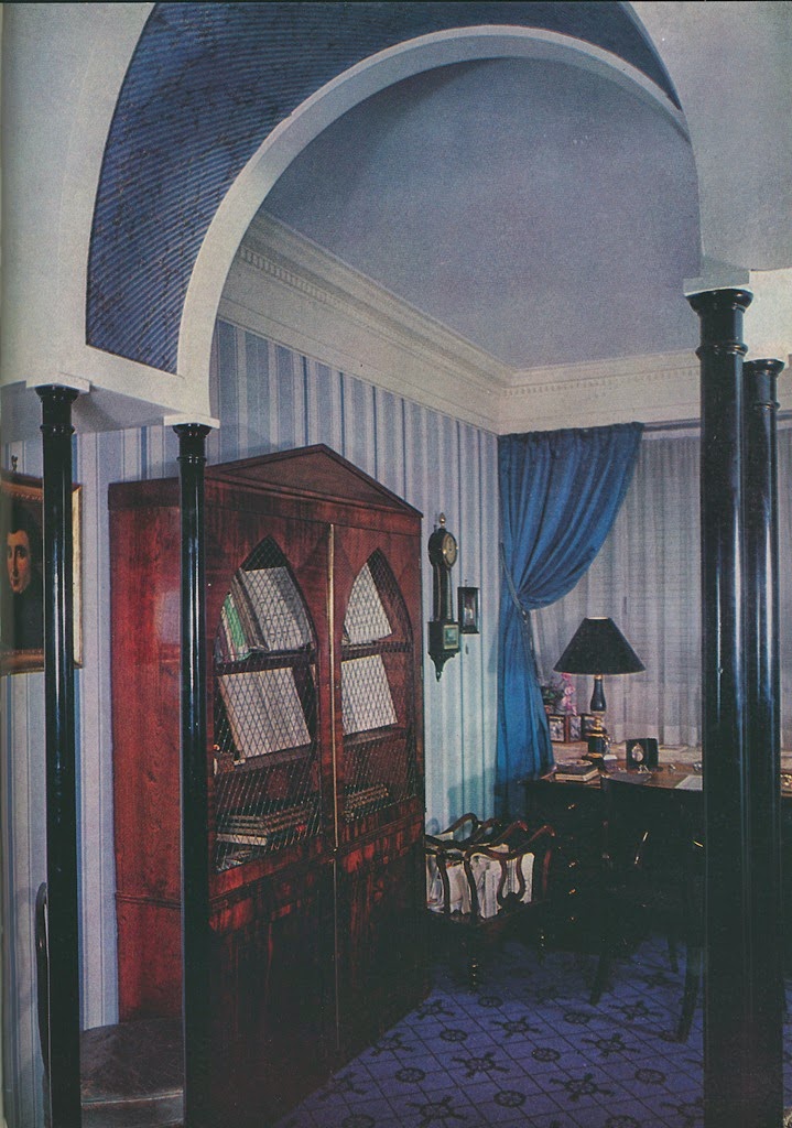
Madeleine Castaing is a designer whom I associate with blue, especially those shades that are quirky. In the photo directly above, you can see the salle de jeu at Castaing's residence on Rue Jacob. Above that is a photo of a Castaing-decorated apartment in which the library is awash in blue. The underside of the arch is papered to simulate lapis lazuli.
The Paris apartment of Jansen designer Pierre Delbée has to be one of my favorite residences. The entrance hall's Louis XV-style paneling was painted in different shades of blue. The color effect gives added dimension to the small space.
According to Jeffrey Simpson's Rose Cumming: Design Inspiration, Rose Cumming's library had "jade-green walls that were washed with Prussian blue". Here, the achieved shade of blue is murky and even rather mysterious-looking.
I believe that in the pantheon of blue rooms, couturière Jeanne Lanvin's bedroom must be one of the most memorable. Her signature shade of "Lanvin Blue" is similar to cornflower blue. It's feminine, and yet, it's not too sweet.
This Michael Greer-designed room was lavished with primary-colored decor. Take away the red rug, and this room would look suitable for the 21st-century.
Frankly, this is not one of my favorite blue rooms. However, it's interesting to note that in an effort to create a blue backdrop in this room, designer John FitzGibbons stained the wall's rough wooden boards a deep shade of blue.


