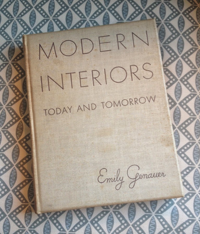
You know how enamored I am with 1920s and 30s-era design, so I was especially excited to receive a 1939 copy of Modern Interiors: Today and Tomorrow from a friend. Written by Emily Genauer, once Editor of the Fine and Decorative Arts Sections, The New York World-Telegram, the book is a "critical analysis of trends" that were seen at both the 1937 Paris International Exposition of Arts and Techniques and later the 1939 New York World's Fair. The critical analysis part might sound a little dry, but it's not thanks to both Genauer's upbeat writing style and the book's copious photos of exhibition rooms done up in modern decor. Just like many decorator showhouse rooms of today, exhibition (or model) rooms were often fantasy concoctions of exaggerated scale, exuberant colors and pattern, and luxurious finishes. Of course, not all exhibition rooms were quite so dazzling, with many of them being about as exciting as watching paint dry. But it was the innovative and sometimes over-the-top rooms that often set trends in motion, most notably when the 1925 Paris Exposition introduced modern decoration to the general public.
While reading this book, it was the sheer volume and decorative range of exhibition bedrooms that piqued my interest. There were bedrooms for women (Genauer noted that French decoration and art "has always been Woman", with 1930s-era Frenchwomen preferring "modern furniture that is a little more flamboyant and a little less functional" in their bedrooms,) as well as for the men (the author wrote that Dickens "dubbed that masculine sanctum sanctorum reserved for the busy leisure of tobacco and books and meditating on life, 'The Growlery'"). Children and toddlers were not overlooked, with some pretty spiffy model nurseries having been designed to inspire both parents and their little ones. Even the infirm got a model room that was addressed to their needs.
If only the photos were in color, we might be able to experience seeing these rooms as the myriad exhibition visitors did back in the late 1930s.
If only the photos were in color, we might be able to experience seeing these rooms as the myriad exhibition visitors did back in the late 1930s.
One of the bedrooms on display at the 1937 Paris Exposition of Arts and Techniques. Note the unusual wall shelves to the left, which held pots of feminine, cheery flowers.
No surprise here that this luxuriously-appointed bedroom appeared at the Paris Exposition. Much of the furniture, including the bed, was made of laced metal accented by glass leaves. The floral motif was continued on the rug as well as the upholstery and bed curtain.
Although I think that a man might have been comfortable sleeping in this bedroom, the decor seems meant for a woman. As striking as the decor is in this Paris Exposition room, it's the room's massive scale that is more impressive.
Yet another Paris room, this one accented in quilted satin. Genauer included this room as an example of the "dressmaker touch".
For the men:
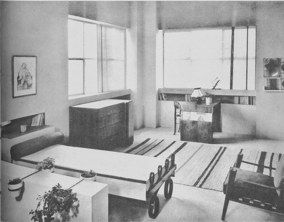
The author deemed this masculine bedroom "one of the most effective rooms in all the Exposition." The room was meant to be a chamber for sleeping as well as a study.
Again, at the Paris Exposition. In this bedroom for a man, white leather was chosen to cover the beds' head and foot boards and the fronts of cabinets. Genauer wrote that "leather somehow is a traditionally virile material."
For a couple:
This bedroom, which was exhibited at the World's Fair exhibition at Bloomingdale's, was decorated by Count Alexis de Sahknoffsky. In typical American fashion, there were electronic bells and whistles added to the single headboard: radio and reading lights. I have to say that I find this room rather lackluster.
The book makes no mention of where this room was exhibited. Nevertheless, this bedroom is a mix of curvy and angular lines, thus making it appropriate for both a man and a woman.
For the children:
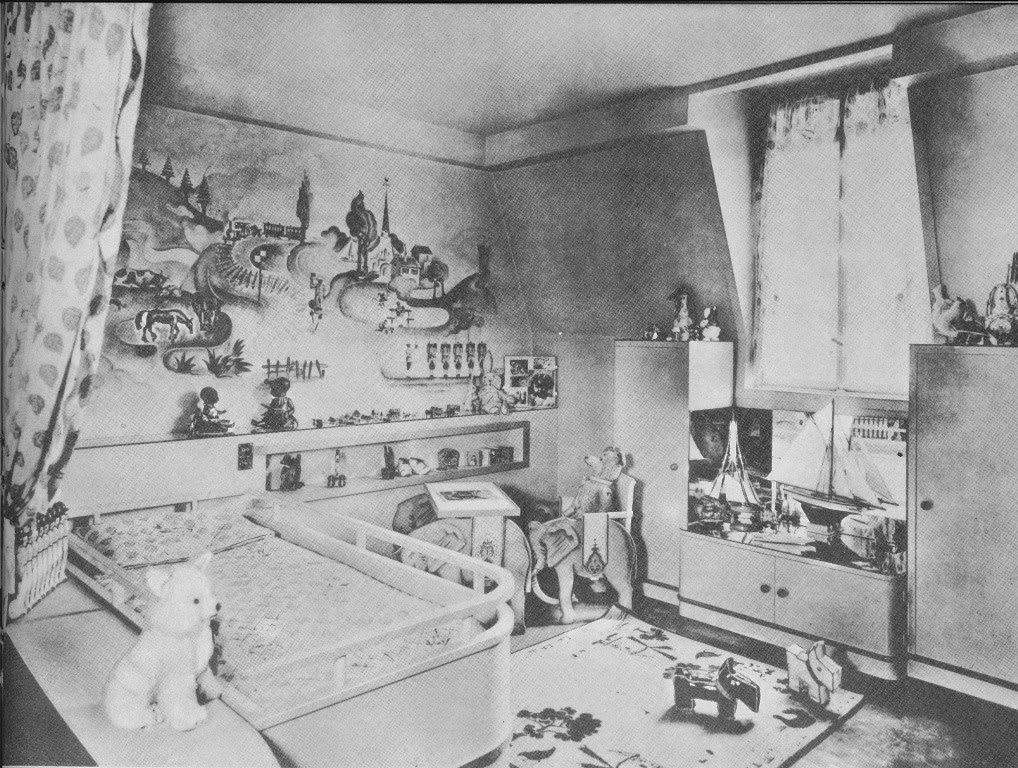
A child's nursery where the painted wall decorations added a dash of whimsy.
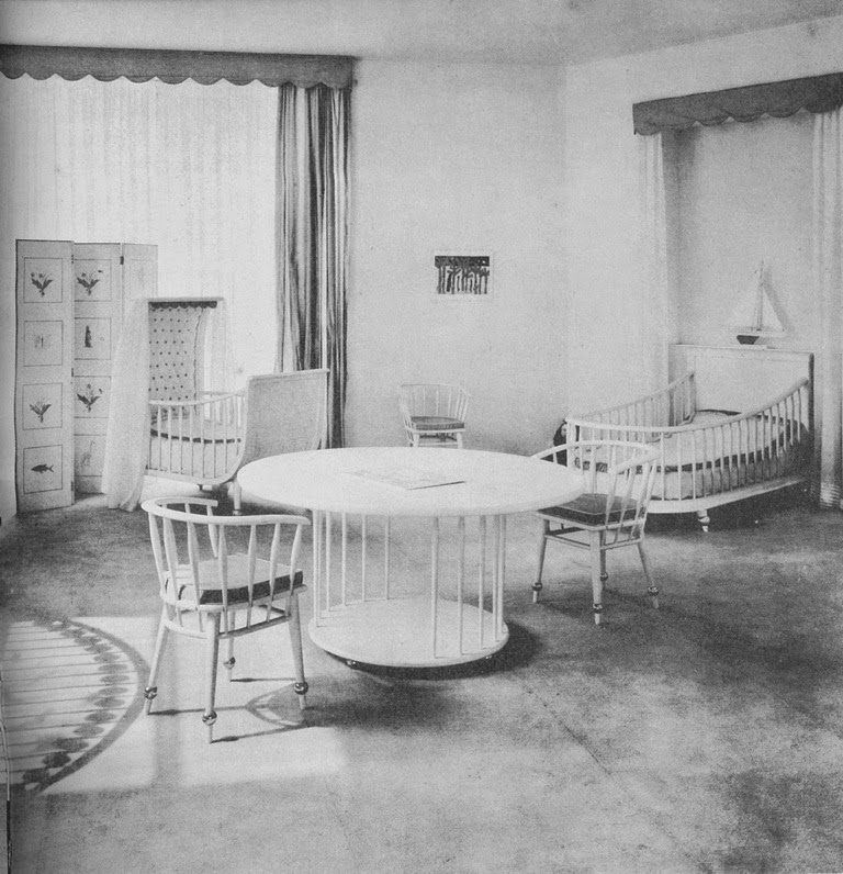
Of this French modern nursery, Genauer wrote, "No frills or furbelows bedizen this modern nursery- instead, it is decorated with simple, sturdy furniture and gay, imaginative accessories."
In Paris, a ship-themed boy's room had a bed suspended from the ceiling with rope. The book's text notes that the bed was also sanitary as it allowed air-flow beneath the bed. Hygiene and easy housekeeping were often selling-points of modern decoration.
For the sick and infirm:
According to Genauer, "Modern design can bring beauty even to a hospital room as this one." This room, which, as you probably guessed, was part of the Paris Exposition, would be entirely impractical in today's hospitals with their spartan (and often germy) rooms. Still, this type of room, and especially the chic metal bed, could actually make a hospital stay halfway tolerable.


