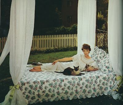
I realize that to some people, plain white sheets are the only aesthetically acceptable sheets to place on one's bed. Not so for me. While I do, of course, have some white sheets, I prefer bedding with a discreet floral or feminine print. It just seems so boring to turn down the covers, only to have plain white cotton greet me. Pink Porthault hearts, on the other hand, make my heart go pitter-patter.
While I have a weakness for Porthault printed sheets, I also like some of the prints available through Schweitzer Linen. Not only are their patterns feminine and sweet, but their bedding is quite affordable too. And although I don't own any bedding from the Lulu DK for Matouk collection, I do really like the upbeat designs that Lulu has created. If you have never before considered patterned sheets, perhaps now is the time for you to take a look at some bedding with personality.
It wasn't too long ago when patterned sheets were all the rage. During the 1960s and 1970s, many fashion and interior designers boasted bedding collections, a popular form of branding (did they call it branding back then?) during the early days of product licensing. As you might expect, the prints were often evocative of their era: colorful, exuberant, busy, and wild. David Hicks, you might remember, had a bedding collection as did Bill Blass. Some of these designer bedding collections look pretty atrocious, at least to twenty-first-century eyes. And what makes this bedding seem even more dated is that it was usually photographed alongside other interior fashions of the day that, like the bedding, hasn't held up very well.
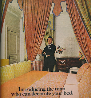
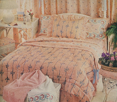
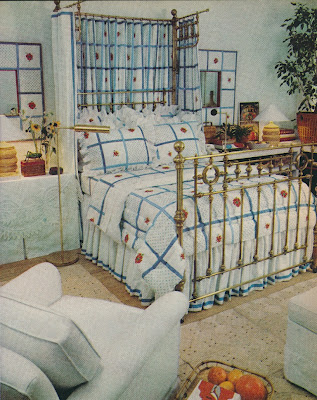
It wasn't hard for me to find photos of designer sheets as my vintage magazines were chock full of editorial features and ads touting these collections. I think that if you take a look below, you might be surprised at some of the prints that these designers churned out, although I do wonder just how involved some of them were in their bedding collections. All I can say is thank goodness that we now have more demure and classic looking printed sheets than what you see below.
And although I don't care for Mr. Blass's sheets, I do think that he redeemed himself with his 1979 edition of the Lincoln Continental Mark V. That was such a fabulous car that I wouldn't mind driving one today!
David Hicks's collection for Stevens-Utica might be one of the better designer bedding collections. In fact, it doesn't look terribly different from his fabrics. The bathroom of the David Hicks Suite at the St. Regis Hotel in New York featured his H-logo sheets used as shower curtains, a basin skirt, and a lamp shade.
Bill Blass designed sheets for Springmaid. Those exotic printed sheets, photographed in Blass's bedroom, were named "Nemuri". Perhaps more representative of Blass's masculine style is the brown and gray plaid sheeting that "creates a penthouse environment in your home."
Just as Blass had his bedding collection, so too did Oscar de la Renta, though Cannon Mills produced his line. For one of the Oscar de la Renta-Cannon ads, the designer wrote, "My designs are for the woman who believes her bed and bath should be as well-dressed as she is." His sheets might look rather dated today, but I think that they might have been kind of chic back in the mid-1970s.
Missoni's sheeting collection doesn't look far removed from their classic clothing prints.
The problem with this bedding collection by Halston (yes, Halston) is that there are too many frills on this bed. Halston's rose pattern was, according to the modest designer, "the prettiest rose pattern that anyone's ever done." I'm not sure about that, but I do find that the pattern was inspired by some Joe Eula paintings to be interesting. I believe that this print also appeared on some of Halston's dresses.
Would you be surprised to learn that these "Rose Elegance" sheets were designed by Yves Saint Laurent? I was, but I really wonder how much of a hand he had in this collection.
Both of these bedding sets were designed by Angelo Donghia and were photographed in Rita Moreno's bedroom. The plaid version is really not bad. In fact, I might say that Donghia did one of the better designer bedding collections.
Slim Aarons photo at top from A Wonderful Time: An Intimate Portrait of the Good Life
 ; David Hicks/ St. Regis photo from David Hicks: Designer
 by Ashley Hicks.


