To those of you who are cruise devotees, forgive me if it seems as though I'm raining on your parade. You see, I'm cruise-ship averse. One reason may be because I get motion sickness at the drop of a hat. Then again, it might also have to do with the fact that the idea of being stuck on a ship in the middle of the ocean kind of freaks me out. And then there's the Norwalk virus. Have you ever seen those news interviews with passengers returning from a Norwalk afflicted cruise?? Talk about a cruise from hell.
However, there are certain ships that might entice me to overcome my cruising apprehension. One is the small but luxurious ship upon which Diane Dorrans Saeks recently traveled during her sojourn to Myanmar. (She wrote about it last week.) The ship that really strikes my fancy, though, is the late French ocean liner, SS Normandie. I don't wish the ship were around today, because traveling on it would be nothing like it was in the 1930s. There just wouldn't be the same sense of style, gentility, and decorum today as there was back then. But, for a taste of what might have been (had we lived back then, of course), take a look at the Rouen suite on the Normandie. Decorated by the French firm Dominique, the suite's decor is an example of the Art Deco and Streamline Moderne styles that were used throughout the ship's interiors. It's sad to think that just seven years after these photos were published, the ship was destroyed by fire in the port of New York as it was being converted to a U.S. troopship, having been seized by the U.S. government in World War II. Such a shame, especially considering how beautiful and well-appointed these rooms were.
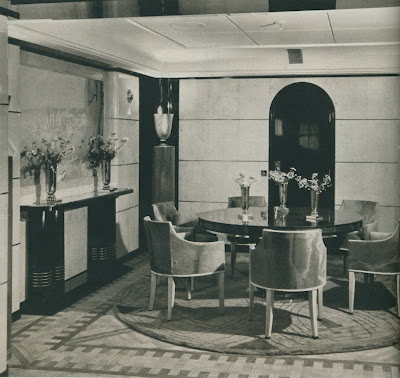
Image at top: The suite's dining room had walls covered in parchment and pallisander.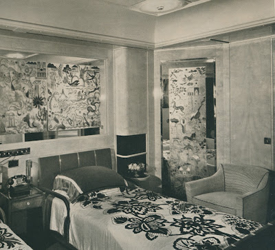
In the bedroom, lacquered blond wood walls had engraved mirrored panels. The color scheme for the room was bisque and brown.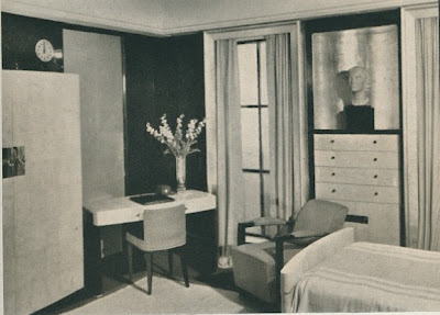
The blue bedroom had silk paneled lacquer walls and sharkskin furniture.
The salon.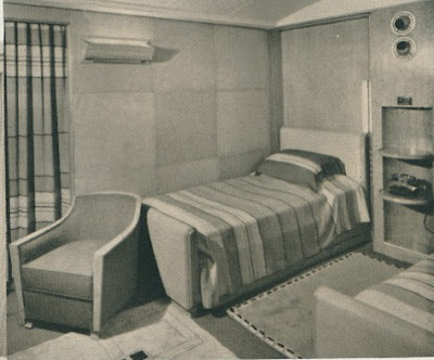
Another bedroom with "laced pigskin...ruddy tones...coarse textures."
All images from House & Garden, August 1935.
↧
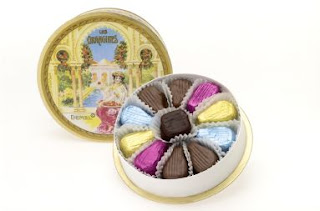
Rouen Suite on the Normandie
↧
Ann Getty Interior Style

One of the most beautiful and engrossing books that I've read lately is Ann Getty Interior Style
For some time now, Getty has been regarded as a well-informed collector and connoisseur, one whose collection, as the author notes, spans countries, periods, and styles. But rather than reading as a disparate grouping of items, her collection is really quite harmonious and dazzling. Saeks' captions that accompany the book's photographs often include detailed descriptions of these treasures, serving as an education on the best of the best antiques and decorative arts. Provenances aside, Getty's use of antiques and art, whether they be in her own home or those of clients, is something that should be studied. History obviously plays a role in her work, and yet, one could never call her interiors staid.
The book's photographs are lavish and colorful, a testament to the depth of Getty's work. But whatever you do, make sure to pay attention to the book's text. Saeks' writing is the perfect partner to Getty's work, lyrical, engaging, and magical in its own right. Reading the book transported me to each of the featured homes, making me feel as though I had a very special perch from which to view these rooms.
If you're looking for a book that both inspires and informs, I urge you to take a look at this book. I think you'll find that it's a special addition to your library.
A holiday table setting inspired by Ann Getty's love of Chinoiserie. (Copyright Ann Getty Interior Style by Diane Dorrans Saeks, Rizzoli, 2012)
The Living Room, with curtains crafted in three shades of Indian silk and a pair of George I gilded armchairs covered in antique blue damask. (Copyright Ann Getty Interior Style by Diane Dorrans Saeks, Rizzoli, 2012)
The Trainas' bedroom, with a japanned and gilded Venetian secretaire, which was a family heirloom. (Copyright Ann Getty Interior Style by Diane Dorrans Saeks, Rizzoli, 2012)
The dining room, set for a fall dinner honoring illustrious scientists. (Copyright Ann Getty Interior Style by Diane Dorrans Saeks, Rizzoli, 2012) 
Hand-painted, gilded, and semiprecious stone-ornamented Syro-Turkish paneled room, carved and adorned with marble and colored stones, featuring a gilded canopy bed. (Copyright Ann Getty Interior Style by Diane Dorrans Saeks, Rizzoli, 2012)
All photographs and captions reproduced with express permission of the author and publisher. Copyright Ann Getty Interior Style
↧
↧
Albert Hadley: A Heritage of Riches

I want to invite my New York readers to join me on Monday, September 24 at the Avenue Antiques, Art, & Design Show at the Armory. I am very excited to be participating in a panel discussion titled Albert Hadley: A Heritage of Riches. Moderated by Inge Heckel, the presentation will also feature Bunny Williams, David Kleinberg, Britton Smith, and Diana Quasha. The event will include remembrances of the great Mr. Hadley as well as an overview of some of his most memorable interiors. Needless to say, I am honored to be included in a tribute to the designer who has so inspired me.
The event starts at 10 a.m. There are also many other interesting events that are part of this show. For more information, please click here. I look forward to seeing you at the Armory!
↧
Pierre Dutel, Decorator
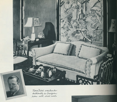
One of my favorite old-time decorators is Pierre Dutel. Based in New York, Dutel and his interiors were frequently featured in magazines during the 1920s and 30s. In the 1940s, however, his published work seemed to have tapered off. There is scant information about Dutel online, and the only tidbit I can find that might pertain to him is the death of a Pierre Dutel in New Jersey, 1975. If that's the same Pierre Dutel, what did he do during the 1940s, 50s, and 60s?
Now, I admit that while I like Dutel's work, I can't say that all of it was successful. Some of his interiors look rather contrived and even fussy, something that unfortunately describes many interiors from the early part of the 20th century. What I admire about him, though, was his unbridled enthusiasm for the then-new pastiche of the era: bamboo, colored mirror, and so-called "modernist" papers and fabrics. Just look at that photo of Dutel above. He looks so stern for someone who used bamboo trim with such abandon.
Take a look below for a compilation of his work. While his work can't be described as novel or ground-breaking, it certainly was pretty snazzy. And anyone who could concoct such elaborate and fanciful window treatments was obviously no slouch in the decorating department. Let's just leave the colored mirror where it belongs: in the past.


A Great Neck, Long Island home decorated in the early 1930s by Dutel. At top is the living room where a "bridge group" stands next to a window with mirrored cornice. The dining room has walls painted with espaliered trees.


↧
My Beverly Hills Kitchen

I recently received a review copy of the new cookbook My Beverly Hills Kitchen: Classic Southern Cooking with a French Twist
 , by Alex Hitz, and I can't begin to tell you how anxious I am to start cooking from it. (I had hoped to cook one of the recipes over the weekend, but I was stuck in bed with a bad cold.) So, which recipe should I try first? Chicken Country Captain? "She" Crab Soup? Salmon Pot Pie?
One of my biggest complaints about a lot of entertaining and party cookbooks is that the authors tout recipes that are supposed to be novel, new, and FUN, when in reality they come across as being fussy and cute. This is why most of us are such fans of Ina Garten. Her recipes are classic, tried and true, and tasty. And although I haven't yet cooked any of Alex's recipes, I have a strong hunch that the same thing can be said of his.
The book is chock-full of recipes for Hors d'Oeuvres (Crab Tarts, Dorothy's Cheese Straws), Soups (Cold Pea Soup with Mint, Shrimp Bisque), Salads (Crab Salad with Bloody Mary Aspic), Eggs, Cheese, Grits, and Quiches (Soufflé "Suissesse", Brooke's Confetti Grits), Vegetables and Side Dishes (Hash Brown Cake, Stewed Tomatoes), Seafood (Pecan-Crusted Salmon with Sauce Gribiche), Chicken, Turkey, and Pheasant (Chicken Pot Pie, Robert's Turkey Hash), Beef, Veal, Lamb, and Pork (Erlinda's Exquisite Short Ribs, Pulled Pork with Carolina Barbecue Sauce), Biscuits, Rolls, Bread, Pastry, and Crepes (Yeast Rolls, Sally Lunn Bread), and finally, Dessert (Peggy's Apricot Mousse, Priceless Pecan Bars). See what I mean about chock-full? What I also appreciate is that there is a chapter on sauces, including recipes for Orange Mayonnaise, Cucumber Sauce, and Hollandaise Sauce and its many variations. While I often serve beef tenderloin, pork tenderloin, or poached salmon at my dinner parties, I will admit that I don't always serve a sauce on the side. I'm certainly going to now.
The book is being released today, so if you're looking for a new book that will entice you to start cooking and entertaining, get thee to the bookstore and check out Alex's new book. If you live in Atlanta, you might want to consider attending one of Alex's book signings next week. Click here for more information.


↧
↧
English Decoration by Ben Pentreath

Last week was mostly a waste for me as I spent it either in bed or on the sofa, nursing a terrible cold. It wasn't a complete waste, though, thanks to my copious TV watching. I learned that Victor Newman had returned to Genoa City (Hallelujah! The Young and the Restless just isn't the same without Victor) and that every episode of Remington Steele included the name "Steele" in its title. Did you know that?
What perked me up immensely, though, was the receipt of two books that were both food for the soul and feasts for the eyes. (Bear with me and the spate of recent book reviews. Just two this week, but I promise that they're good!) First up is British architectural & interior designer Ben Pentreath's new book, English Decoration: Timeless Inspiration for the Contemporary Home
 .
. I have been a fan of both Ben's work and his eponymous shop (or at least its online version) for a few years now. I have to say that after reading this book, I'm even more of a fan now. Although I don't know Ben, I do think that we are kindred spirits as we both find vast inspiration in the past, but we reinterpret it for today. At least, that's the way I view it.
English Decoration: Timeless Inspiration for the Contemporary Home
profiles a range of English homes owned by the author himself as well as an assortment of creative types. What makes this book so interesting is that the homes, for the most part, have not been decorated by professional designers, but rather were concocted by the homeowners themselves. And personal looking is what these homes are. There are family portraits, children's artwork, treasures found at country house auctions, and the "accretion of decades." These homes are not decorated to perfection, and yet, a kind of perfection is found in these homes' loosely mannered appearances. In addition to a very complimentary forward written by the great Nicky Haslam, the book is divided into chapters on Entry Halls, "Comfortable Rooms", Kitchen and Dining Rooms, and even Utility Rooms. Each chapter is filled with lush photographs as well as Pentreath's charming and sometimes humorous captions, all of which go a long way to explaining the essence of English Decoration. And after reading this book, I really do feel as though I have a better sense of what makes up the DNA of this style of decorating. As Ben writes in the book, one attribute of the English style is "the unstudied way in which we have in an instant achieved both comfort and cosiness, grandeur and simplicity, sense and sensibility: in short, a place the English can call home." Sounds like the best of all worlds, don't you think?
After reading this book, I felt both uplifted and inspired. I have a very strong feeling that this is a book that I will return to often, and in my opinion, that's the very best kind of book there is. I hope that you'll give this book consideration, because I really do think you'll enjoy it.
Book number two, Gil Schafer's The Great American House: Tradition for the Way We Live Now
 , will be featured in the next few days.


All photos from English Decoration: Timeless Inspiration for the Contemporary Home
by Ben Pentreath, Jan Baldwin photographer. Ryland, Peters, & Small publishers.
↧
Chuck Williams and His Earthquake Shack

A week ago today, Williams-Sonoma founder Chuck Williams celebrated his 97th birthday. Could an enthusiasm for good food and hard work be the secret to his longevity?
You might remember that I posted a few 1970s-era photos of Williams' San Francisco kitchen a few months ago. (Click here to read that post.) After that post was published, a reader, Robert Ruiz, very kindly emailed me a 1989 Architectural Digest article which featured this very same home. I am showing the AD article photos here.
According to the article, Mr. Williams bought his "earthquake shack" in the early 1960s. In the wake of the great 1906 San Francisco earthquake, the city built and situated small clapboard dwellings in Golden Gate Park for those left homeless by the disaster (twenty thousand people, in fact.) A year later, with the city's residential district mostly rebuilt, the city offered to give those cabins to those who were living in them on the condition that they move them to permanent, residential sites. Williams' shack was moved by horse and buggy to its current location on Nob Hill, near the intersection of Sacramento and Leavenworth.
When Williams bought the shack, it was little more than four rooms with an outside bath. No surprise that he embarked on a renovation, one that appears to have modernized his home without losing any of its historical charm. Part of the renovation entailed going down into the ground into a primitive storage cellar, a space that eventually became Williams' small but efficient kitchen and dining room.
What you'll see in these photos is an abundance of country antiques, many of which Williams picked up during his European travels. There are oak gate-leg tables, Luneville plates, faience, cooking accoutrements, and books. What a delectable combination! The article also mentions Williams' preferred style of entertaining. Just as he exclaimed in the 1972 article about which I previously wrote, Williams kept the size of his dinners and lunches to around four to six guests. In good weather, cocktails, after dinner coffee, and weekend lunches were (and perhaps still are?) held on the terrace just off of his kitchen and dining room.
On another note, Robert also mentioned that the recently published biography on Williams, Merchant of Sonoma: Pioneer of the American Kitchen
 , is an interesting read. The book not only includes some of Williams' favorite recipes, but it also features pages devoted to some of the now-essential cooking equipment that Williams helped to popularize, including the Kitchen Aid mixer, Le Creuset cookware, and the Apilco cow creamer.
Sounds like hearty belated birthday greetings are in order. A happy belated birthday, Mr. Williams!


All photos from Architectural Digest, 1989, John Vaughan photographer.
↧
Bedford Antiques & Design Show

If you're looking for something to do this weekend, why not consider attending the Bedford Antiques & Design Show? (That is, of course, if you live in the vicinity of Bedford, New York.) Held at Historical Hall at the Village Green, Bedford, the show runs from Saturday, 10am to 6pm, through Sunday, 11am to 4pm. Benefiting Bedford Historial Society's Properties Fund, tickets are $10.
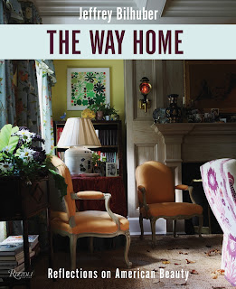
The highlight of the event is sure to be Saturday evening's cocktail party and presentation by designer Jeffrey Bilhuber, who will be discussing his recent book, The Way Home: Reflections on American Beauty. The introduction will be given by Martha Stewart. And you won't go hungry, either, as cocktails and lavish hors d'oeuvres will be served, all under a tent on the Village Green. Sounds like a festive evening indeed.
For more information, visit the Bedford Historical Society's website, or call (914) 234-9751. For tickets to Saturday's cocktail party, click here.
↧
Gil Schafer and The Great American House


The other book for which I can credit my speedy recovery is The Great American House: Tradition for the Way We Live Now
by Gil Schafer. Before reading the book, I was pretty confident that I would enjoy it as I'm an avid fan of Gil's work, not to mention the fact that he is a very affable and interesting person. Still, I didn't anticipate just how much I would enjoy this book. I opened the book, and before I knew it, a few hours had passed. And really, I can't imagine a better way to spend a few hours than to read Gil's engaging text and pore over the big, beautiful photos of his work. I think that what I enjoyed most about this book is that it isn't solely a book about architecture. It's just as much about decoration and landscape architecture, too. And what impresses me is that Gil is so knowledgeable about all three, something that might explain why his houses have such great appeal. There is a harmonious relationship between the bones of the house and what lies both inside and outdoors. This is no easy feat, and Gil makes it look so effortless, though I realize it isn't. That takes great skill, something which Gil obviously has in spades.
If you want a book that is filled with glorious homes, beautiful interiors, and lush grounds, then Gil's book won't disappoint you. But if you also want a book that makes you think about what makes a home comfortable, modern, and timeless, then you've come to the right book. My only complaint is that I don't have a piece of property upon which to build a home of Gil's design.
*Gil will be presenting what looks to be an interesting talk next Tuesday, October 16, 11 a.m., at ADAC Atlanta. Titled Pink Clapboards and Tea Olive: What a Southern House Taught Me About Tradition, Memory, and Great Design, the presentation should be highly entertaining and informative, especially to those of us who call the South home. For more information or to register, please click here.


 by Gil Schafer III, Rizzoli Publishers, 2012. Photo of Schafer, Rebecca Greenfield photographer.
↧
↧
Mr. Adams Goes to Budapest

I've written about London based designer Richard Adams before. His luxuriously appointed, bijou London flat is a favorite of mine thanks to what is, really, a heady mix of glimmer and glamour. (Click here to see photos of it.) Well, I'm back with more photos, but this time, they show Richard's luxuriously appointed, bijou Budapest pied à terre.
Richard now divides his time between London and Budapest, a city that, according to Richard, has a large and interesting expat community. The designer's new home features the same elegance as that which we saw in his London flat, with some of that home's furnishings having made the move to Budapest. But I'm not the only fan of Richard's new domicile. It seems that the editors at Polgari Otthon, a Budapest design magazine, feel the same way. They are featuring Richard's flat in their latest issue, the article photos which you see here.


All images from Polgari Otthon, September/October 2012.
↧
Walter Gay - Impressions of Interiors

In the midst of all of the blockbuster fall book releases, there is one book that I hope will not be overlooked. Titled Impressions of Interiors: Gilded Age Paintings by Walter Gay
 , the book is an informative, but more importantly interesting, overview of the work of the late, esteemed interior illustrator.
 Written chiefly by Isabel Taube as a companion catalogue to The Frick Art & Historical Center's exhibition of the same name, the book provides an engaging overview of Gay's oil renderings of both European and American interiors. There is an entire chapter devoted to Gay's paintings of his own homes, including Château du Bréau, as well as other chapters that profile Gay's studies of the homes of friends and patrons. Also included is an enlightening essay on the style of interior decoration that was most often seen in Gay's work, something that provides context for Gay's charming paintings.
I know that many of you collect (or hope to someday collect) interior illustrations, so I do hope that you'll visit The Frick's exhibition if you're in the Pittsburgh vicinity. And by all means, get a copy of this book! It will only help to fuel your passion for this exquisite form of illustration.

Symphonie en Blanc (Château du Bréau)

Interior of the Bedroom of the Château du Bréau, c. 1912
The Artist's Study, rue de l'Université, c. 1910

Antechamber of Marie-Antoinette, Château de Fontainebleau

The Green Lacquer Room, Museo Correr, Venice, 1912/22
All images courtesy of Impressions of Interiors: Gilded Age Paintings by Walter Gay
, Isabel Taube author. D Giles Ltd, 2012
↧
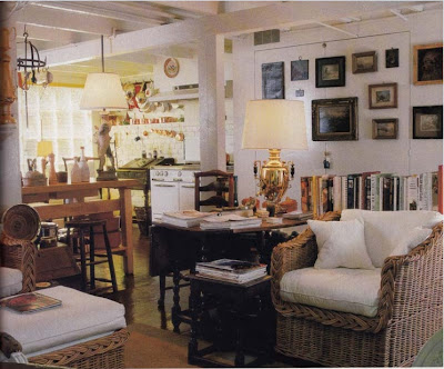
A 1970 "It" Home

Every so often, there is a home whose interiors seem to resonate with us. Perhaps it's because the home captures the mood of the time, or maybe it's that the homeowner or designer hit the nail on the head when it came to using various popular decorative trends. No matter the reason, these homes usually end up being featured in numerous shelter magazines, and now, blogs, too.
One such home that was the hit of design magazines in the early 1970s was the Manhattan apartment of Mr. and Mrs. John C. Moore III. I first saw the home, one notable for creating a country home effect in a New York apartment building, in a 1970 issue of House & Garden. While the home was evocative of that era- layer upon layer of prints and patterns, wicker furniture, needlepoint, and Italian ceramics- I do think that it was a rather interesting idea to imbue the space with such quaint, country effects. Design editors must have thought so, too, because just a few months later, in 1971, House Beautiful also featured the Moore's apartment. But this version was a little different. I'm fairly certain it was the same apartment, but the fireplace mantel seems to have changed as well as some of the fabrics. And strangely enough, the painted piano from 1970 seems to have been repainted with a different design just a short time later.
There are other differences, but I stopped looking at the photos as it was giving me a headache. Suffice it to say, the Moore's residence was an "it" residence of the early 1970s, one that captured the spirit of that time.
Image at top: The Moores' Dining-Sitting Room as it appeared in 1970. The white piano bore painted miniature fruits and vegetables.

In 1971, the dining room has a change in fabric, and paneling seems to have been added. Here, the piano was painted with exuberant flowers.

Jumping back to 1970, Marni Moore was photographed sitting on her charming sofa with blue and white floral pillows.

Another 1970 photo which shows a wider view of the living room.

A detail 1970 photo of Mrs. Moore's cocktail table with a top made of blue, white, and red tile. The same table was a holdover for the 1971 photo shoot.
The Living Room circa 1971.
And here, in 1970, was a black and white shot of the living room with the dining room beyond.

The colorful Library made it into the 1971 House Beautiful article, but not that of the 1970 House & Garden issue.
The Moores' bedroom, which I do think is rather pretty, from 1970.
↧
Taking a Stand

Here in Atlanta, we finally got a taste of fall a few days ago. With nightly temperatures hovering in the 30s, it was time for my pretty potted geraniums to come indoors. Unfortunately for them, though, they went from a comfortable balcony to the floor of the kitchen, the only spot that I could find for them where they would get sun. And because I do find geraniums to be a genteel plant, they really have no business being unceremoniously dumped on the floor.
I could always find a narrow table like the one in the illustration above, one on which I could park a few plants, but the problem is that such a table takes up space, something in short supply around my home. What I want, and think that I need, too, is a good old-fashioned plant stand, one dignified enough for geraniums, not to mention my living room as well. Of course, what I covet is a stand much like that owned by the late John Fowler, seen immediately below this text. That has to be the all-time best looking plant stand that I've ever seen.
While looking for other photos of plant stands, I realized that the best examples I could find were featured in books on English and Irish design. Not surprising, really, as a pretty stand holding a flowering plant seems made for both quaint country cottages and grand country houses alike.
For all of you who are being affected by Hurricane Sandy, please stay safe and be well!

John Fowler's stand in the hall at his Hunting Lodge.

A plant stand in Lady Gunston's drawing room in Pelham Crescent, decorated by John Fowler.
A wire plant stand on a table in Fowler's home-showroom at 292 King's Road.
A modern scheme includes a column supporting a potted urn, decorated by David Mlinaric.
A stand with what looks like a terrarium on top, in an 18th century lodge decorated again by Mlinaric.

The charming and much-photographed living room of the late Mark Hampton. The curvy plant stand in the window held a pot of pretty paperwhites.

A fountain converted into a plant stand, at Killadoon, County Kildare
And a Victorian looking stand at Birr Castle, County Offaly.
Image #1 and #7 from Colefax and Fowler: The Best in Interior Decoration
 by Chester Jones. #2 from Nancy Lancaster: English Country House Style
 by Martin Wood; #3 and #4 from John Fowler: Prince of Decorators
 , also by Wood; #5 and #6 from Mlinaric on Decorating
 ; #8 and #9 from The Irish Country House
 .
.
↧
↧
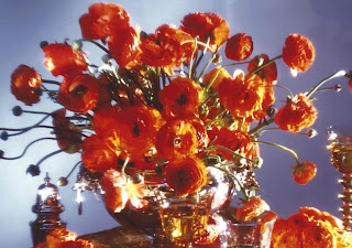
The New Constance Spry Style

I have lived in a high-rise building for some years now, and I love it. Every morning, my newspaper is placed outside of my front door. I have a trash chute conveniently located within reach of my kitchen's service entrance. And what's not to love about having a lobby staffed by somebody 24 hours a day? The one thing I lament about living in a high-rise, though, is that I have no yard from which to clip flowers, leaves, branches, and pine cones for my floral arrangements.
My childhood home's property yielded all kinds of wonderful yet uncomplicated flowers and greenery. There were gardenia, camellias, magnolia and oak trees, and beautiful holly bushes that bore fiery crimson berries come Christmastime. Our property was my mother's floral market, and her arrangements always reflected what was blooming and thriving outdoors. What I remember most, though, was how loose and simple her arrangements were. A single magnolia blossom floating in a silver revere bowl, or branches of copper colored oak leaves perched within an antique glass fish bowl. They weren't studied nor fussed about. These arrangements were as Mother Nature intended, in a way.
When House Beautiful asked that I write a blog post about what the "New Constance Spry Style" means to me, I started to think about Spry's artistic, iconoclastic, and, most importantly, naturalistic floral arrangements. (In case you're not familiar with Spry, she was one of the most noted floral designers of the 20th century. Her arrangements took the fashionable set by storm in the late 1920s and 30s thanks to Spry's then offbeat use of greenery like grasses, leaves, and seed heads.) It occurred to me that after years of living without a yard- and years of relying upon my local grocery store for flowers like lilies, roses, and carnations- that I forgot that arrangements don't have to be tight, compact, and of one variety. After all, our houses aren't one note, so why should our vases of flowers lack diversity? Maybe it is high-time for me to heed Spry's advice and start mixing eucalyptus leaves, kale, or pussy willow into my arrangements. Perhaps I need to tone down the bright colors to which I am attracted and start seeking flowers in shades of dusty greens, soft pinks, and pale gold. Oh, and grass. I need to do as Spry did and add grass to my floral arrangements.
Well, while I figure out from whose yard I can retrieve this greenery and grass, I leave you with a few photos of arrangements that reflect the spirit and creativity of Spry. They were all done by Michal Evans, one of the foremost floral and event designers in the South. (I consider him to be Atlanta's own Constance Spry.) I crave all of Michal's designs, but what I like about these are their complexity. By building layers of flowers and greenery of different colors, textures, and shapes, Evans has created masterpieces that are artistic, intriguing, and really quite beautiful. More importantly, though, they look like arrangements of which Mother Nature would approve.
*This post will be featured in the December/January issue of House Beautiful.


The photo at top is courtesy of House Beautiful, December/January 2012. The remaining photos courtesy of Michal Evans.
↧
Pretty Paper

So, while I was on the Fortnum & Mason website, I noticed that they now sell cakes from Demel. Well, that excited me because I visited the venerable patisserie while in Vienna a few years ago. Their chocolates are absolutely delicious, but what I liked even more than the chocolate itself was, wait for it...the packaging. I even saved two of their candy bar wrappers. They've been sitting in a drawer for five years, and heaven knows what I'll ever do with them. Still, you can't just throw away wrappers like this:

After leaving the Fortnum website, I just had to visit the Demel site. I didn't order anything considering that I had a high-calorie pudding on the way to me, but I certainly did spend time browsing. Just look at their chocolate box that is based on a Wiener Werkstätte design:

Then there's Les Orangines containing candies of orange fondant and orange marzipan:
And for you cat lovers, the Katzenzungen milk, which is described as cat's tongue shapes made of milk chocolate:

And then, as usually happens when surfing the web, I somehow ended up on another site, this one with even more charming boxes and bags, the French chocolatier Maison Boissier:


They even have chocolate petals:

Then I found the pretty boxes of Prestat chocolate from England:


At this point, my confectionary tour ended because I knew if I didn't stop, I'd be up all night. I didn't even make it to the Laduree or Charbonnel et Walker sites. If you know of other sites with packaged chocolates and candies like those at Demel and Maison Boissier, please let me know. I might be ready to take another tour very soon.
↧
Feeling Daft about Delft

I was looking through my copy of Nancy Lancaster: English Country House Style
a few days ago, and I was reminded of how much I admire Lancaster's blue and white plates that hung above her fireplace at the Coach House, her last home. You can see a detail shot of the plates, above. I wonder if Lancaster's plates were antique Delft plates that depicted the months? I can't confirm this; it's only a hunch. But I also have a hunch that quite a few of you do know something more about these plates, and if so, feel free to drop me an email or comment below.In the meantime, I did find a few plates that have a similar look to Lancaster's plates. Certainly these examples are all charming, but they would be even more beguiling in a home decorated like that of Lancaster.

A set of seven Dutch Delft month plates, 18th c.

A pair of Delft plates that are currently being auctioned off on ebay.

A set of reproduction 18th c. Delft plates that depict each month.

An 18th c. antique Delft plate available on ebay.
↧
Problems, Problems

I suppose that when a magazine is presenting practical tips to their readers, its editors feel the need to spice up the article in order to make it seem not so boring. At least, this must have been the case with an article that I read over the weekend, one that appeared in a 1934 issue of House Beautiful. The article's premise was how to make a woman's bathroom, dressing area, desk, and bedroom more efficient in order to help make her day run smoothly. But, the kicker was that these tips were all presented within the context of a fictional account of women getting together for a coffee klatch (actually, the article said it was tea) and discussing the daily trials and tribulations that they faced.
One of the women said, "Every time I step into the tub I think of what an insurance man once told me. Did you know that there are more casualties annually from slipping into bathtubs than there are deaths by motor cars? It's a fearful strain, really." A strain, indeed. Then there was Mrs. D who was livid about towel bars, ruing the "barbarian who first put towel bars over bath tubs behind bars of another sort." I'm not really sure of what she is speaking, but evidently it caused her towels to get wet, forcing her to make a "six-foot sprint across the room for a dry towel", something that she claims "nearly kills me." And then there is poor Mrs. C whose "gastronomist has positively forbidden any excitement during meals." And yet, when Mrs. C is "trying to be very calm and unhurried about my orange juice and toast, wouldn't that just be the time my Finnish Lena would bellow, 'Mrs. Carpenter on the telephone, Madam,' and I have to scramble out from under the breakfast tray and like as not upset my orange juice in the confusion." I don't know about you, but I would kill for these kind of problems.
I have to admit, though, that the practical ideas that were mentioned still seem like good sense today. Take, for example, a small table placed tubside that allows you a place upon which to place your towel. (It certainly beats the barbarian-created towel bar.) Then there is the "glorified" hospital table that fits conveniently over your chaise longue, a far more convenient way to take breakfast than a tray on the lap. My breakfast lasts all of ten minutes, so I might use such a table for Sunday night suppers at home. But the best idea of all has to be something called the "Servitone", described as a small disk-like microphone "into which you have only to whisper that you would like your morning coffee in bed...and the fact is boomed out in the butler's pantry through a loud speaker." Why go through the Starbucks' drive-through window when you can order your coffee from the comfort of your bed...and over a microphone, too. Now that might be the solution to my problems!
Image at top: Handy niches for bottles, jars and cloths. A waterproof cushion and rack for the tub. The small table keeps your towels available.
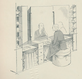
For a dressing table, this luxurious built-in arrangement with an adjustable mirror and copious cabinets for storing lotions and creams.

Breakfast in comfort on a chaise longue with a glorified hospital table instead of a tray and your telephone swinging at your elbow.

The drawer in the desk at the right has a light concealed inside. The blotter is fastened down.

For evening make-up this mirrored slab, draped top and sides, offers full-length vision. It is lighted by a concealed spotlight. The tables at each side are for creams.

Reading in bed with a light concealed in the wall and a back rest with soft, quilted framework for sheer comfort.
↧
↧
2012 Atlanta Homes & Lifestyles Christmas House

A few days ago, I previewed the 2012 Atlanta Homes & Lifestyles Christmas House. Benefiting Atlanta's Alliance Theatre, the Christmas House features the work of thirteen of Atlanta's top designers, all under the roof of a charming Chastain Park house.
The house is open to the public Thursday through Sunday starting this Friday, November 16 and running through December 9. Kicking off the show house is a Champagne and Candlelight Opening Party which will be held at the house tomorrow night. For more information about the house as well as tickets to the show house or opening night party, please visit the Christmas House website.


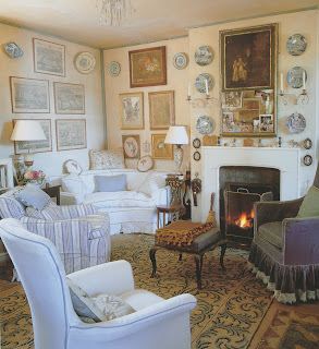
Gentleman's Study by Tammy Connor

Living Room by Beth Webb

Dining Room by Jim Howard


Breakfast Room by Gretchen Edwards. (Gretchen told me that the fabrics are by Jim Thompson and No. 9 Thompson and the table accessories are from Travadavi.)


Family Room by Liz Williams


Mud Room and Back Stair Hall by James T. Farmer III


Library by Laura Walker

Young Boy's Bedroom by Barbara Heath. (Much of the room's furnishings are available through Barbara's store, The Mercantile.)

Nursery by Michel Boyd


Upstairs Study by Chris Holt

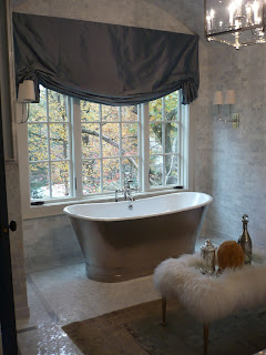
Master Bedroom and Bath by Amy D. Morris
All photos by Jennifer Boles for The Peak of Chic
↧
More Constance Spry...in a way

Quite a few of you expressed interest in the lead photo of my recent Constance Spry post. The photo shows a c. 1911 Manhattan apartment that was decorated by Alexander Doherty. Featured in the December-January issue of House Beautiful, the apartment is awash in moody colors and tranquil light. You can see a few photos here, but for the full effect, check out the upcoming issue of House Beautiful.


All images courtesy of House Beautiful, December-January 2013, Francesco Lagnese photographer.
↧
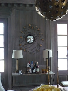
Inman Cook and the Celanese House

While looking through the November 1965 issue of House & Garden in hopes of finding Thanksgiving related photos, I found an interesting article that featured the work of designer Inman Cook. I've seen Cook's work before, usually in mid- to late 1960s design magazines, and it has always caught my eye. Like so many other designers of this era, Cook embraced bold prints and colors, and yet, there was a reserved elegance to his work as well. His interiors were exuberant, but they also conveyed a traditional sense of propriety. If my memory serves me correctly, I believe that a friend told me that Cook was Southern, so this might explain his work. And if Cook wasn't born in the South, well, then, what do I know.
The photos seen here show Cook's decoration of a mid-19th century brownstone in midtown Manhattan that temporarily housed the Celanese House, a show house sponsored by Celanese Contemporary Fibers. The Celanese Corporation charged Cook with decorating the four-story brownstone for a mythical family. The challenge, though, was that Cook could only update the home through paint and fabrics woven of Celanese. According to this article, the house was rife with exposed pipes and radiators, but as they were mostly located near windows, Cook was able to hide them using cleverly designed curtains and low screens. Now that you know this fact, you can look at the photos below and determine which rooms were plagued with these eye-sores. I have to say, though, that Cook was successful in his cover-up. My only question is, if Celanese is a synthetic fiber (am I correct?), then how did the fabric near the radiator not go up in flames?
The other thing that struck me about the interiors is that if you didn't know this was a show house, you just might think a real family lived here. Nothing looks temporary nor too staged, something that sometimes happens at show houses. And despite some of the dated-looking prints, I must say that few of the rooms look out of place today.
Image at top: The Living Room. Note how the curtains extend beyond the corner of the room. This device helped to conceal exposed pipes.


All images from House & Garden, November 1965, Otto Maya photographer.
↧