Quantcast
Channel: The Peak of Chic®
Viewing all 483 articles
Browse latest View live

Porcelain Kick #2: TheHighBoy

$
0
0

If the rooms that have been featured on my blog this week have intrigued you to the point where you want to start your own porcelain collection, then you might want to visit the recently-launched antiques website, TheHighBoy. I met the founders of the site, Douglas Scott and Olga Granda-Scott, at the Nashville Antiques Show earlier this year, and what impressed me most about them is both their knowledge of and their enthusiasm for antiques. It's also worth nothing that the couple is young. I only add that because I think that their youthful, technological savvy coupled with their passion for antiques will be a winning combination in today's high-tech world.

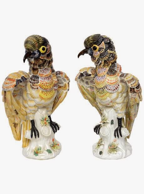
If you're not familiar with the site, it is an online antiques marketplace that is made up of a carefully-selected group of dealers. Their offerings include furniture, fine art, textiles, antiquities, and porcelain.  It's their porcelain section, which has a little something for everyone, that kept me glued to my screen for a good hour the other day.  Chinese porcelain and Chinoiserie-style pieces, always popular with collectors, are present on the site, as is Delftware.  There are pieces that are very lady-like, such as the Dresden ink well set.  And then there is my favorite type of porcelain: lettuceware.

I asked Douglas to share with me his thoughts on porcelain.  He said, "I think what's really compelling about porcelain is that it's not just for plates or vessels, as many might quickly guess.  Porcelain was often used in light fixtures, candelabra, washstands, dolls, drawer handles, etc.  It is a very diverse material." And Olga added, "Porcelain speaks to me because of the high level of quality and craftsmanship that goes into each piece. Accessorizing your home or table with one-of-a-kind, rare accessories—such as porcelain—gives an added personal dimension to any decor." I couldn't agree more.

For more examples of porcelain and other antique furnishings (or to learn about their designer-only Concierge Service), please visit TheHighBoy.com.


A pair of late 19th-century Chinese figures


18th-century pair of Delft vases


Antique Dresden ink well set


Set of eight Wedgwood Lettuce plates


A 19th-century Meiji Period Satsuma bowl


Chinese Rose Mandarin cups and saucers, 19th century


Old Paris Porcelain veilleuse, c. 1830
Paris Match

$
0
0

I must have read Christiane de Nicolay-Mazery's The Finest Houses in Paris dozens of time, and yet, I failed to make the connection that the Paris house that I featured on my blog last Monday, and which first appeared in the October 1999 issue of House & Garden, is also featured in the de Nicolay-Mazery book.

As you may recall, the house in question was once a garage that had been beautifully transformed into an elegant hôtel particulier. The House & Garden article captured the home's interiors bathed in sunny light, which helped to spotlight the interior's Neoclassical details. But in the de Nicolay-Mazery book, it is the home's Russian flourishes that are profiled, with the author noting that, "in the main salon, a visitor is transported deep into Russia." (The chapter's title is even Russian-inflected: "The Spirit of Saint Petersburg".) I must admit that when I wrote last week's blog post about the house, I didn't detect a Russian feel to the house. However, after looking at this book's photos with their dreamy and rather brooding light, I guess that the house does conjure up Russian fantasies...well, somewhat.

I still believe that the house has a much stronger Neoclassical style to it than a Slavic one, although I do think that the intricately-stained wooden floors and the sumptuous fabrics could pass for Russian.  It doesn't really matter, because the house looks splendid in both publications.  It's just interesting to see the house through the lens of a different photographer.

*If you're looking for a beautiful book about Paris interiors, I highly recommend The Finest Houses in Paris. It is truly one of my favorite books.  It is out of print, but copies are available on Amazon and Barnes & Noble.


All photos from The Finest Houses in Paris by Christiane de Nicolay-Mazery, Jean-Bernard Naudin photographer.

The Door to Gracious Living

$
0
0

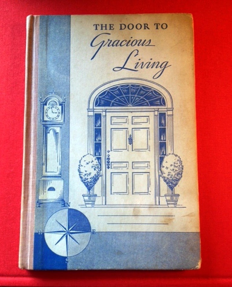
I recently bought the 1932 book, The Door to Gracious Living, based solely on its cover.  The book turned out to be a compilation of articles that had been published in the old Delineator magazine.  Some of the articles, especially those written by designer Joseph Platt, were interesting, while others, such as the one about how to deal with children who lie, didn't quite strike my fancy.  No matter, though, because it's the book's cover design that delights me.  The stately door with its fanlight and sidelights and those neatly-clipped potted trees conjure up fantasies of the archetypal dream house with its front door that warmly implies, "Welcome Home".

Dorothy Draper was a firm believer that the front door said much about the home behind it and was an opportunity to make a good first impression.  In Entertaining is Fun!, Draper wrote, "Your home's welcome begins right at the front door." In the book's photo, below, you'll see that Draper advocated showy architecture, a glossy painted door, a laurel wreath, a big, brass knocker, potted plants, and a friendly-looking Dalmatian.  I'm with Draper.  A front door should have a good paint job, some kind of tailored potted plants or trees, and rich-looking hardware.  Of course, a dog is a must-have, too.

I found a few other photos of front doors that captured the essence of gracious living.  Wouldn't you like to be welcomed by such snazzy front doors?


Front doors were important to Dorothy Draper, as evidenced by both the photo and the illustration that appeared in Entertaining is Fun!


The façade of the Pavillon de la Reine in Paris.


Not a door to a home, but rather, to a hotel: the Saint Vincent in Paris.


The door to Alex Hitz's Beverly Hills home (photo courtesy of House Beautiful)


This front door appeared on the cover of Sybil Connolly's In an Irish House.


Much like the rest of Furlow Gatewood's houses, the front door of his pigeon house is a study in unstudied elegance.


Draper photos from Entertaining is Fun!; Paris hotel photos from Parisian Hideaways; Irish front door from In an Irish House by Sybil Connolly; Furlow Gatewood's pigeon house from One Man's Folly: The Exceptional Houses of Furlow Gatewood.

Virginia Robinson Gardens

$
0
0

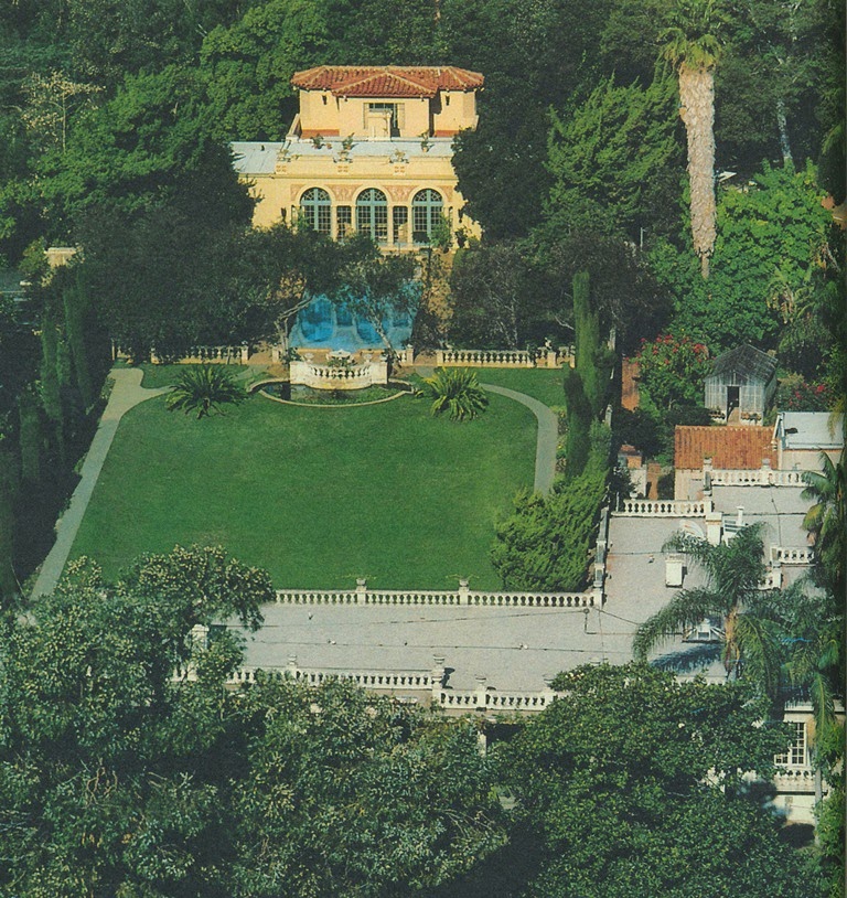
When I was visiting Los Angeles last March, I had the opportunity to tour the beautiful Virginia Robinson Gardens.  Built in 1911 and commissioned by Harry and Virginia Robinson (of Robinson department stores,) the gardens and house are considered to be the first luxury estate built in Beverly Hills, thus earning the Gardens a place on the National Register of Historic Places.

The Robinsons' house, whose decor has been left intact since Virginia Robinson died in 1977, is like taking a step back in time.  Mrs. Robinson, who was widowed in 1932, was considered to be one of Los Angeles's leading hostesses and philanthropists- dual roles that required her to entertain frequently in her elegant yet comfortable home.  The house has "good flow", as we say today, which must have made the house an ideal location for parties.  And yet, the house isn't a behemoth like so many of the estates being built today.  How refreshing.

But it is the estate's gardens that are truly unforgettable.  Some are formal, while others, such as the Palm Forest, are downright exotic and tropical.  When touring the gardens, it is hard to believe that you are in the middle of bustling Beverly Hills.  The estate is like a quiet, elegant refuge from the glitz and glamour of close-by Rodeo Drive.

The estate is open Tuesday through Friday for docent-led tours, but please keep in mind that you must make a reservation ahead of time in order to participate in the tours.  For more information, please visit the estate's website.


ADAC in Bloom

$
0
0


I hope that you'll join me next Wednesday, July 16 for ADAC in Bloom, which is hosted by flower magazine and ADAC.  The day-long event will begin with a panel discussion that I will moderate; joining me will be special guests Alexa Hampton, Ben Page, and Matthew Robbins.  Throughout the day, each guest will give individual presentations, which will be followed by book signings.  I will be signing copies of my book, In with the Old, alongside Alexa Hampton following her presentation.

ADAC in Bloom is always a highlight of the Atlanta summer season, and this year's event will be no exception.  For more information, please visit flower's website; to register for the event, please visit adacatlanta.com/events.

Veere Grenney's Folly

$
0
0

Designer Veere Grenney's Palladian temple folly has garnered a great deal of print and online coverage, and with good reason. Simply put, it's splendid. Built in 1760 and once inhabited by David Hicks, the folly is modestly-sized: one room deep and made up of two floors. The bottom floor consists of a kitchen and bedroom, but head upstairs to the second floor and one will find a spacious drawing room that belies the folly's compact size. As Grenney once said, "I live in a cottage and a palace at the same time. Downstairs is like a cottage-my bedroom lies off the kitchen- and upstairs is like a palace."

The most recently published version of Grenney's folly shows a drawing room that is decorated in soft putty-tones and solid fabrics. But in the version that you see here, and which was published in the January 1998 issue of British House & Garden, the drawing room's walls were painted candy pink. The choice of wall color was a bold one, especially considering that candy pink can go all bubble-gum and sweet sixteen quickly. And yet, in Grenney's deft hands, this shade of pink flatters the room, making it a sophisticated yet colorful companion to the room's impressive (and somewhat mannish) interior architecture. Grenney also struck a balance between those pretty, ornate balloon shades (which are still present in the room today) and the furnishings, which were comprised of modern pieces and elegant antiques.

If you want to compare the two versions, click here to see the temple's current incarnation on Veere Grenney's website.


Image at top: The folly's setting is equally as captivating.  Flanked by two hedges (which were planted by Hicks upon the recommendation of John Fowler,) the temple looks out upon a canal and parkland.


The three images above show the stately drawing room and the view from within.


The kitchen table and chairs were covered in a check-print fabric by Colefax & Fowler.


The guest-house bedroom.


All photos from British House & Garden, January 1998, Jeremy Young photographer.

Double Wedding

$
0
0

When I'm getting dressed in the mornings, it's not CNN nor the morning talk shows that I watch on TV. (Does anyone else get annoyed with those CNN anchors who constantly interrupt and talk over the person being interviewed?  And why do commercials have to be so LOUD?)   Instead, I like to have Turner Classics going in the background, because the channel often airs 1930s-era movies early in the morning.  Just last week, TCM showed Double Wedding, a 1937 screwball comedy starring Myrna Loy and William Powell.

The movie was cute enough, but it was the Cedric Gibbons-designed sets that caught my eye, especially the house of Loy's fashion designer character, Margit.  (See below.)  I decided to rent the movie so that I could pay attention to both the sets and the dialogue.  Here are a few of my favorite scenes from the film:


After passing through Margit's front door with its louvered fan and side lights, one entered the entry hall...


...which had that wonderful staccato black and white floor. The stairs had quite a loopy banister, which resembled a garden border fence.


Blanc de chine objects and glossy satin upholstery, seen here in the living room, were of course the rage on 1930s-era film sets.


In the dining room, there were dramatically-scaled panels with broken pediments, which framed the doorway.  Throughout the movie, the mirror-clad dining table was set with those high-style crystal trees and centerpiece...


...which makes sense considering that even the breakfast grapefruit was served rather formally.


Margit was a little uptight and liked order in her household- order that was partially maintained by these typed breakfast menus.


Framing the sliding glass doors, which led to a terrace beyond, were curtains with a pennant-edge...


...whose jagged edges were mimicked by the border fence.  And don't you like the curlicue furniture?


The four photos above show Margit's fashion studio, which was quite glamorous with its white-lacquered furniture, horse statue-capped borne, garland-print wallpaper, and those magnificent Greek-Key motif doors.


The bonus shots show a minor character's apartment, which I might like even more than Margit's house.  I'm crazy for the living room's plaster swag and tail, which framed the Marie Antoinette-ish bust.  But the poor woman's bedspread??  I'm not so crazy about that.  It reminds me of Austrian shades.

A Unique Opportunity

$
0
0

Speaking of this Martin Battersby photo of various Syrie Maugham-designed pieces, F.P. Victoria & Son is currently having a floor model sale, which includes models of pieces that were originally made by Frederick Victoria for Maugham and Elsie de Wolfe.  Models include the Syrie Maugham Magazine Table, which is a slightly taller variation of the table featured in the Battersby photo, and the De Wolfe Muffin Table, a satin nickel and parchment occasional table that would work well underneath a chilled Martini.  The sale also features a few models that don't carry the Maugham or de Wolfe moniker, but which are equally as chic.

The sale only runs until the end of this month, so visit Victoria & Son's website ASAP to claim your piece of design history.  For more information, please visit their website  or contact Freddy or Tony Victoria at (718) 392-9651.


Syrie Maugham Magazine Table.  The table, which was based on a English Regency piece, was adapted by Frederick Victoria for Syrie Maugham.


Syrie Maugham Coffee Table, whose design was originally developed by F.P. Victoria for the designer during the 1940s.


De Wolfe Muffin Table.  According to Freddy Victoria, de Wolfe saw the prototype of this table, which was brass with red leather tops, when she visited Frederick Victoria's showroom.  De Wolfe was desperate to buy the table, but Victoria would not sell it to her.  Later, she sent Victoria a letter asking for the table and included a sketch of where she intended to use it.  Victoria eventually made her a copy of the table.


Polished Nickel Cole Porter Table. Freddy's father, Tony, adapted this table from the firm's famous étagère design for Billy Baldwin.

What Nifty Little Rugs

$
0
0


Cecil Beaton's circus-themed bedroom has long amused me, so much so that I discuss the room's attributes in my In with the Old lecture.  But until I read the July issue of World of Interiors, I had never seen the photograph that captured the room's fireplace wall.  (See below.)  Yes, the fanciful murals are enchanting as are the drum side tables.  But what especially caught my eye was the small leopard-pelt motif rug in front of the fireplace.  It reminded me of a similar rug that appeared in the Martin Battersby book, The Decorative Thirties.  (You can see a photo of that rug below as well.)

These trompe l'oeil-style leopard rugs fascinate me because I've always been curious of their origins.  Could they have been inspired by the now highly-collectible Tibetan Tiger Rugs?  Tiger rugs, whose designs feature simulated tiger pelts, hail from Tibet, where the large cats and their skins have long symbolized power.  Tiger rugs were traditionally given as gifts to lamas, who did their Tantric meditations on them.  Little was known about these rugs until the latter part of the twentieth century, so perhaps their existence was not widely enough known to have been a contributing factor in the design of those 1930s-era faux leopard rugs.  And of course, I do realize that the Tibetan rugs feature tiger pelts while the Beaton and Battersby rugs depict leopard skins, but the stylized images of their pelts are rather similar.

By the 1960s, it was Piero Fornasetti's faux leopard pelt rug that was all the rage, gracing the floors of some swank European residences.  And the stylized leopard skin rug is still going strong today, as evidenced by Diane von Furstenberg's "Climbing Leopard" rug design for The Rug Company.  But still I wonder, just who created the vogue for these chic and amusing leopard rugs?  

Images at top: You'll find two examples of Tibetan Tiger Rugs above.  The top photo shows a 19th-century Khotan Tiger Rug from Turkestan, while the second image is of an early 20th-century Tibetan rug.

Cecil Beaton's Circus Bedroom was decorated with murals painted by the likes of Rex Whistler and Oliver Messel, drum side tables, and a leopard-pelt motif rug.


Amongst this grouping of Syrie Maugham-designed furniture, Martin Battersby, author of The Decorative Thirties, placed a stylized leopard rug. Unfortunately, he made no mention of it in the book's text.


By the 1960s, Fornasetti's leopard style rug could be found in stylish halls and baths, for example.


And most recently, Diane von Furstenberg designed "Climbing Leopard" for The Rug Company.


Beaton image, World of Interiors, July 2014; Battersby photo from The Decorative Thirties; Fornasetti rug photos from Nouvelles réussites de la décoration française, 1960-1966; Climbing Leopard photos courtesy of The Rug Company.

Fantastic Voyage

$
0
0

Did you read last week's New York Times article, "Reclaiming Our (Real) Lives from Social Media"? I share the frustration felt by the article's author, Nick Bilton,  over time spent- and wasted- on social media.  What starts out as a quick morning check-in on Instagram or Facebook turns into an hour-long slog through status updates, sundry thoughts, and links to random websites.  As Bilton so aptly put it, "Yet I am blaming the Internet for sucking people into a cacophony of links, videos and pictures that are constantly being dangled in their faces like some sort of demented digital carrot on a stick." Here, here.

While I try hard to avoid those labyrinthine visits to social media sites, I have no such qualms about time spent researching on the Internet.  Those twists, turns, and tunnels through which such research leads me usually result in my learning about places with which I am not familiar.  They also lead me to some really great photos.  And that was exactly what happened when I recently searched for German and Austrian porcelain rooms.  One room led to another, and before I knew it, I had spent close to two hours studying- and coveting- these paeans to porcelain.  But whereas I typically leave social media sites with not much to show for it, here I ended up with some beautiful photos, not to mention a bad case of wanderlust.


Schlossmuseum Oranienburg, Oranienburg, Germany


Porcelain Gallery at Schlossmuseum Arnstadt, Germany


Room of the Sibyls, Altenburg Palace, Germany


Neue Kammern, Park Sanssouci, Germany


Porcelain Cabinet, Schloss Eggenberg, Austria


Porcelain Collection at Zwinger Palace, Dresden, Germany; the design of the porcelain galleries was the handiwork of Peter Marino.


Porcelain Room, Schloss Charlottenburg, Germany

Chez Adolfo

$
0
0


When I think of the fashion designer Adolfo, I think of my teenage years spent reading W. I devoured each issue (especially Suzy's column) because I couldn't get enough of Nan Kempner, Pat Buckley, Jerome Zipkin, and their see-and-be-seen canteen, Mortimer's, not to mention Donna, Calvin, Ralph, Oscar, Bill, and Adolfo. Back then, we knew fashion designers by their first names. And also back then, it was Adolfo who dressed the society ladies, including C.Z. Guest, Nancy Reagan, and Betsy Bloomingdale. It was a heady time for both fashion and society.

Adolfo may no longer be designing, but his name still conjures up images of ladies clad in elegant dresses and suits and accessorized with stockings and low-heeled pumps.  This was, after all, before the days of the high-fashion stripper shoe.  But getting back to elegance.  Until recently, Adolfo maintained a resplendent Manhattan duplex in the Berwind Mansion, which was recently purchased by Russian tycoon Roman Abramovich.  Photographed for House & Garden in 1997, Adolfo's residence was decorated, as the magazine noted, in baronial splendor.  Among the damask and stripes was a notable collection of antique pictures, including portraits of nobility, as well as furniture, whose styles ranged from Louis XIV to Napoleon III and American Empire.  What all of these pieces had in common, though, was that the designer and his late partner, Edward C. Perry, had ardently collected them over the years.

All in all, a supremely elegant home, one that was fit for a supremely elegant designer.  Sadly, with the sale of Adolfo's apartment, I doubt that we'll see too many more of these richly- and tastefully- appointed homes.

Editor's Note: As I was finishing up this post, I learned that Doyle New York will be auctioning off Adolfo's collection of furniture, antiques, and paintings on October 15, 2014.  For more information, and to see more recent photos of Adolfo's apartment (it doesn't appear that much has changed since the 1997 House & Garden article), click here.


All interior photos from House & Garden, November 1997, Michel Arnaud photographer.

More Thoughts on Richard Neas

$
0
0

Most of my blog posts about designer and muralist Richard Lowell Neas have focused on Neas's penchant for and proficiency at trompe l'oeil decorative painting rather than his decorating. That's not to say that Neas was not a talented designer, because he was. Neas's interior design work, which was frequently imbued with an unassuming elegance, reflected his innate flair and taste. And it's that flair, I think, that comes through brilliantly in his trompe l'oeil work.

Trompe l'oeil painting tends to be of two varieties. One type is an attempt at mimicry so realistic that one has to touch and inspect the work to determine if it's real or not. Neas was a master at this type of painting, able to make wooden floors look like they were made of centuries-old stone and wainscoting appear to be carved of real marble. And yet, Neas could just as easily execute the other kind of trompe l'oeil painting, which is realistic-looking up to a point and meant to fool somebody in a "wink, wink" fashion. This is the kind of painting at which Neas really excelled.

Take, for example, his work in the yellow dining room below.  At first glance, one might think the walls are embellished with elaborate treillage and wainscoting.  But blink once and look again and one realizes fairly quickly that the trellis, delftware and brackets are really decorative illusions.  The same goes for another Neas project, which featured cabinet doors painted with faux paintings of the china stored within the cabinet.  The value of this kind of decorative painting lies more in its ability to charm rather than to fool.  And charm is something that Neas's work had in spades.

Image at top: Neas's Manhattan apartment, c. 1983, featured a mirrored panel on which Neas painted trompe l'oeil curtains.


It was Neas who designed Brunschwig & Fils's Bibliotheque wallpaper, one of the all-time classic trompe l'oeil papers.


In the Philadelphia dining room of Mr. and Mrs. Ronald Gross, Neas painted the room's treillage, delftware, brackets, and delft-tile fireplace surround in the trompe l'oeil manner.  I assume that he was also responsible for the painted floor.  To be frank, I think that the floor was less successful than the room's other decoratively-painted flourishes.


For Mrs. Charles Engelhard, Neas painted the doors of this china cabinet with trompe l'oeil images of her Rockingham china.


In his own house in France, Neas painted the wood floors to simulate stone.  He also painted the chandelier in a delft finish.

The French Château

$
0
0

When a friend recently gave me a copy of the book The French Château, I was ecstatic. You see, the book's author, Christiane de Nicolay-Mazery, also wrote The Finest Houses of Paris, which happens to be one of my very favorite books. I had a feeling that I would be equally as taken with The French Château, and after reading it, I can say that I am.

As the book's title suggests, The French Château profiles some of the loveliest châteaux in France, including Château Lafite, Courances, and Brécy. But rather than focus on the grand rooms of these grand houses, the book captures the intimate side of life at these châteaux. There are lush snapshots of back staircases, family dining tables, elegant bedrooms, and family memorabilia. What I found to be most striking about all of the featured châteaux is the sense of comfort and coziness (really) that they all possess, coziness that was achieved through that always-enticing blend of rich color (reds and greens especially), traditional printed fabrics (chintzes), lustrous fabrics (damasks and velvets), and comfortable upholstered-seating.  Of course, the generations-worth of family treasures also help by further adding to the lived-in feel of these houses.

Life in a château looks awfully appealing, does it not?

*The French Château is out-of-print but can be purchased on Amazon, Barnes & Noble, and Abebooks.

Image at top: The library looking into the salon at Montgraham.

Sandy seemed to find the château at Courances quite cozy.


One of the many well-appointed bedrooms at Le Fresne.


The salon-library at Château-Lafite.


A painting of the dowager Marquise de Ganay at Courances.


Two shots of the big salon at Brécy.


The Great Hall at Courances.

A Guest Room Primer

$
0
0

Articles about the well-appointed guest room aren't really relevant to me considering that my home's second bedroom now serves as my study. If, however, that well-appointed guest bedroom can serve as inspiration for my own bedroom, well then, that is relevant. Such is the case with this January 1999 House & Garden article, which featured a guest room that was exquisitely decorated by Howard Slatkin. Slatkin also penned the article's text, which laid out the gracious necessities that all guest rooms should have.  According to the designer, these include adequate light for reading, snacks, a well-stocked medicine cabinet, and disposable slippers.

As helpful as this checklist is, it is the room's decor that is the real draw here.  The painted floor, the lit à la polonaise, and the rose-print fabric used on walls, windows, and bed canopy all help to create a space that few guests would ever want to leave.  And then there are the details: small wicker baskets that hold roses and hyacinths; elegant notepads with matching pencils; Porthault bed linen.  Really, it is enough to make me exasperated by my own bedroom.  Perhaps I need to spoil myself as I would a guest in my home and create an oasis of beauty in which to slumber.

P.S.- The rose-print fabric was custom designed by Slatkin.


All photos from House & Garden, January 1999, Claus Wickrath photographer.

Zajac and Callahan: The Later Years

$
0
0

If you have followed my blog for the last few years, you know that I have frequently featured the work of designers Edward Zajac and the late Richard Callahan. Zajac and Callahan, as the design duo was better known, became design-world darlings in the late 1960s, when their work appeared almost constantly on the covers of American shelter magazines. What made their work so popular at that time was the designers' enthusiasm for zesty color and bold patterns. In fact, it was not uncommon to see five or six different patterns used within one Zajac and Callahan-decorated room. But rather than mixing color and pattern in random fashion, Zajac and Callahan concocted their pattern-laden decor with planning and forethought, something which resulted in rooms that were cohesive in spite of their variety and robustness.

Throughout their careers, Zajac and Callahan remained committed to marrying disparate patterns in their work.  In the Long Island home of Callahan's sister and brother-in-law (seen here and originally published in House & Garden, January 1999), the designers took an exuberant and playful approach to the home's decor, which H&G described as "American rococo." Here, the Zajac and Callahan medley included Chinoiserie-motif wallpaper (a custom print designed by Zajac,) floral chintz, geometric-print ceiling paper, damasks, and even foliage wallpaper.  And tucked amongst this pattern-on-pattern was a collection of antique furniture in an array of styles, something which elevated this decorative play of prints to a level of maturity that was appropriate to its surroundings.

More than anything else, though, I think this home- and really all of the other Zajac and Callahan projects that I have shown on my blog- was evidence of the design duo's love of decorating.  Only enthusiastic decorators like Zajac and Callahan could have concocted such an enchanting blend of fabrics, color, prints, and furniture under one roof.

Image at top: The house's entrance hall.  The unique window valances were designed by Edward Zajac.

The living room.  The sofa was covered in "Fairoak", a Rose Cumming chintz.


The fireplace in the master bedroom.  The floral-print carpet was by Stark.


The dining room walls were covered in a custom paper designed by Edward Zajac.


The study with its foliage-papered walls ("Foret Foliage" wallpaper by Brunschwig & Fils.)


The master bedroom.  The bed canopy was based on a valance seen in a Venetian palazzo.


All photos from House & Garden, January 1999, Melanie Acevedo photographer.

Those Luxurious Greens

$
0
0

Look at any book on elegant French interiors, and you'll likely find a number of rooms where the color green dominates. Not any old green, mind you, but sumptuous shades like bottle green, forest green, and emerald. These rich greens typically aren't introduced into a room through anything as mundane as wall paint.  Instead, they appear in the guise of luxurious fabrics, such as velvet, silk, and damask.  And I can't forget to mention lamp shades.  In handsome French homes, many a lamp is adorned with a shade made of splendid green silk. It's enough to make you pea green with envy, no?

I most associate Hubert de Givenchy with these sophisticated shades of green.  Peruse the various rooms of his Paris hôtel particulier, and you'll see that M. de Givenchy seems drawn to green velvets as well as green silk lamp shades.  And Henri Samuel and Alberto Pinto, those late-yet-still-lauded French interior designers, often used green in their design work, namely emerald velvet.

So what is the attraction to these dignified shades of green?  Well, taken at face value, they can be quite attractive.  But I also suspect that deep-bodied greens, especially in the form of velvets and silks, are often chosen because they recall lavish nineteenth-century decor, which remains an exemplar of elegance still today.  I have included an image of an early 1860s watercolor, Living Room in Second Empire Style, which depicts a well-appointed room that is awash in green fabrics.  It really doesn't look much different from some of the recently taken photos featured below, a testament to the classic good looks of those luxurious greens.  


The three photos above, plus the image at the top of the post, show both the Green Salon and a larger living room in the hôtel particulier of Hubert de Givenchy.


In the Paris home of designer Henri Samuel.


Alberto Pinto's green velvet-dominated dining room.


The gallery of the late Alberto Pinto's Paris apartment.


Another view of Alberto Pinto's dining room, which is swathed in green velvet.


In the gallery at Château de Bataille, which is the residence of designer Jacques Garcia.


Designer Alain Demachy's dining room.


Karl Lagerfeld's library.


A bedroom in the Paris apartment of Jacques Garcia.


The Paris house of designer Guy Thodoroff.


The Paris house of Jean-Luc Gaüzère.


The Paris salon of Hugo Dujour.


Living Room in Second Empire Style by Fernand Pelez, possibly 1862. Mario Praz Collection, Rome.

Image #1 and #2 from The Givenchy Style; #3 and #4 from The Finest Houses of Paris; #5 and #6 from The Best of House & Garden; #7 from Table Settings by Alberto Pinto; #8-#13 from The Grand Book of French Style; #14 and #17 from Private Paris; #15 and #16 from Parisian Interiors; #18 from An Illustrated History of Interior Decoration by Mario Praz.

Kara Ross's Rock Lobsters

$
0
0


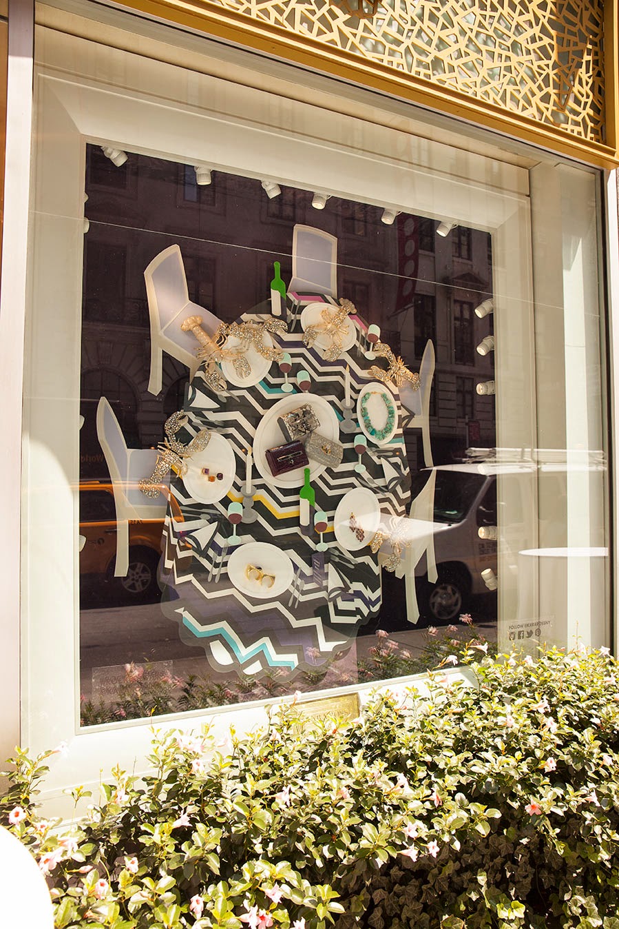
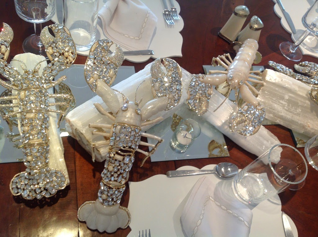
In an effort to bring pizzazz back to the dining table, I want to bring to your attention jeweler Kara Ross's debut collection for the home, which is aptly named Rock Lobster.  Embellished with pearl resin and crystals, Ross's bejeweled crustacean hark back to a time when noted hostesses often decorated their dining tables with porcelains, objects, and jeweled bibelots.  The fact that these rock lobsters have flexible legs and antennas means that they can be used in myriad table settings.  Already, they have appeared in a trompe l'oeil table setting in Ross's store window as well as on her own dining table in the Hamptons.  (See photos below.)

The lobsters are available exclusively through Ross's Madison Avenue boutique, and additions to the collection are planned for the future.  In a world dominated by monastic tableware, don't you think it's time to treat our dining tables to some well-deserved whimsy and pizzazz?


I Want to be Alone

$
0
0

A few months ago, I finally got around to reading Cecil Beaton's autobiographical Memoirs of the 40s. At the risk of offending any Beaton devotees, I confess that the book got on my nerves. Specifically, it was Beaton's chronicle of his obsessive love affair with Greta Garbo that I found to be most tiresome, if for no other reason than Beaton kept up the Garbo mania for more or less the entire book.

In Beaton's diaries, Garbo is portrayed as an enigmatic figure, a quality for which she was and still is well known.  And, if Beaton's reminiscences of Garbo are to be believed, she could also be quite manipulative too.  Not knowing very much about Garbo other than her famous movie line, "I want to be alone", and her penchant for privacy, I can't say if Beaton's portrait of Garbo is faithful to the woman or not.  More research on my part is needed.

However, long before I read Beaton's book, I was familiar with Garbo's reputation for having very good taste.  I had heard that her Manhattan apartment was beautifully decorated, which was confirmed over the weekend when I found photos of her apartment in the April 1992 issue of Architectural Digest.  The glitz and glamour of Hollywood seemed left far behind, and in its place was an elegance and refinement that was thoroughly Continental.  Garbo surrounded herself with French and Swedish furniture, Chinese porcelain, and, most notably, a fabulous collection of paintings, which included works by Renoir, Bonnard, Delaunay, and Jawlensky.

For all of the home's elegance, though, warmth and comfort did not appear to be lacking.  It seems that Garbo had innate talent when it came to decorating, furnishing her home with her blue-chip pieces in a way that was neither showy nor pretentious.  The result was an apartment that looked both very personal and incredibly inviting.


The apartment's entry hall boasted brown flocked wallpaper, whose Victorian demeanor was tempered by that modern-looking geometric patterned rug.  It was Garbo herself who designed the rug, which was one of many that she designed in conjunction with V'Soske.


Renoir's Léontine et Coco (1909) was hung above the living room's fireplace, on which Chinese porcelain was displayed.


The two photos above show just some of Garbo's collection of paintings, which included works by Bonnard and Jawlensky.


Yet another Renoir, this one titled, Enfant Assis en Robe Bleu (1889)


A painting by Jean Atlan, Composition,  and a painted chest in the master bedroom.


Garbo's closet.  The rug was designed by Garbo.


Paneling from a Swedish armoire, which Garbo disassembled and used in various guises in her bedroom.

All photos from Architectural Digest, April 1992, photos of apartment by Fritz von der Schulenburg; photo at top part of the MGM Collection.

The Glasgow Residence of Anthony Ferrie

$
0
0

The heat is on, both physically and euphemistically. It's mid-August, the temperature in Atlanta is close to 100 degrees, and I have not yet completed one of my goals for the summer: organizing my massive collection of magazine clippings. The old system really wasn't working, so I am in the throes of figuring out a new system before my end-of-the-summer deadline.  The good news is that while I'm in this organizational frenzy, I am finding old clippings that I had either forgotten about or assumed were lost, like the 2006 Architectural Digest article, seen here, that featured the Glasgow residence of prints dealer Anthony Ferrie and his partner.

According to the article, Ferrie submitted his home to the magazine as part of an AD challenge, which must have been a "show us your home"-type contest.  I can just imagine that the AD editors were ecstatic to have received an entry that was so sophisticated and pulled-together.  The decorative threads that run throughout the house include Neoclassicism as well as the work of Billy Baldwin, David Hicks, and Stéphane Boudin of Jansen. In fact, look at the photo of the living room below and tell me that it doesn't remind you of a David Hicks interior.  The cherry on top, though, has to be the master bedroom, which is both pleasantly crisp thanks to the use of a Colefax and Fowler plaid fabric and soothing, too, because of the soft blue color palette.

Stay tuned for more articles culled from my clipping files.  In the meantime, enjoy the tour of this polished gem of a residence.


A view of the living room, dressed for dinner.  Does this image not remind you of a David Hicks interior?


Alexander Pope stands guard in one corner of the living room.


The hallway with its assemblage of marble and plaster pieces.  I'm getting a whiff of Sir John Soane here.


A view from the living room to the garden.


The master bedroom with its bounty of plaid Colefax and Fowler fabric.


The garden.

All photos from Architectural Digest, June 2006, Durston Saylor photographer.

Moody Blues

$
0
0

Have you seen House Beautiful's new look?  If you have read the September issue, then you know that House Beautiful has been redesigned, and it looks terrific.  HB has long been known for its coverage of color in interiors, and the new design emphasizes this focus.  Color now plays a starring role, with the first section of the magazine being devoted to it.  Each issue will open with the color that HB loves for that particular month, and for September, that color is Indigo, a shade that "knows no borders and has many different moods."

Blue, with its enticing range of shades, is a particular favorite of mine, so much so that I enveloped my living room in powder blue, teal, and peacock blue.  And although I don't currently have any touches of indigo in my home, I do appreciate the shade's attitude.  Indigo implies depth, soul, and fortitude, at least to me anyway.  I attempted to compile a list of my favorite old and historic rooms where indigo was the defining color, and truth be told, I couldn't think of too many.  I expanded the list to include other moody and atmospheric hues of blue, and here is what I came up with:

In the Chinese Pavilion at Drottningholm, this shade of blue is able to stand up to the exuberance of the pavilion's decor. It also frames the Chinoiserie murals, allowing them to come into sharp focus.


Some shades of blue are stately-looking, thus making them appropriate for architecturally formal interiors. This photo shows how the Entrance Hall at Monticello appeared in the late 1960s. Today, the walls of the Entrance Hall are painted a historically accurate Whitewash, while the dado is painted in a shade of yellow-orange. Nonetheless, I find this shade of Wedgwood Blue to be attractive.


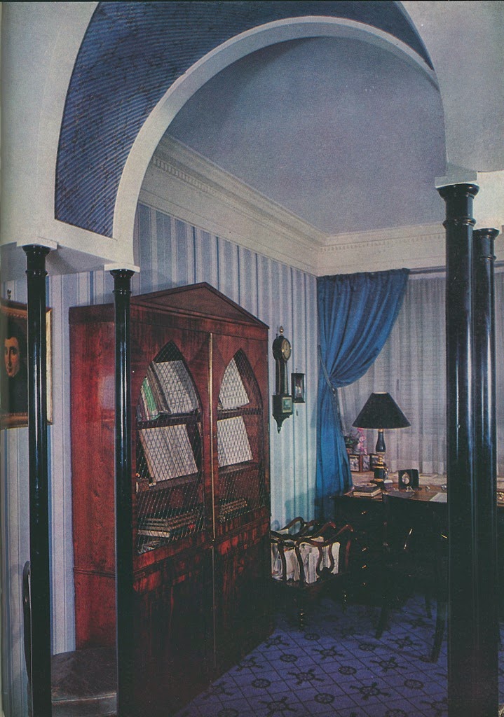
Madeleine Castaing is a designer whom I associate with blue, especially those shades that are quirky.  In the photo directly above, you can see the salle de jeu at Castaing's residence on Rue Jacob.  Above that is a photo of a Castaing-decorated apartment in which the library is awash in blue.  The underside of the arch is papered to simulate lapis lazuli.


The Paris apartment of Jansen designer Pierre Delbée has to be one of my favorite residences. The entrance hall's Louis XV-style paneling was painted in different shades of blue. The color effect gives added dimension to the small space.


According to Jeffrey Simpson's Rose Cumming: Design Inspiration, Rose Cumming's library had "jade-green walls that were washed with Prussian blue".  Here, the achieved shade of blue is murky and even rather mysterious-looking.


I believe that in the pantheon of blue rooms, couturière Jeanne Lanvin's bedroom must be one of the most memorable. Her signature shade of "Lanvin Blue" is similar to cornflower blue. It's feminine, and yet, it's not too sweet.


This Michael Greer-designed room was lavished with primary-colored decor.  Take away the red rug, and this room would look suitable for the 21st-century.


Frankly, this is not one of my favorite blue rooms. However, it's interesting to note that in an effort to create a blue backdrop in this room, designer John FitzGibbons stained the wall's rough wooden boards a deep shade of blue.
Viewing all 483 articles
Browse latest View live