Quantcast
Channel: The Peak of Chic®
Viewing all 483 articles
Browse latest View live

The Pirch Effect

$
0
0

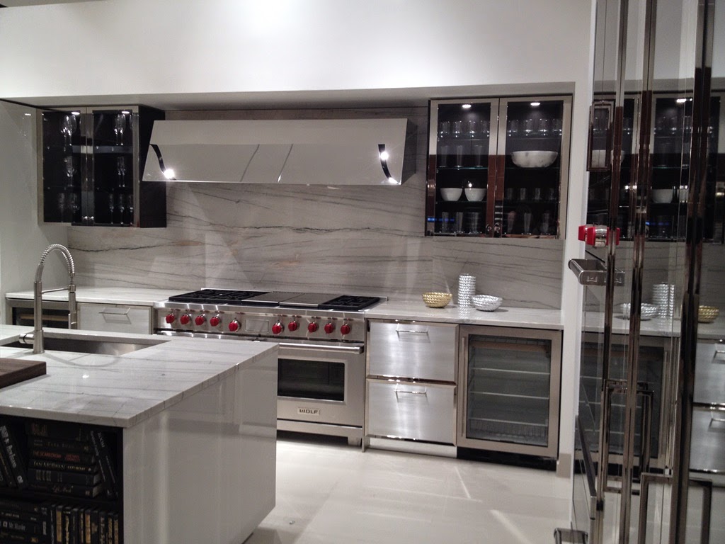
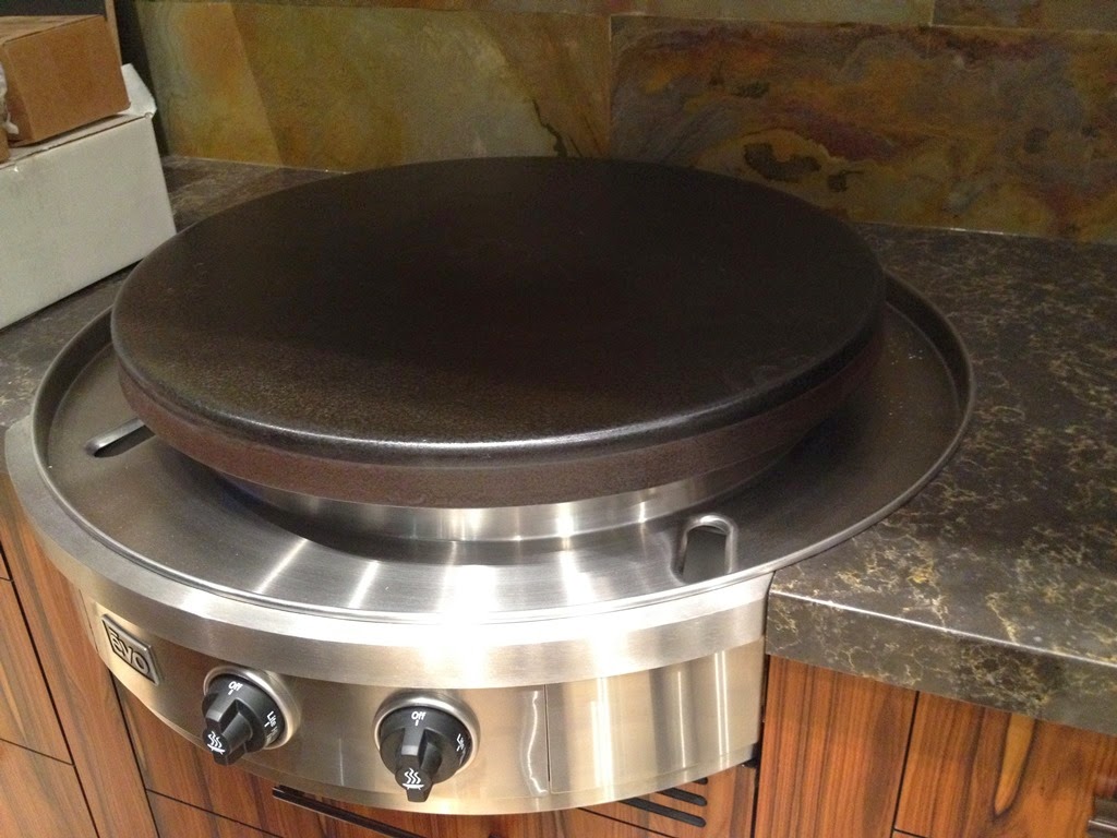
Back in December, I attended the launch party for the Atlanta opening of Pirch. In case you are not familiar with it, Pirch is a national kitchen, bath, and lifestyle retailer with showrooms around the country.  (Look for new showrooms to open in Paramus, New Jersey this year and in New York City next year.)  Before I toured the Atlanta store, I had heard of the Pirch brand but knew little more than the name.  What I wasn't prepared for was the excitement I felt as I looked at ranges, faucets, vent hoods, and bathroom sinks.  Who knew that I could get so giddy over the prospect of scrambling eggs on an outdoor flattop grill?

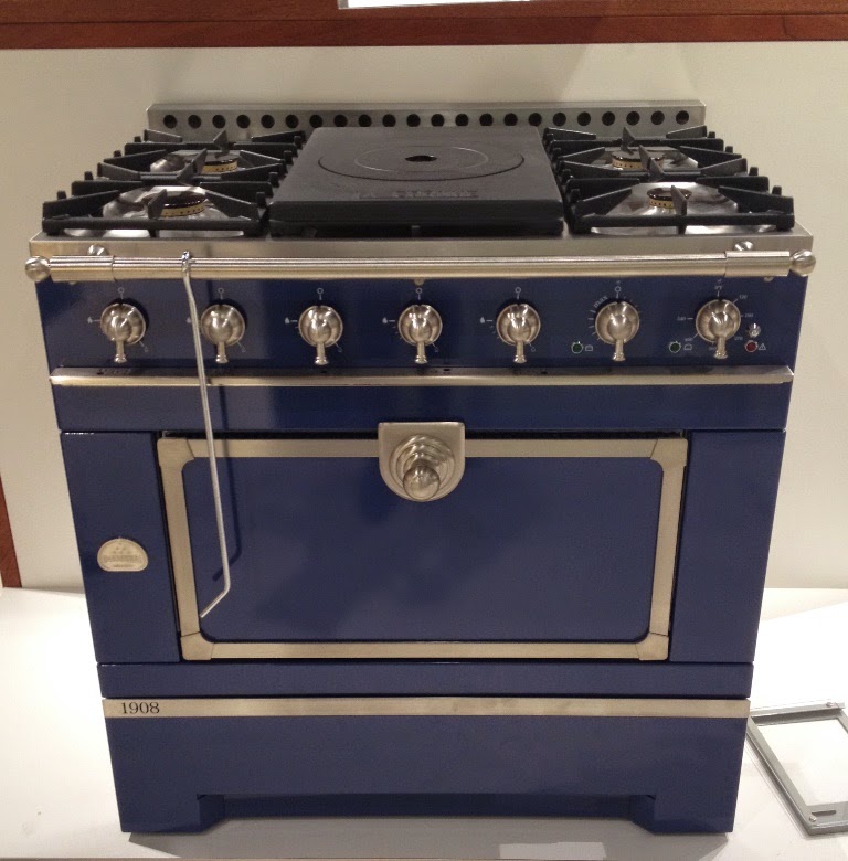
Pirch carries an impressive range of high-end kitchen appliances and bath fixtures, with such brands as La Cornue, Bertazzoni, American Range, and Gessi making appearances.  But what makes Pirch unique is that the customer is encouraged to test out the products before purchasing them.  If you're curious about what kind of water stream will emanate from a shower head, simply turn it on as most of the showroom's faucets and shower heads actually work.  Are you leaning towards purchasing a La Cornue range but are unsure of its capabilities?  No problem.  Pirch will connect that range in their test kitchen and have their in-house chef instruct you on how it works.  It's like taking a car on a test drive before buying it.  Now do you see why I found my tour so inspiring?

As someone who cooks on a 1968 cooktop (I swear) and whose bathroom still has its original plumbing fixtures, I wasn't really aware of all of the recent innovations in kitchen and bath technology.  There are now so many options in terms of color, materials, and finishes, not to mention all of the bells and whistles that help to make cooking and bathing more efficient and luxurious, too.  After I finished my tour, I came to the conclusion that it is high time for me to liberate my kitchen and baths from their 1968 shackles and outfit them in Pirch-style.  If you're in the same boat as me, or if you simply wish to see and test out the latest in bath fixtures and kitchen appliances, then I encourage you to visit a Pirch store soon.  Trust me.  You'll walk away feeling inspired.


Cookbook author and Atlanta native Alex Hitz was the featured chef at the launch party, hence the sterling silver and crystal epergne and the scrumptious food.


The reflective finish of these cabinets caught my eye because it has a slightly 1930s-look.


Colorful ranges.


"The Patio" is Pirch's showcase for outdoor cooking equipment, including the flattop cooking grill upon which one can fry eggs and bacon.


See what I mean about bells and whistles?


Some of the ways with which you can turn your bathroom into a spa.


All photos taken by Jennifer Boles with the exception of #2, 3, and 8, which were taken by Kim Simons.

Lady Diana Cooper in Little Venice

$
0
0

If you have read Rooms, the compilation book of photographer Derry Moore's interior photos, then you likely remember the London home of Lady Diana Cooper. Moore's photos of the Cooper residence, which was located in the Little Venice section of London, were memorable to me for me two reasons: Cooper's Martin Battersby-painted trompe l'oeil panels, which graced her dining room walls, and her jaunty yachting cap, which Cooper wore as she posed for the famed photographer.

Thanks to a kind reader of mine, I recently found these c. 1970 photos of Cooper's Little Venice home.  As you can see, her living room and dining room formed one large space, which was divided by a painted floor screen.  Further delineating the dining area were the Battersby trompe l'oeil panels, which created a rather striking setting for dining.  The living room appeared to be more relaxed than the dining room and, well, more British thanks to the chintz-covered chairs and sofa.

It's worth studying Cooper's myriad objects and art.  To the right of the living room fireplace was a J.J. Shannon portrait of Cooper as a child.  Other displayed Shannon portraits included those of Cooper's mother, Violet, Duchess of Rutland, and an infant Cooper.  A gold doré miniature of the Vendôme Column, which could be found in the dining room, was a gift to Cooper from Louise de Vilmorin.  (Their complicated relationship is a story for another day.)  And the unicorn, which was a symbol of sorts to Cooper, appeared as a dining table centerpiece as well as in a Jean Cocteau illustration.

These photos might be forty years old, but isn't it refreshing to see a home whose interiors don't seek to impress through impertinence, flamboyance, or ill-advised efforts at originality?  

Cooper's living room.


The two photos, above, show Cooper's dining room.  Situated in the center of the red fabric-draped table is the gold column that was given to Cooper by Vilmorin.


J.J. Shannon's portrait of an infant Diana.


Cocteau's unicorn illustration.  The inscription reads, "A Diana, souvenir des licornes.  Jean 1946."


Shannon's painting of Violet, Duchess of Rutland, who was Diana's mother.


A close-up of the Vendôme Column that was surrounded by tiny unicorns.


An illustration of Diana's mother.

Waterhouse Wallhangings and the Edward Zajac Collection

$
0
0


If only I had an abundance of rooms in which to hang wallpaper. That's how I felt when I saw the newest wallpaper collection from Waterhouse Wallhangings, which will be available in showrooms starting this month.  New designs include beefy stripes (Hyde Park Stripe), damask (Wheat Damask), Paris landmarks (Monuments of Paris), and Noah's animals (Noah's Ark), which is sure to delight both children and their parents. It's not often that I am tempted to decorate my home with such whimsical creatures, but I am completely charmed by these animals.  (By the way, Noah's Ark is based on a print found in one of Dorothy Waterhouse's old books.)

Waterhouse Wallhangings is also debuting the Edward Zajac Collection.  You have seen numerous posts about Zajac and his late partner, Richard Callahan, on this blog.  Zajac and Callahan were known for their enthusiastic use of pattern.  A Zajac and Callahan room typically had layer upon layer of pattern, but they were mixed in such a way so that the effect was sometimes daring, often ravishing, and never discordant. 

Zajac often designed custom fabrics and wallpapers for his clients, which was the impetus for this new collection.  The collection's prints include Regency Rope, Regency Rope Trellis, Regency Rope Panel, Charlotte Ruching, and Don't FretRegency Rope Panel, which measures 12 feet long and 27 inches wide, was inspired by a set of folding screens in Zajac's apartment.  All three Regency Rope prints were designed so that they can be used together to spectacular effect.  And you'll notice that Charlotte Ruching has a border that runs down one side of the paper.  This border can be cut and applied as a border at the ceiling or along all four sides of a wall.  The line's versatility is very much in the spirit of Zajac's custom work.

For more information, please visit the Waterhouse Wallhangings website.  Coordinating fabrics for the Edward Zajac Collection wallpaper will be introduced in September.


Monuments of Paris


Hyde Park Stripe


Noah's Ark


Provincetown


Wheat Damask


Gingko


The Edward Zajac Collection:


Regency Rope


Regency Rope Trellis


Regency Rope Panel


Charlotte Ruching


Don't Fret


All images courtesy of Waterhouse Wallhangings

A Request for Information

$
0
0

I hope that one (or some) of you might be able to help me.  I am researching the Van Day Truex drawing that is shown above.  The drawing depicts what appear to be two stone bull heads perched atop a vine-covered wall.  Between the bulls is a uniformed man, who might be a gardener or perhaps an attendant of some sort.  This uniformed figure might indicate that the scene was painted in a public place.  Behind the bulls is a dense, darkly painted Cypress tree. 

Truex spent time in France, Italy, and Mexico, so it is possible that this scene is located in one of these countries.  Can any of you identify the location of this scene?  If so, please email me at Jennifer@thepeakofchic.com

A Tribute to Carroll Petrie

$
0
0

Nan Kempner, Pat Buckley, Judy Peabody, and now Carroll Petrie. It seems that so many of the socialites whom I read about as a child are dead. Back in the '80s, these were the boldface names that graced both the party pages of Town & Country and W as well as "Suzy", the best gossip column ever.

Carroll Petrie, who died recently, was one of my favorite socialites for a number of reasons. First, she was a South Carolina native who moved to Manhattan as a young woman, became a model, married the 17th Marquis de Portago, and, after two subsequent marriages, married retail tycoon Milton Petrie. Second, she was really quite beautiful. And third, her signature red lipstick always looked chic and never contrived. 

Her Fifth Avenue apartment, which can be seen below, was equally as beautiful.  Decorated by David Easton, the apartment was, as one would expect, well-appointed.  But what some people might not have expected was that pink dining room.  It was certainly not a conventional dining room, but I can only imagine that Petrie and her dinner guests must have looked like a million bucks while surrounded by that flattering shade of pink.

As the saying goes, "They don't make 'em like they used to."            


Photo of Carroll Petrie, at top, courtesy of New York Social Diary; apartment photos from New York Apartments: Private Views by Jamee Gregory.

A Nifty Shade of Grey

$
0
0


Perhaps I ought not to admit this, but I saw Fifty Shades of Grey last week.  When I received an invitation to attend a preview of the movie, I accepted with alacrity because I wasn't about to miss an opportunity to see what the hoopla was about.  And what did I think about Fifty Shades?  Let's just say that there are two good things about this film, both of which are awfully nice to look at: the actor Jamie Dornan ("Christian Grey"), whose good looks made me forget the absurdity of the movie's premise; and the de Gournay wallpaper that hangs in one of Grey's bedrooms.  The movie redeemed itself immeasurably thanks to both.

As you can see in the photo above, the wallpaper, which is de Gournay's Askew pattern, is a wonderful bird and tree scene painted on a silver background.  This shimmery version works well with the film's chilly grey color palette (what a surprise!), striking a feminine note in a mostly flinty, hard-edged apartment.  Of course, there is that one room in Christian Grey's apartment that is red, but I won't get into that.

All of this leads me, in a very roundabout way, to the focus of this blog post, which isn't really about the movie of the moment, but rather Estee Lauder's former office.  I have been meaning to show photos of her office for some time now, and the uncanny similarities between de Gournay's Askew paper and the hand-painted rice paper on Lauder's office walls made now seem like a good time to discuss it.  The first thing you might notice is that her office resembled a formal living room, what with the wallpaper, that Louis XVI desk, and those dressy fabrics.  But the other story here is the room's color palette, which is comprised mostly of shades of taupe, oyster, cream, and champagne.  The one touch of grey can be found on the office's carpet, which provided an unimposing foundation for the room's furnishings.  It just goes to show that grey doesn't have to, ahem, dominate those softer, quieter colors surrounding it.

*With special thanks to Angela Patrick of Ainsworth-Noah for identifying which de Gournay pattern appeared in the movie.


Estee Lauder office photos from Executive Style by Judith Price

The Future of Antiques

$
0
0


I would like to invite you to join Olga Granda-Scott, John Lyle, Kerry Howard, and me next Friday, February 27 from 7 to 9pm for a conversation about the future of antiques and 21st-century Southern design.  Knowing my fellow panelists as I do, the conversation is guaranteed to be spirited, informative, and humorous, too.

The event, which is presented by The HighBoy, will take place at The Gables Antiques, one of Atlanta's preeminent antiques shops.  If you plan to attend (and I hope you will!), please click here to RSVP.

An Early Summer, Courtesy of Jim Thomspon and No. 9 Thompson

$
0
0

Last week, I attended a presentation of the Spring 2015 collections from Jim Thompson and No. 9 Thompson.  The temperature outdoors might have been hovering around the freezing mark, but it certainly didn't feel like winter inside the Jim Thompson showroom.  So vibrant and colorful are the new collections that I could have sworn warm weather had arrived.

Taking his inspiration from the textiles of Central Asia, Turkey, and Tangiers, No. 9 Thompson designer Richard Smith has created a collection that is the essence of summer.  Named "Anatolia", the new collection is abundant with juicy color, easy-going patterns, and breezy textures.  There is Karapinar, a multi-colored abstract print which is based on a 19th-century Caucasian carpet, and Zelig, whose pattern is reminiscent of North African ceramic tiles.  In addition to cottons and linens, there are a number of outdoor fabrics, including one, Fez, which is embroidered with a motif often found on flat-weave carpets.  And because a finished-look is welcome any time of year, two new border tapes have been introduced.  (See Casablanca, below.)

"Forbidden Colours" is the new Jim Thompson collection, and again, the story here is color.  Just look at the vibrant colors of Lamun, which is a beautiful handwoven silk.  Or what about Anais, a luxurious 6-ply silk ikat?  Jim Thompson is, of course, renowned for its silks, but cotton and linen have not been forgotten, with Cinnabar, Adler, and Balthazar striking casual-yet-sophisticated notes among those refined silks.   

I think that when you take a look at the new collections, you'll likely find yourself yearning for summer...and perhaps some new fabrics, too.

No. 9 Thompson Collection:

 Karapinar


 Torba


 Aisha


 Anatolia Stripe


Tan Tan


Casablanca

Zelig


Agadir


Fez

Tunis


Jim Thompson Collection:


 Lamun


 Ylang


 Chailai


 Eden


 Elixir


Anais


 Cinnabar


 Adler


 Balthazar


All photos courtesy of Jim Thompson

Home Tour: Dottebob Andes

$
0
0

One of the many highlights of my book tour was visiting my sweet friend, Dottebob Andes, in her chic Philadelphia-area home.  Prior to my visit, I was aware that Dottebob and I had a lot in common, especially our shared love of "the classics".  (That would be classic décor, not classic literature- although perhaps we have similar taste in books, too.)  Like me, Dottebob, who is a well-regarded decorator, has an appreciation for bright colors (especially blue and coral), prints, Chinoiserie, and the sense of coziness that fabrics bring to a room.  But not until my book was published did I realize just how simpatico we are. 

Shortly after she read my book, Dottebob sent me photos of her home, explaining that she lives with most of the classic furnishings about which I wrote.  Sure enough, many- if not most- of my book's entries can be found in Dottebob's home.  There are examples of Chinoiserie, portières, leopard print, needlepoint, trompe l'oeil, singerie, exotic prints, garden stools, trellis, slipper chairs, skirted tables, and, well, I could go on and on.  Dottebob's home is like In with the Old come to life.  If I didn't know better, I would think that we had been separated at birth.

When I visited Dottebob, I was struck by how closely her home and her personality are intertwined.  Dottebob's home is a reflection of her warmth and generosity, her enthusiasm for socializing and spending time with friends and family, and her passion for decorating.  She is surrounded by things she loves and treasures that have meaning to her.  In my mind, all of these qualities represent the true meaning of decorating.

I'll leave you with the photos I took during my visit. Looking at them reminds me of what decorating is supposed to be about.


All photos are the copyright of Jennifer Boles/ The Peak of Chic

Thank you Flower Magazine

$
0
0


I want to thank Karen Carroll and flower magazine for featuring me in their "House Party" column in the March/April issue. When Karen asked me to describe my style of entertaining, the first word out of my mouth might have been "Cocktails!" Because, as you know, I do love to mix a classic cocktail. I enjoy having guests over for cocktails and heavy hors d'oeuvres, which is not only a fun way to spend an evening, but it's easy on the hostess, too.

You can read all about my cocktail entertaining in the new issue. Karen has also included a short-list of my favorite host and hostesses along with their words of wisdom.


Cover photo courtesy of flower; Sarah Dorio photographer. 

Spring Book Releases, Part One

$
0
0

The Spring book releases are just starting to make their debuts, and two that I have read- and enjoyed- thus far are A Home in Paris, written by Catherine Synave with photographs by Guillaume de Laubier, and Nicky Haslam: A Designer's Life, which was written by the designer himself. The former is a voyeuristic look at some of Paris' more intriguing homes, including residences decorated by Jacques Garcia and Tino Zerduvachi.  Organized mostly by decorating and architectural styles, the featured homes are grouped into such categories as "Tradition and Reinterpretations", "Modern and Contemporary Interiors", and "The Soul of a Collector".  (It should come as no surprise that the traditional-oriented section is my favorite.)  Although there have been a multitude of books published on Paris interiors, I continue to add them to my library because, quite simply, I never tire of looking at beautifully-appointed homes in Paris.  If you're like me, you should consider adding this volume to your design-book collection.  Do note, though, that the book is modestly-sized, measuring roughly seven-by-nine inches.  I like the book's scale because it made reading in bed easy, but I want to let you know in case you were expecting a larger-sized book. 

A much different design book is Haslam's latest effort.  The book's subtitle is, "An Archive of Inspired Design and Décor", and what an archive it is.  Haslam's work is well-represented in the book by big, beautiful photos.  But Haslam takes the reader beyond the glossy surfaces by making him privy to the inspiration and creative-process behind each interior.  The designer's upbringing has greatly influenced his work, as have books, travel, and the glittering personalities with whom Haslam associates.  In his book, Haslam writes of these influences, linking them through witty text and photos to the interiors and decorative finishes that they inspired.  Yes, the book reads in part as a memoir (and a lively one at that,) but it also allows the reader to see how a designer such as Haslam translates inspiration into some very posh interiors.  If you're looking for a delightful design book, then Haslam's book should suit you to a T.

A Home in Paris:

The living room leads to the library, where Jacques Garcia has placed an armchair bearing the stamp of the famed chair maker Jean-Baptiste Séné. Turgot, the Controller-General of Finance at the beginning of Louis XVI’s reign, used this piece in his office. © Guillaume de Laubier


On a table in the smoking room, a Wedgwood vase and obelisk are displayed with a late nineteenth-century oil lamp to compose a charming still life. © Guillaume de Laubier


The living room is a tribute to the splendors of the past. Modern designer furniture and decorative objects comfortably adapt to a backdrop of gilt boiseries. Vast mirrors, reflecting the light, further expand the space. © Guillaume de Laubier


In the living room, English furniture mingles with Arman’s “Danceuse” armchairs. The gilding of the Directoire mirror and the Oriental subjects of the paintings stand out against the cherry-red wall covering, which is bordered with colourful strips cut from a shawl. The rich tones are repeated in the sofa’s upholstery. © Guillaume de Laubier


Enlivening the entrance and recalling the interiors of old Saint Petersburg, the Wedgwood-blue walls are ornamented with a frieze of stencilled motifs that accent the outlines of the doors and panelling. © Guillaume de Laubier


Nicky Haslam: A Designer's Life


A Haslam-decorated living room in a New Orleans home. © Andrew Wood.


Look closely, and you'll see the fringe-trimmed pelmets.  As Haslam wrote, "I always wanted to put a fringe on these pelmets."  © Andrew Twort.


A former home of Haslam.  The library's walls were covered in charming paper painted by the legendary George Oakes for Colefax and Fowler. © Fritz von der Schulenburg


Nicky Haslam designed this tiled garden seat after Portuguese azulejos.


©A HOME IN PARIS, Flammarion, 2015. Images ©Guillaume de Laubier. ©NICKY HASLAM: A DESIGNER'S LIFE by Nicholas Haslam, Rizzoli New York, 2015.

Fromental at The Goring

$
0
0


Although I have never been a guest at The Goring Hotel in London, I have long been familiar with it.  The hotel, which recently celebrated its 105th anniversary, has endeared itself to generations of well-heeled guests, including the Duchess of Cambridge, who, as you might recall, spent the night before her wedding at The Goring.  Just a few days ago, I read that the hotel had reopened after a major refurbishment, but I did not know until yesterday that Fromental, whose hand-painted wallpapers send me into reveries, was responsible for the magnificent scenic paper in the hotel's Front Hall, which was decorated by Russell Sage.

At first glance, the paper impresses with its hand-gilded silver leaf background, its dense coloration, and its idyllic scenery.  But look closely at the photos below, and you'll see all kinds of charming creatures, including flamingos, lions, and horses.  According to a recent Fromental press release, the paper depicts anthropomorphized animals, some of whom represent members of the Goring family.  The founder of the hotel, Otto Richard Goring, is seen as a "bejeweled walrus", as is his son, Otto Gustave.  The family's pet pigs are doing their military duty in the Battle of Trafalgar, while Managing Director David Morgan-Hewitt, who has a law degree, is depicted as a gorilla in a judge's wig.  Is it any wonder that it took four artists eight weeks to paint these scenes? 

Like The Goring, Fromental also recently marked an anniversary: its tenth, which is yet another reason to celebrate.  Based on the photos below, I'd say that both the hotel and Fromental can look forward to many more anniversaries.  But back to that wallpaper by which I am so captivated.  It has sparked my imagination, and I have thought about how Alfie and I might be depicted should I ever engage Fromental to paint a similar paper for me.  I don't see Alfie engaged in battle, because he is too much of a whimp for that.  For a dog who seems unabashedly drawn to the finer things in life, he needs a luxurious scene.  I can see it now: Alfie painted as a maharaja in resplendent attire with his minions waiting on him hand and foot.  Actually, that scene isn't so far from the truth.  


All photos courtesy of Fromental and The Goring Hotel.

Baron de Redé and his Headdress Ball

$
0
0


Although the late Baron de Redé, the noted French aesthete, host, and financier, might be better known for his 1969 Oriental Ball, he is almost as famous for an earlier fête: his "Bal des Têtes", which was held in 1956 at Hôtel Lambert, Redé's Paris residence.  As the title of this blog post indicates, the ball's theme was headdresses, with guests encouraged to wear fanciful creations.  Redé asked three of his guests, Elsa Maxwell, the Duchess of Windsor, and Charles de Beistegui, to help him judge which party-goer wore the best headdress.  The winner was Jacqueline de Ribes, who modeled a most fetching feather-and-jewel number.

According to Redé's memoirs, Yves Saint Laurent, then an assistant at Dior, was hired to design the ball.  I don't know the extent of Saint Laurent's contributions, but I do know that he designed a number of headdresses for some of the lucky female guests.  You can see sketches of his headdress designs below.  He also illustrated a rendering which depicted the theme of the party (see the two images above.)  If you own a copy of Redé's hard-to-find memoirs, then you know that this illustration was used for the book's endpapers. 

Of the fancy-dress balls that he and his ilk hosted, Redé wrote that they were "the excuse for dressing up and competing for imaginative outfits."  Although the days of such balls are long gone, it does make me pine for the days when people actually made an effort with their appearances, especially when going to a ball. 


Baron de Redé with his fellow judges, the Duchess of Windsor, Charles de Beistegui, and Elsa Maxwell.


Jacqueline de Ribes and her winning headdress.


Bal des Têtes guests included Princess Ghislaine de Polignac, the Duke of Windsor, Elsa Schiaparelli, and the Duchess of Windsor.

Spring Book Releases: Anouska Hempel

$
0
0

I read Anouska Hempel last week, and I have to confess that I'm having difficulty putting my thoughts into words.  Designer monographs typically provide readers with an even-keeled reading experience.  There are some design books in which the featured work looks more or less the same throughout the entire book, while there are other monographs- Nicky Haslam's comes to mind- whose photographs capture a range of looks and styles.  However, even when a body of work is diverse or eclectic, its collective similarities are often obvious enough to make it look cohesive on paper, something which usually guarantees that reading design books will be smooth-sailing.

But Anouska Hempel's work- and Anouska Hempel, for that matter- is altogether different.  It seems to shift course dramatically, moving from one end of the style spectrum to the other.  Take, for example, the designer's country house, Cole Park, which is featured prominently in her monograph.  When I studied the book's photos (see below), words like "lavish" and "baroque" came to mind.  I was even reminded of a perfume that I frequently wore back in the early 1990s: Guerlain's Samsara, which is a heavy, oriental-type fragrance.  It must have been Cole Park's surfeit of objects and rich, deep colors that evoked this olfactory memory.  And yet, in just one flick of the page, the home's opulent redolence evaporated, for there on the page was a photograph of Cole Park's attic bedroom, a palate-cleanser of a room if there ever was one.  Like the rest of the house, this room has a sharply-defined look, but its non-color colors and earthy fabrics convey a mood that is altogether different from the rest of the house.

Such radical shifts in style and aesthetics have the potential to exhaust and confuse the reader.  But Marcus Binney, the book's author, manages to create a sense of harmony out of interiors that may seem discordant at first glance.  In the book's introduction, Binney writes of those hallmarks of Hempel's work, including the use of screens ("to add an air of mystery, partially concealing, but also hinting at what lies beyond"), grouping of objects, and attention to light and reflections.  Once armed with this information, the reader will start to see that Hempel's rich, decadent interiors and her zen-like spaces are not as dramatically different as they might at first seem.  It takes a thorough reading and careful study of this book to understand why Hempel designs as she does.  If you're not prepared to do both, then this book may not be for you.  But, if you're up to the challenge, what you are rewarded with is a book that will likely encourage you to think differently- and more deeply- about the design process.


Porcelain displays such as this at Cole Park are a constant feature of Anouska Hempel interiors © Cameron Maynard


The dining room lighting at Cole Park is designed to create shimmering opulence © Fritz von der Schulenberg


Hurricane lamps in the dining room of Cole Park © Cameron Maynard


The attic bedroom at Cole Park © Adrian Houston


The Lion’s Cage suite at The Hempel © The Hempel


Image credit: © Anouska Hempel by Marcus Binney, Rizzoli New York, 2015.

Nina Campbell for oomph

$
0
0

One of the more talked-about product debuts at the upcoming High Point Spring Market will likely be designer Nina Campbell's new collection for oomph.  The collaborative line includes two designs by which I'm particularly taken.  The first is the What Not, an étagère which becomes a pair of end or side tables when separated.  The other is the Billy Tray, which looks like it's ready-made for use at tea time or the cocktail hour.  What these two pieces have in common is that both were inspired by antiques that Nina owns.  In fact, Nina based the entire collection on antiques, which just goes to show that everything old can be new again.

Below, you can see photos of the what not and tray plus the antique pieces that inspired them.  And of course, in the oomph tradition, the designs are available in an array of colors and finishes, including four new colors that are exclusive to this collection.  For more information, please visit the oomph website


The Sister Parish Connection

$
0
0


The first thing that one typically does after buying a home is to furnish and decorate it to one's liking.  That might mean a fresh coat of paint, discarding curtains, or ripping out carpet.  But what if Sister Parish had once decorated your new home or, even better, lived there?  Would you strip away all of those Sister Parish touches?  I wouldn't, because any Sister Parish leftovers would make me love my new home even more.  However, not everybody feels as I do.  Take the Manhattan apartment seen here.  Located at 960 Fifth Avenue, this is the maisonette in which Parish once lived.  By 1990, when these photographs were published, the apartment had a new owner, who hired Keith Irvine of Irvine & Fleming to decorate it.  Assisted by Richard Keith Langham, Irvine set out to take the apartment "in a different direction" from the one Parish had taken, which, according to Irvine, had made the home feel like "a Yankee vision of a London house."  The homeowner concurred, deeming Parish's décor "country and gardeny... It took me four months to get her presence out of the apartment."  Well, each to his own.  I would have been thrilled to have had Parish's presence in my home, but that's just me.

Nevertheless, Irvine's work on this apartment is worth discussing.  The dining room's Directoire wallpaper, which is one of my favorite Brunschwig & Fils papers, is quite handsome, as is the living room's yellow striped wallpaper from Clarence House.  Look closely at those curtains.  I realize that today's preference is for clean-lined window treatments, but we can learn a lot about craftsmanship and technique from the curtains seen here.  And take note of the mirror above the living room sofa.  This was one of the few remnants of the apartment's Sister Parish décor.  Installed by Parish, the mirror remained in the new design scheme, although Irvine added a Clarence House wallpaper border to the edges.

Of course, time marches on and so does this apartment's décor.  You'll recall that not too long ago, Mario Buatta decorated this maisonette for a later owner, Patricia Altschul, who sold the apartment about two years ago.  I haven't seen nor heard about the apartment's current décor.  Have you?


The Living Room


The Dining Room


All photos from House & Garden, September 1990; Michael Mundy photographer.

A Modern Approach to Traditional Fabrics

$
0
0

I have been a fan of Brunschwig & Fils fabrics for as long as I can remember. It is their snappy prints to which I really gravitate, because they seem the natural companion to my preferred style of decor: classic; polished; well-mannered yet not at all boring.  They also remind me of the good ol' days of American decorating.  But I think that one of the biggest assets of Brunschwig & Fils' prints is that they are versatile- perhaps more versatile than some people realize.  To see this versatility in action, look no further than the Palm Springs home of designer Michael S. Smith and James Costos, the U.S. Ambassador to Spain.

Recently published in the April issue of Architectural Digest, the house, which was built in the early 1970s, was designed by architect Howard Lapham.  What I find remarkable about the house- in addition to its spectacular setting, of course- is its unusual architectural style, one with which I was completely unfamiliar.  The house was designed in the Mayan Revival style, hence those striking carved motifs that appear both on the home's exterior and in its interior.

When it came to decorating the house, Smith went for a blend of sophisticated 70s-era furniture and new pieces from his Jasper line, while the predominate color palette, which evolved from the hues found in the home's travertine floors, is a pleasing mix of neutrals and green.  What really caught my eye, though, were the Brunschwig & Fils fabrics that Smith used throughout the house.  Smith is the Consulting Creative Director of Brunschwig & Fils, so his use of their fabrics might be expected.  But perhaps what isn't so expected is how some of Brunschwig's more traditional prints can look so at ease in a quintessential 1970s Palm Spring house.  This is the versatility to which I referred earlier.  Who knew that the much-loved fern print, Les Fougères, could look so at home in a Mayan Revival house?  Michael Smith, that's who.


Les Fougères

I believe that most of us are familiar with Les Fougères, that classic fern-leaf print which is so closely associated with Elsie de Wolfe.  For me, Les Fougères has traditionally conjured up thoughts of garden furniture, sunrooms, and wicker.  (In fact, in the illustration that accompanied my book's entry on "Faux Bois", it was Les Fougères that covered a rustic faux-bois bench.)  But when covering the walls of Smith's guest bedroom (see above), the fabric has a more modern feel to it.  The print seems earthier than when I've seen it in the past, something which I attribute to the room's desert color palette and sophisticated mix of furniture.


Les Touches

New Athos

Another print which needs no introduction is Les Touches, Brunschwig & Fils' classic snow-leopard print cotton fabric, which was introduced in 1965. Michael Smith joins the ranks of Geoffrey Beene, Van Day Truex, and Billy Baldwin, all of whom employed this fabric to stylish effect. But the green colorway, which Smith chose for another guest bedroom, is a nice departure from the oft-used black and cream colorway.  It was also the most logical choice for a home in the desert.  In the AD article, Smith mentions that he "wanted to do whole rooms in prints.  It's the 18th century fast-forwarded to the 1970s."  And using a single print throughout a room is, in my opinion, one of the best ways to use Les Touches.  It's also easier to do now that Brunschwig offers Les Touches in a coordinating wallpaper.

The printed fabric that is seen below the photo of Les Touches is New Athos in spring/aqua, which Smith selected to cover the bedroom's sofa.  Like Les Touches and Les Fougères, New Athos has a long and interesting history.  The print, which was inspired by an 18th-century hand-painted Chinese silk fabric, was introduced by Brunschwig & Fils before World War II, making it one of the longest-produced prints in Brunschwig's history.  The print was updated in 1980.


New Watson

And finally, we have New Watson, a woven fabric that was first introduced by Brunschwig & Fils in the 1980s.  It has since been updated in new colors and with a weightier feel to it.  Smith chose New Watson in the pewter colorway for banquette in the home's living room.


Interior photos from Architectural Digest, April 2015, Roger Davies photographer.  Fabric swatch photos courtesy of Brunschwig & Fils.

Atlanta Magazine's HOME

$
0
0


If you live in Atlanta, be on the lookout for the newest local shelter magazine. Atlanta Magazine's HOME recently debuted its premiere issue, and it looks great. Of course, I'm a little biased considering that I wrote an article for the issue.  Titled "From Generation to Generation", the article focuses on some of Atlanta's most successful designers and architects and their equally successful protégés, including Norman Askins, Yong Pak, Dan Carithers, Heather Dewberry, Will Huff, Charles Gandy, Barbara Westbrook, Amy Morris, Carol Klotz, Margaret Bosbyshell, and Clary Bosbyshell Froeba.

For this article and much more, please visit your local newsstand or Atlanta Magazine's website.

Seventies Redux

$
0
0

You've likely heard by now that Seventies style is back in fashion...again.  Much has been written about this latest bout of Seventies fever, which seems to strike those who didn't experience this decade the first time around.  Under the circumstances, it only seems fitting that we revisit a few interiors that were published in 1970.  I don't think we should copy that decade's decorating room for room, but there are elements in each of these chosen interiors that, when taken out of their 1970s context, are really kind of fabulous.

So, what were prominent decorators up to at the dawn of the 1970s?  Let's start with Albert Hadley, whose Manhattan living room is shown at the top of the post.  I'd say that's a room that looks terrific no matter the decade.

Editor's Note: Since I wrote this article last week, I have read two more articles about the allure of 1970s-style, one in Bazaar and the other in T.  I think this post will be the last on Seventies style for a while. 


You could say that the bedroom of designer François Catroux and his wife, Betty, reflects a very specific moment in time. However, you could also say that Catroux was forward-thinking in the way he decorated this space. Innovation helped to drive decorating through the 1970s.  It was anything but a stagnant decade in design history.


The U.N. Plaza apartment of Mr. and Mrs. Stanley Schneider, which was decorated by Burt Wayne and John Doktor.  I admire the chrome furniture as well as the David Hicks carpet, but those vertical blinds and stalactite diffused lighting?  Not so much.


The London dining room of Mrs. John Duffield, which was designed by Count Alessandro Albrizzi.  Albrizzi also designed the octagonal glass dining table as well as the carpet.  Just imagine the dinner parties Mrs. Duffield hosted in this room...and just imagine how exhilarated Albrizzi must have felt while decorating this room.


Designer Val Arnold was behind the décor of this card room, which boasted then-de rigueur flamestitch fabric.


A sophisticated pink palette, courtesy of Milo Baugham, who designed this living room.


Designer Arthur Elrod chose this colorful triptych by artist Helen Munkacsy for his Palm Springs vacation house.  Bright, bold colors were a hallmark of 1970s decorating.


Designers Stuart Blaine and Robert Booth used colorful wall decorations (the canvases were painted by the designers) as a counterpoint to their living room's neutral color palette.  The furniture, not to mention that Stark antelope-print rug, look just as good today as they did back then.


Between you and me, I kind of like vinyl wallcovering, but only if it's high-quality.  The dark brown vinyl-covered walls and ceiling look dramatic, if not slick, in the Milan home of antiques dealer Dino Granzin.


Designer Thomas Britt went for it with camel-colored plaid in the New York City apartment of Bernard Relin.

A Long Time in Coming: the Geoffrey Bennison Monograph

$
0
0

Like fellow designers Henri Samuel and François Catroux, the late British decorator Geoffrey Bennison's name is not as well known in America as, say, Billy Baldwin or Dorothy Draper.  And I'd be willing to bet that some designers don't realize that Bennison Fabrics is named for the designer, whose reproductions of 18th and 19th-century textiles, which Bennison used often in his design work, form the nucleus of the collection. But Bennison deserves to be better known here in the States, for he was remarkably talented and a true "decorator's decorator", one who was equally admired as an antiques dealer.  This might explain why there is so much buzz over the long-awaited monograph, Geoffrey Bennison: Master Decorator, which was written by his former assistant and Bennison Fabrics founder and president, Gillian Newberry.

There is so much positive that I can say about this book, because it's a master class in first-rate decorating.  A Geoffrey Bennison-interior never flaunted its superb and often singular furnishings and finishes.  Instead, it presented itself as comfortable, unpretentiously elegant, and even a little time-worn.  Bennison effected a style of decorating that on the surface looked so effortless, and yet, a great deal of effort was involved in achieving it.  And Bennison was a marvel at conjuring up that most elusive and hard-to-create quality: atmosphere.

If you are a design student or a new-to-the-profession designer, this book will not only introduce you to the work of one of the twentieth century's most talented  designers, but it will also educate you about the significant roles that quality, craftsmanship, and connoisseurship should play in interior design. And if you're an old-hand in design, this book will remind you of the days when all three qualities were considered noble pursuits.


Bennison photographed at his Pimlico Road antiques shop, 1981.


The library in Peter Glenville's Manhattan apartment, which was decorated by Bennison beginning in the mid-1960s. Glenville's close friend, Bennison continued to work on the apartment up until his death in 1984.


One of Bennison's most high-profile projects was for publisher Lord Weidenfeld. In this photograph, Weidenfeld can be seen in his Bennison-decorated Riverside apartment in Chelsea.


These two photos show the Paris dining room of Princess Firyal of Jordan. Bennison considered his work for Princess Firyal to be some of his best work.


Image credit: © Geoffrey Bennison: Master Decorator by Gillian Newberry, Rizzoli New York, 2015.
Viewing all 483 articles
Browse latest View live