Quantcast
Channel: The Peak of Chic®
Viewing all 483 articles
Browse latest View live

What I Saw at the Chicago Botanic Garden Antiques & Garden Fair

$
0
0

I had a wonderful time last week attending the Chicago Botanic Garden Antiques and Garden Fair. Not only did I thoroughly enjoy participating in a panel discussion with Julia Reed, Marisa Marcantonio, and Emily Eerdmans, but I also had the chance to listen to Michael Smith speak about his forthcoming book (it looks very interesting, by the way) and do a lot of shopping. I'm currently getting caught up on emails and laundry, so until regular posting resumes in the next day or so, I'll show you some of my favorite picks at the show, seen below.

And next year, you should really consider making the trip to Chicago to attend this show. It's a top-notch show filled with antiques, 20th century furniture and accessories, and garden-related furnishings.

Photo at top: Garden vignette designed by Mariani Landscape.


Donald Stuart Antiques of Winnetka, Illinois had a really lovely booth, which was one of my favorites. They don't have a website, but they can be contacted at (847) 501-4454.


Lee's Antiques of Kenilworth, Illinois had a lot of vintage furniture for sale, including a pair of red director's chairs with zebra needlepoint backs and seats.


You know that I love porcelain, so I took copious photos at the booth of Lynda Willauer Antiques of Nantucket, Massachusetts. Looking at all of the beautiful platters, bowls, and urns, I was perplexed as to why more people don't collect porcelain. (I also couldn't resist a photo of the Staffordshire dogs that looked like Alfie.)


The Find, which has locations in both Chicago and Highwood, Illinois, also had a nice booth filled with great accessories, like these fish and shell motif objects.


I had to stop at the booth of Ben Caldwell as he lives in Nashville. He crafts all kinds of beautiful copper serving pieces, including these antler-handled serving spoons and flat servers. Made from naturally shed antlers, some of the handles' ends have been carved. (Check out Ben's website as he also crafts pieces from sterling silver, too.)


I love the seed packets from Hudson Valley Seed Library.


At more & more Antiques of New York, there was an intriguing set of 19th century watercolors that depicted various Danish rulers. I also spied a good-looking tole floral piece.


How great was this gazebo at the booth of Mayfair Antiques?


All photos taken by Jennifer Boles for The Peak of Chic

Time May Change Me

$
0
0

While flipping through The New York Times Book of Interior Design and Decoration, I came across the photo above, which depicts a Manhattan living room. It's certainly attractive and elegant, but it's not extraordinary. The furnishings seem very much in keeping with that early to mid-1960s formal style that was just starting to loosen up.

And then, while looking at the pillows on the sofa, something caught my eye. It was my first indication that this apartment belonged to someone with whom we are all familiar. Can you guess?


The pillow at the far right bore the logo of Bill Blass. A little research on the internet confirmed that this was, in fact, the home of Blass. It's far different from his later homes, where strict editing and a well-defined aesthetic, coupled with the decorating assistance of Chessy Rayner and Mica Ertegun, resulted in interiors that were pretty close to perfection.

As it turns out, it was another female design duo, Barbara Brown and Clare Morrow, who decorated this apartment for Blass.  Brown and Morrow were models who also decorated, working for clients such as Blass and Donald Brooks, another talented fashion designer.  (Morrow mostly modeled for Norman Norell.  Glamorous, don't you think?)  But it seems that Brown and Morrow also had a knack for decorating for attractive, single women, with Brown once telling the New York Times, "it's a help to work for beautiful women, especially if you feel you should help them get married."  Um, I think that there might be quite a few of us who could use the decorating/matchmaking services of Brown and Morrow.

The photo below shows Blass' dining room.  As much as I love Porthault table linen, I have to say that I'm a little surprised to see it combined with the leaf-print covered walls and the faux-bois chair cushions.  I suppose that I just never thought of Bill Blass as being a floral Porthault linen kind of guy.  Nevertheless, the dining room, like the living room, has a charm that was fitting for the time.  It is also a good example of how personal style and taste change, evolve, and, most importantly, mature over time.


Photos from The New York Times Book of Interior Design and Decoration; NYT quote from September 10, 1968 article by Virginia Lee Warren.

Le Cabinet de Porcelaine

$
0
0

My weekend internet fishing expedition turned up what has to be my new favorite shop...although sadly, I have yet to visit it. Le Cabinet de Porcelaine, located at 37 rue de Verneuil in Paris, deals exclusively in the porcelain work of Didier Gardillou and Samuel Mazy. You might be familiar with Gardillou's charming porcelain fruits, vegetables, and flowers, which have been sold in the past at Charlotte Moss' Townhouse, Sue Fisher King, and Branca. Unfortunately, I do not own any pieces by Gardillou, but my sister has one of his small lettuce boxes, which is très magnifique.

I love the idea of a jewel-box shop that is devoted solely to one type of treasure.  (It doesn't get more focused than a store that sells not any old porcelain, but porcelain vegetables and flowers!)  In fact, my idea of heaven is a small cobblestone alley filled with shops selling embroidered linen, porcelain, stationery, antique books, scents for the home, antique copper cookware, and antique silver- all on a bijou scale, of course.  Le Cabinet de Porcelaine would fit into this dream shopping mecca perfectly.


All photos from Le Cabinet de Porcelaine.

2013 Lake Forest Showhouse & Gardens

$
0
0
Decorator Showhouse season is in full swing, and that means that wherever you live, there is probably a recently opened showhouse close by.  One showhouse which I recently visited was the Lake Forest Showhouse & Gardens, located in a fabulous David Adler house in Lake Forest, Illinois.  As expected, the house's architecture is amazing, but what is equally as impressive are the rooms decorated by some of the finest Chicago and Lake Forest designers.  Although the rooms represent a range of styles, what they have in common is that they are all well-appointed and finished looking.

I was able to take just a few detail shots, but I hope that the photos are enough to pique your interest.  It's really a great showhouse and one which, if you live in the area, you shouldn't miss!


Susan Kroeger did a lovely job creating a tranquil, feminine bedroom.


Summer Thornton Design took a stylish walk on the wild side with her Upper Gallery space. I liked her use of Les Touches for the space's curtains.


This centerpiece of Julia Buckingham Edelmann's Party Room was this Currey & Co. "Rondelay" covered in a Brunschwig & Fils fabric.  She also included a great looking card table and chairs in this space.


Matt Lorenz of ML Design Studio used the Garden Room's niche as a bar.


Joseph Szymczak conjured up a masculine Dining Room with Grand Tour accents.


The entry foyer as designed by Lichten Craig.  The paper is a Fornasetti design.

Stanmore Collection from Travers

$
0
0

Last week, Ainsworth-Noah of Atlanta hosted a cocktail showing of Travers' new fabric collection, Stanmore.  Inspired by an exhibit of Norman Parkinson's fashion photography, Erin Finn, Travers Design Director, used the photos' ornate Indian settings as a starting point for her latest collection.  And indeed, when you look at the new fabrics, you do see the influence of these photos.

What I found to be most striking about the new collection is the starring role that texture plays.  There are embroidered flowers and vases, appliquéd flowers (made from laser-cut petals), and crewelwork that is anything but old-fashioned looking.  One of my favorite prints is Changmai Chine, which is a fresh and lively take on a traditional warp print.  In fact, most of the new fabrics are based on historical fabric styles, but they have been given rejuvenated appearances thanks to updated colors and motifs.

To see these fabrics for yourself, visit Ainsworth-Noah or your local Zimmer-Rohde showroom.


A few of the Norman Parkinson photos that influenced this collection.


 Vasi


Floral Portrait 


Le Toquet 


Edenberry


The four images above show Changmai Chine, which is a beautiful silk warp print.


 Antonia


Salaria 


Stanmore Felt 


Or you could do as Dennis Hunt of Zimmer-Rohde did and have some pants made up of the Coralie print fabric.


All photos are the copyright of Jennifer Boles for The Peak of Chic

Wirthy Design

$
0
0

I can't tell you how many times photos of the homes and gardens of designer Barbara Wirth have caught my eye. There was the Veranda article about Wirth's holiday table as well as her Paris home that she shares with her husband, both of which I wrote about here. Then there was yet another Veranda article, this one about the Wirths' bigger claim to fame, the gardens of their Normandy home, Château de Brécy. And then, as I was recently rereading Architectural Digest Traditional Interiors, I found photos of a previous home owned by the Wirths. Somehow, I missed the Wirth connection when I first read the AD book.

Wirth is not only a talented interior designer, but she also once managed the David Hicks shop in Paris. For her villa that is seen here, Wirth collaborated with her cousin, designer Christian Badin, on the home's decor. Like Wirth, Badin also worked for David Hicks. I think you can see traces of the Hicks look in these photos, and perhaps that is one reason why they piqued my interest. The modern lamps, uplights, sleek side tables, and the living room's skirted table all seem very much from the Hicks play book, and yet, the cousins added their Gallic flair to the house with their exuberant uses of indigo and blue toile de Tanlay in the dining room and feminine, floral chintz in the bedroom.  Even better is the fact that not much of this 1970s-era home looks dated, with the exception of the bedroom's wall to wall carpet.  Not bad for a house that was decorated decades ago.


All photos from Architectural Digest Traditional Interiors, Pascal Hinous photographer.

Kenneth Jay Lane Entertains

$
0
0


"Kenneth Jay Lane Entertains".  Such a simple title for this March 1977 House Beautiful article.  And yet, were any other words really needed to persuade the reader to peruse the article?  After all, Kenneth Jay Lane's fans are legion.  (I for one will never part with my KJL Maltese Cross cuffs, dragon bracelet, and panther ring.)  And an article that also chronicled his dinner parties?  Even better!

Lane (that's him above, holding what appears to be one of those coveted Tiffany & Co. heart-motif silver repoussé cups) has long had a yen for the exotic, most notably his collection of Orientalist art.  And his home has always reflected this passion, stuffed to the gills with treasures and mementos garnered on far-flung excursions.  His dining room, seen below, is no exception.  It was tented to resemble a Moroccan tent.  And would it surprise you to know that under that tented ceiling, Lane liked to serve his guests Moroccan food (especially couscous), which was prepared by his Moroccan chef?

The article's photos show what Lane's dining room looked like at such feasts.  For smaller affairs, a round table was set with dinnerware from India, carafes from Japan, and a tagine that I assume came from Morocco.  Lane also used mismatched dining chairs.  If the guest list grew at the last minute, he simply pressed one of the room's skirted tables into service at a corner banquette.  Lane mentioned that he took his dinner parties in stride, saying "I never worry and always hope."  Great advice, although I do think that having a Moroccan chef certainly helps...a lot.


All photos from House Beautiful, March 1977

Peter D'Ascoli Fabrics

$
0
0

Today's post is an introduction to the exquisite fabrics of Peter D'Ascoli. Peter is an American who lives in India with his family and dog, a Cavalier, no less. (That's Peter, above.) Fascinated by the history and culture of his adopted homeland, Peter was inspired to apply his American entrepreneurial spirit to the art of traditional Indian textiles, thus creating an eponymous fabric collection that celebrates Indian heritage. Although the collection is currently being sold to Indian designers and architects, Peter is developing a new collection of hand-printed linens, woven cottons, and embroidered fabrics that will be sold very soon at select U.S. showrooms.

Of his current collection, the "Parsi Gara" group of fabrics is especially steeped in Indian history. The Parsis are Indians of Persian descent, having fled religious persecution during the eighth to tenth century A.D. (By the way, both Zubin Mehta and the late Freddy Mercury claim Parsi lineage.) Eventually settling in India, the Parsis later flourished and prospered during the British Raj, with some Parsis emigrating to China for trade purposes. This mixture of Persian, Indian, European, and Chinese influences is evident in the "Parsi Gara" fabrics, which includes Marsh Multi, Parsi Gara, Canton Multi, and Mandarin (see below.)  The other part of the current collection includes beautiful silks like Gilded Age chintz, Tiger and Ming.

The entire collection is really quite beautiful, and the stories that these fabrics tell only add to their allure.  I for one am eagerly awaiting Peter's American debut, and as soon as it happens, I'll be sure to let you know.  In the meantime, you might want to visit Peter's site to learn more about these Indian-made textiles.  I think you'll be enchanted.


Parsi Gara


Marsh Multi


Canton Multi


Mandarin Black


Mandarin Green


Gilded Age chintz- Gilt


Gilded Age chintz- Amalfi Blue


Venezia- Crimson


Gilded Age chintz- Taupe


Ming- Citron


Tiger- Gilt

Plum in Pink and Red

$
0
0

Unless you've been a recluse over the past week, you have likely seen photos of last week's Met Gala. I'm not going to get into too much detail about it except to say that my picks for the three best-dressed guests were Lauren Santo Domingo, Vanessa Traina, and Plum Sykes, all of whom work in the fashion world. Plum Sykes's decision to wear scarlet satin Manolo Blahniks with her pale pink column dress especially captured my attention because the color combination was a bit unexpected. And yet, it was really quite smashing, with Sykes's red shoes making her prim gown sing. It also reminded me of how much I love this color pairing. (I did not want to fool with obtaining permission from Getty Images to use their photo of Sykes, so you'll have to click here to see her stepping out to the Gala.)

Rarely do you see pink and red used together within the same room.  In fashion layouts, however, you do.  When standing alone, pink can appear slightly (or sometimes sticky) sweet.  But when dashes of red are thrown in for flavor, the effect can be sophisticated and effervescent.  Could this be why Babe Paley wore pink and red for her Round Hill, Jamaica portrait?

One interior designer who did mix the two colors together to great effect was David Hicks.  Hicks, however, took a brash approach to the pairing, using pinks that had vigor and swagger.  Cerises, scarlets, and magentas mingled to create rooms of bravado, fit for even the most manly of men.  If all of this sounds too swashbuckling, you could take your cue from Hicks (or even Mark Hampton, whose 1970s-era Manhattan apartment included a red and pink bedroom) but tone it down for more feminine sensibilities.  Paint a room's walls in lacquered aubergine and upholster its furnishings in pink silk and red damask.  I think that such a room would like really pretty...or, to use a phrase that gets on my nerves, such a room would look "very gala."

A 1962 Ormond Gigli photo of Halston back in his early days as a milliner.


Veruschka photographed in 1970 wearing a jeweled necklace and beaded red, pink, and white silk headdress.


A David Hicks-designed room in Yorkshire. The curtains are red tweed, while the chairs appear to be upholstered in red leather.  The table is covered in a fuschia silk cloth.


The Paris apartment of Rambert Rigaud. (Photo from Vogue, March 2013)


The Maharaja of Jaipur (photo by Constantin Joffe)


The dining room at Britwell Salome, decorated by David Hicks, was energized with cerise velvet-upholstered wingchairs and a red silk damask tablecloth.


The early Manhattan apartment of Mark and Duane Hampton. Their bedroom was decorated in shades of magenta and pink with some red thrown in for good measure.


Serge Obolensky photographed by Slim Aarons at the St. Regis Roof, New York. I can't really tell if the room was mostly pink or if there was some red somewhere (perhaps the ceiling?)


Photo of Paley and Obolensky from A Wonderful Time: An Intimate Portrait of the Good Life by Slim Aarons; Hicks and Hampton photos from David Hicks: Designer; Maharaja of Jaipur photo from The World in Vogue 1893-1963.

Neisha Crosland Scarves

$
0
0

From time to time, I receive samples and merchandise for editorial consideration.  Please know that I only write about what I would actually use in my own home or, in some cases, what I would wear on my body.  With that in mind, I want to introduce you to Neisha Crosland scarves.  Although I knew Neisha for her fetching textiles and accessories, I did not realize that the designer recently embarked on a scarf collection.  And what an attractive collection it is!

I received a scarf very similar in color to the one featured above, and I was very pleased with the quality.  The scarf is made of silk twill and looks and feels much as my Hermès scarves do.  The nice thing about this particular scarf is that its square pattern and subtle colors are a nice departure from my more exuberantly printed Hermès scarves.

That's not to say, however, that all of Neisha's scarves are so minimal.  For those with a penchant for pattern, there are florals, sunbursts, and the like, all of which have a slight vintage feel to them. (Vintage in a good way.)  While some of the scarves are made of silk or silk twill, there are also versions made of cashmere or wool.  Take a look below for a small sampling, or visit Neisha's website.  Although the site is based in the U.K., international shipping is available.


Berry Flower in Pink Red, a floral print in the Aubrey Beardsley style.


Sunburst in Coral


Zebra in Brown


Starfish in Black

A Walter von Nessen Masterpiece at Wright

$
0
0


With last weekend's release of The Great Gatsby, not to mention the film-inspired merchandise currently being sold at Tiffany & Co. and Brooks Brothers, the 1920s is coming back into vogue.  The timing couldn't be better for Wright auction house, which will be selling this extraordinary Art Deco-style chair- the work of American furniture designer Walter von Nessen- at an upcoming auction in June.  The armchair, thought to have been one of a pair, is both important and rare, with a pre-auction estimate of US$200,000-$300,000.

First exhibited in 1928 at the International Exposition of Art in Industry, Macy's answer to the 1925 blockbuster L'Exposition Internationale des Artes Décoratifs et Industriels Modernes in Paris, the chair features a curved aluminum back and base, with cast bronze armrests and cut brass ornamentation.  Most striking, at least to me, are both the cut and applied ziggurats, a classic motif of the Art Deco style.  What adds to the chair's allure is its peculiar, and almost tragic, history.  Housed at a movie theater in upstate New York, the chair was sold along with other metals to a scrap metal hauler in the late 1970s.  Thankfully, the hauler recognized that this chair likely had value, so he contacted a couple who had recently sold their important Art Deco collection.  The couple bought the chair, and it has remained in their care for the last forty years.  To think that this chair almost ended up in the scrap metal pile!

The chair, a notable example of the American Art Deco style, has a documented history of its early years.  Featured in a November,1928 article in The Metal Arts magazine, the chair also appears in a period photograph that was included in At Home in Manhattan: Modern Decorative Arts, 1925 to the Depression

Wright's Important Furniture auction will take place in Chicago on June 6. For more information, please contact Wright.


A photo showing the chair in situ at the Macy's exhibition.  This photograph appears in At Home in Manhattan: Modern Decorative Arts, 1925 to the Depression.


All photos used with express permission from Wright.

Parisian Hideaways

$
0
0

Over the last ten or fifteen years, there has been a lot of clucking over the popularity of hotel-inspired residential design. I scratch my head every time I see a home that could be mistaken for a W hotel. What's fine for a hotel is rarely good for the home, where comfort and, more important, the homeowner's personality should be in abundance. Except, of course, if one's home was inspired by the hotels featured in the terrific book, Parisian Hideaways: Exquisite Rooms in Enchanting Hotels.

I have mentioned this book before, but upon reading it again over the weekend, I felt it was worth a revisit. The beauty of these hotels is not just that they are incredibly chic, but they look like residential interiors.  These are the kind of hotels that I pine for when I am stuck at one of those slick, too-cool-for-school hotels where everything seems so impersonal.  When I'm staying at a hotel, I want cubby-hole sized bars, canopied beds, jewel-box libraries, and boiserie panels.  And when I'm at home, well, I want the very same.


Photo at top: The Salon at Le Daniel, which boasts custom-painted wallpaper by de Gournay.


The Ming Suite at Dokhan's.


The Entry Hall at Grands Hommes.


The library at Relais Saint-Germain.


The bar alcove at François 1er that is papered in Brunschwig & Fils' Bibliotheque wallcovering.


The Raphael suite at Hôtel Raphael with its 18th-century Chinoiserie paneling.


Also at Hôtel Raphael is this charming bath.


Suite 10 at San Regis.


All photos from Parisian Hideaways: Exquisite Rooms in Enchanting Hotels by Casey O'Brien Blondes.

Building Beauty: The Alchemy of Design

$
0
0


Recently, I had the opportunity to hear Michael Smith lecture about his new book, Building Beauty: The Alchemy of Design. Prior to the event, I knew of the premise of the book, which chronicles the evolution of a house from conception to reality.  But until I heard Michael speak, I had not realized how truly special this home really was.

Built to evoke a Palladian villa, this Malibu, California house was a labor of love, one seen through to fruition by the homeowners, the designer, the architect (Oscar Shamamian), the contractor, and various artisans.  The tales that they share are the heart of this book, and they give much insight into what makes a spectacular home.  But what I find to be most remarkable about this story- and what intrigued the most about Smith's lecture- is both the care and the detail that was lavished on this house.  From imported stone to mosaics to a smattering of furniture once owned by Bill Blass, nothing but the best would do for this house, although there was nothing ostentatious in the result.  It all worked well together splendidly.

As most of you know, the house has since been sold to new owners and the contents of the home were auctioned off by Christie's last month.  Thank goodness that we have this fascinating book that documents this one-of-a-kind house.


© Building Beauty: The Alchemy of Design by Michael S Smith, Rizzoli publishers, 2013.

High Flyers

$
0
0


The period between the World Wars has always fascinated me, and for a number of reasons, too.  Fashion was never chicer, homes never looked more cocktail party ready, and cars reached the pinnacle of their sleek elegance.  But the other reason for my interest is that this era also saw a lot of innovations that captured people's imaginations.  Take, for example, the airplane.

During the 1920s and 1930s, many social swells were besotted with the airplane, a fascination that was fostered by no less than Vogue, which encouraged its female readers to buy their own recreational planes.  (As one Vogue article noted, "As surely as the woman of yesterday was born to ride in a limousine, the woman of today was born to fly in an aeroplane.") A number of society ladies engaged in such high-flying pursuits, including the Duchess of Bedford, who unfortunately disappeared in her plane during a trip from Woburn Abbey. 

One had to dress the part, wearing aviation attire designed by Poiret and Patou.  In fact, the Vicomtesse de Sibour (née Violette Selfridge, daughter of Gordon Selfridge) went flying around the world with her husband, and because their small plane meant small luggage, Violette brought along four beige Patou outfits to get her through the journey in style.

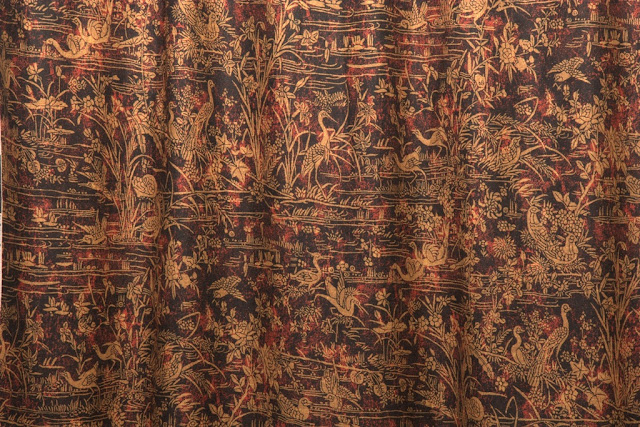
Airplanes, or rather, the airplane motif, sometimes made their way into the home, appearing on wallpaper and fabric.  One such wallpaper, which you'll find below, was Aeroplane.  Designed by Raymond McGrath, an Australian architect, during the early 1930s, the paper was thought to have been conceived for the house of an aviatrix.  (The house, referred to as Rudderbar, was never built.)   I can just see this paper in the late 1920s home of the fictional Phryne Fisher, who, like many of her trailblazing female counterparts, knew how to pilot a plane.

As World War II approached, the airplane motif began to appear as a symbol of a different kind of freedom, one from Nazi tyranny.  Patriots, both in the U.K. and here in the U.S., proudly wore airplane-emblazoned attire as both an act of support for their troops and of defiance against the enemy.

Although airplanes may no longer hold the same appeal that they once did (frankly, they make me think of germs spreading through the air and passengers walking barefoot to the bathrooms,) it's interesting to see how they once inspired fashions for the body and for the home.

P.S.- If you want to watch a brief 1928 film clip that shows Mr. Selfridge sending off his daughter and son-in-law on their airplane trip around the world, click here.


Aeroplane wallpaper, designed in the early 1930s by Raymond McGrath, is still available today through Bradbury & Bradbury.


In 1926, Vogue suggested wearing a "knitted chiné woollen suit by J. Suzanne Talbot" when flying.


The interior of John Hay Whitney's two-motored Sikorsky Amphibian looked more like a residential interior than a plane.


An Art Deco Airplane Smoker's Companion, designed by J.A. Henckels in the 1930s, is available through M.S. Rau Antiques in New Orleans.


Vogue featured planes announcing the Paris openings on their March 1932 cover.  This image is available for sale as a print through the Conde Nast store.


Victory V cotton dress fabric, printed in 1941 by the Calico Printers' Association of Manchester, England,  was just one patriotic dress fabric produced during the Second World War.  The border features a pattern of three dots and a dash, which was Morse code for "Victory". (Collection of Victoria & Albert Museum)


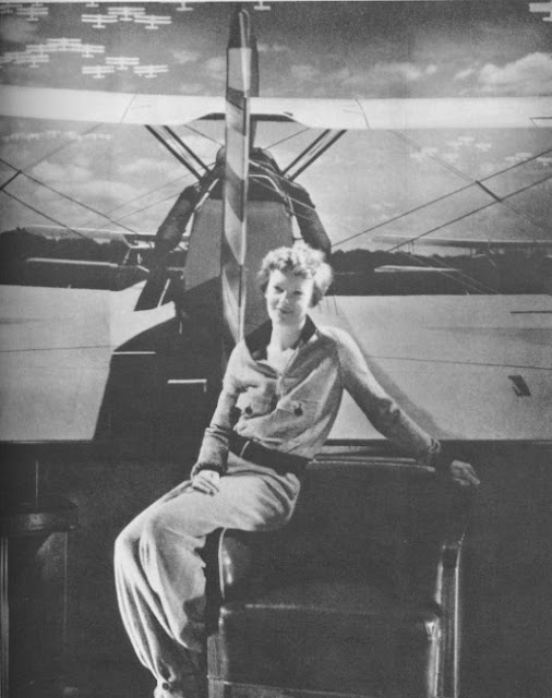
Photo at top: Amelia Earhart, the most famous aviatrix of all.

Revisiting Henri Samuel

$
0
0

Did you read the April issue of French AD? If so, you probably saw the article about the late French designer Henri Samuel. Samuel was one of the all-time design greats, having created interiors that were, and still are, the epitome of French chic. Although some of his work could be described as grand (his work for the Gutfreunds, for example, was notable for its tasteful splendor,) not all of Samuel's work was quite so lavish. His own home, seen here, was supremely sophisticated and yet, a tad bit more relaxed than what one might expect.  Perhaps you could liken Samuel's casual decorative gestures to a blue blazer, Hermès pocket square, neatly pressed blue jeans, and loafers rather than a hoodie, sweatpants, and flip-flops, an outfit which is, unfortunately, most people's definition of casual.

While Samuel could craft some purely traditional interiors, he was equally drawn to contemporary furniture, as is evidenced by the modern pieces with which he lived. Samuel was very adept at mixing, say, Guy de Rougemont-designed furniture (like that brass cloud table, below) with antiques and refined accessories in such a way that these super-sleek pieces were elevated to the sublime.  I hate to say it, but in lesser hands, this type of contemporary furniture is often used in ways that ultimately look a little seedy, and seedy is a word that will never describe Samuel or his work.

If you missed the article, take a look below.  Although some of these photos have appeared in a few design books, it's important to revisit them again.  This is the work of a true master.


The salon of Samuel's apartment on Rue du Faubourg Saint-Honoré, Paris.


Another view of the salon...


...and another.


This snazzy Philippe Hiquily table resided in a Munich apartment decorated by Samuel.


A Plexiglas and chrome Mouchoir table by François Arnal and two upholstered gondola-style chairs once decorated Samuel's library.

All photos appeared in the April 2013 issue of French AD.

J'adore Dior

$
0
0


This year, we're seeing a Christian Dior revival. Not that the famous couturier was ever really far removed from our radars. We still invoke his name as one of the twentieth century's great tastemakers (that term is overused today, but Dior was a tastemaker in the truest sense of the word), and photos of his fashions still abound in books, magazines, and, of course, the internet. But, this year, Dior's work and legacy are more front and center than they usually are.

There is the exhibition, Impressions Dior, which is currently installed at Musée Christian Dior in Granville, France. The show explores Dior's work through the prism of Impressionist art, asserting that the couturier was influenced by nature (especially his garden), light, and reflections, just as Impressionist painters were. The show runs through September 22, but for those of us who might not have the opportunity to visit it in person, there is a soon-to-be-published book, Dior Impressions: The Inspiration and Influence of Impressionism at the House of Dior, that accompanies this exhibition.

This year's other notable Dior book, which will be published this fall, is Dior Glamour: 1952-1962, and it features fashion photographer Mark Shaw's photos of both the couturier as well as his frocks.  Shaw shot some wonderful photos of that era's models outfitted in Dior, and he captured the models in some really sublime settings (including Dior's Paris Winter Garden, which is featured on the cover of this book.)

So, in honor of all things Dior, I am featuring photos of Dior's Paris l'hotel particulier.  Dior's home featured the work of designers Georges Geffroy and Victor Grandpierre, both the ne plus ultra of French decorators.  I think you'll agree that M. Dior's home was as elegant, and well appointed, as the clothes which made him a legend.

(You can pre-order both books via Amazon, Barnes & Noble, or IndieBound.)


The entrance hall to Dior's l'hotel particulier. Note the emerald green shantung that was used for both undercurtains as well as hangings along the stair rail.


Le Salon. Decorated by Geffroy, the room featured an antique Aubusson rug and a Sèvres jardinière.


Dior's Winter Garden which also served as a fumoir.


The drawing room was decorated by Victor Grandpierre.


Dior's Louis XVI bed with baldachin.


Also in the bedroom was this Louis XVI bureau plat.


This hall led to the bath. The doors were painted in the faux bois style.


Dior's bathtub was painted to mimic green marble. The curtains that framed the tub alcove were made of emerald-colored faille.

Fornasetti Still Fascinates

$
0
0

Cole & Son recently debuted their new Fornasetti II collection of wallcoverings, and I think it's a breath of fresh air...or maybe that should be flair.  Available in the U.S. through Lee Jofa, the collection features all kinds of eccentric designs such as pen nibs, umbrellas, walking sticks, and trompe l'oeil architectural niches. Rather than seeming silly, though, these designs are quintessential Fornasetti, dashing in appearance and plucky in attitude.

Take, for example, Magia Domestica, seen above.  It's a classic trompe l'oeil design with its open door, suit of armour, bookshelves, and drawn curtains.  On the other hand, Nuvolette, a white and black cloud design paper, is probably more versatile and suitable for those who prefer subtlety.  Regardless of whether you're a design renegade or someone who can tolerate just a hint of humor, you should take a look at the new collection.  Fornasetti's designs are truly unlike any other.


Teatro has to be one of my favorite prints from the collection, and it would be so appropriate for a home theater. In fact, it reminds me of this old Lancome ad, which also beguiled me when I first saw it:


I would paper the walls of a small foyer or coat closet with Promenade.  Or, perhaps the dressing room of a dandy?


Recently, I have seen Nuvolette used in two different showhouses, and both times, the paper was used to stylish effect.  I also think this print might be the most versatile of the collection.


I believe that I like Uccelli's border almost as much as its menagerie of colorful birds.


Pennini has masterpiece written all over it.


This print comes with monkeys (Procuratie E Scimmie)...

...or without (simply Procuratie). The zebras peeping through are not part of the new collection.


All images courtesy of Lee Jofa/ Cole & Son.

A Room with Some View

$
0
0

Look at this photo and tell me that you wouldn't kill for that view of the Arc de Triomphe.  I know that I would.  It's a good thing that the bureau plat and chair were placed with their backs to the window, because had it been otherwise, I doubt any work would have been accomplished.

I love to find photos of interiors that boast amazing views.  Whether it's a Paris monument, a bucolic vista, or even a simple but majestic tree, a good view almost manages to make a room's interior play second fiddle.  In these situations, attractive interiors are simply the icing on the cake...or perhaps it's the view that is the cherry on top.  Well, whatever.  A killer view and a lovely room from which to view it truly are beautiful sights to behold.


The view at designer Veere Grenney's home is of the River Thames and what I believe to be the Peace Pagoda at Battersea Park. (U.K. readers, is that correct?)


This Paris rooftop garden had a great view of the Eiffel Tower, which could be enjoyed while sitting in butterfly chairs.  The grass, by the way, was plastic.


Madame Ralli's Paris rooftop garden boasted this view of the Hôtel des Invalides. The Vicomte de Noailles advised Ralli on her urban oasis, which also featured plastic grass. I can only conclude that plastic grass must have been the dernier cri at the time.


Evidently, quite a few chic people lived with stunning views of the Hôtel des Invalides, including the late Walter Lees, who was so inspired by the scenery outside of his window that he had napkins embroidered with the landmark's motif.


Author Gordon Merrick posing in front of his view of the Hôtel des Invalides.


The riverside pavilion at Syon boasts a view of the Thames, too. This photo from the 1960s shows interiors that were the work of R A P Pinckney.


A majestic tree stands beyond the window at Villa Agnelli in Turin, Italy.


An arched doorway frames this view of a fountain at château de Fléchères.

A Frisky Feline

$
0
0


Without a doubt, this has to be one of the most fantastical bars ever created.  Designed by François-Xavier Lalanne, this chat polymorphe was purchased by architect Émile Aillaud in 1968.  Although at first glance it looks like a feline Trojan Horse made of repoussé brass, the bar has curious appendages that make it seem more akin to some mythological creature- namely, a fish tail and birds' wings that reveal the contents inside.  It's certainly imaginative, not to mention impossibly chic, too.

The photo you see here shows the bar in the Paris home of Charlotte Aillaud, widow of Émile. Charlotte used the bar to hold her treasured collection of Venetian glassware and eighteenth-century Portuguese glasses. I use the past tense as it seems Charlotte sold her cat at a 2002 Christie's auction. The cat's hammer price was $197,125- appropriate, I suppose, considering that the cat bar was one of only two made by Lalanne:


Although I seriously doubt that Charlotte Aillaud used her cat to mix complicated cocktails, I do think this cat needs a signature drink. Should it be a Tiger's Tail? Or better yet, what about the Pussyfoot?


Pussyfoot

A non-alcoholic cocktail, the Pussyfoot is a Jazz Age drink that was first concocted at the Embassy Club in London.  According to some, it cures hangovers...


1 fluid ounce lime juice
1 fluid ounce lemon juice
1 fluid ounce orange juice
Grenadine to taste
Maraschino Cherry for garnish

Mix in a cocktail shaker with ice and strain into a glass.

Food For Thought

$
0
0


Whatever happened to porcelain-handled flatware, earthenware tureens, table centerpieces of flowering plants in wicker baskets, cabbageware plates, faience, floral print cloths and napkins, and all of the other traditional, charming table accessories that one used to see so often?  Not that any of this tableware is obsolete.  In fact, I am sure that many of you set your tables with one (or most) of the aforementioned items.  It's just that the current vogue for spare, minimal tableware seems to relegate the old and the jolly to the annals of yesteryear's tablesetting books or, even worse, to the backs of kitchen cabinets.

Look at the 1980s-era table setting above.  At Hélène Bouilloux-Lafont's house in France, a table was set for a casual breakfast.  Blue and white china, a strawberry teapot, and cabbageware dishes filled with fruit were considered fashionable for dining in the country.  But today, tables in the country are set much as they are in town.  The china is monochromatic as is the table linen.  Glassware is bereft of any ornamentation.  (Sometimes it is even bereft of stems!)  Flatware is little more than tines, blades, and bowls attached to plain metal sticks.  It's all so serious.  Where is the fun?  Where is the imagination?  Where is the strawberry teapot?

As much as I understand the practicality of plain tableware, I am also pretty certain that a beige colored plate won't enliven your table, or your mood, the same way a cabbageware tureen does.


Before we get to the table, let's discuss this room.  I think it is perfection, although the blackamoor vase is a little incongruous considering the room's decor.  This was the Essex home of Peter Coats, who I am assuming is the same Peter Coats, a noted landscape designer, who was involved in a relationship with Henry "Chips" Channon.  Anyway, looking at the table, you'll see there is not much more than a cabbage tureen, plates, simple stemware, and a bottle of Rosé.  So simple, and yet, so chic.


See?  Flowers in wicker baskets.  Very charming.  But what makes this table so very pretty is that floral cloth and napkins.  The blue and white check fabric in the room doesn't hurt, either. (At Château de Saint-André-d'Hébertot in Deauville, France.)


Jacqueline Hagnauer set this table in her home in Provence. The cloth was an Indian print, upon which small slipware plates and "Pont-aux-Choux" place plates were placed. Pink, green, and clear glasses were positioned at each setting. Note those Lilliputian-sized cabbageware salt cellars or mustard jars, as well as the trompe l'oeil basket of cherries.


A Tiffany tablesetting created by Mrs. Angier Biddle Duke.  The "Blue Canton" china looks smashing against the orange chintz cloth.  And that basket, filled with chrysanthemums and cornflowers, helps to tone down any formality at a "Country Supper on the Back Porch".
Viewing all 483 articles
Browse latest View live


Latest Images