Quantcast
Channel: The Peak of Chic®
Viewing all 483 articles
Browse latest View live

A Bedtime Story

$
0
0


The June issue of British House & Garden is a good one, but what especially caught my attention was the article about the Wiltshire house of Diane and John Nutting.  Not only is the house bright and airy, but it is filled with beautiful porcelains, antique furniture, and chintzes, all of which are arranged in a tidy fashion.  But the real show-stopper of the house, to me anyway, has to be that beautiful bed, seen above.  I'm not sure which part of the bed I like the most: the carved, gilded tester, or the bed curtains made from a now-discontinued Colefax & Fowler chintz.  The bedroom's seating area, also above, is quite fetching, too.

If you think you've seen this bed before, you probably have. It, along with most of the other furnishings ensconced in the Nuttings' home, once stood proudly in the couple's former house, the regal, early 18th c. Chicheley Hall. I found photos of the Chicheley Hall bedroom in Chester Jones's Colefax and Fowler: The Best in English Interior Decoration. According to this book, the late Tom Parr of Colefax & Fowler was responsible for Chicheley's redecoration, including the fabric chosen for the bed (which, according to the book, is Colefax & Fowler's "Charlotte" chintz.)  You can see this book's photos of the Nuttings' former bedroom below, including the fireplace seating area which was more or less recreated in the new home. You'll also notice that the Colefax & Fowler carpet that was chosen for the Chicheley Hall bedroom was also selected for the Nuttings' current bedroom.

And funny enough, the bed also made an appearance in one of my favorite books, The English Dog at Home by Felicity Wigan. Mrs. Nutting was photographed on her lovely bed alongside Scotties Matthew and Mollie.  (Little dogs seem to have a nose for fine bed linen.  I know that Alfie does.) 

You can see photos of Chicheley Hall below.  And if you have not already done so, I do urge you to take a look at the June issue of H&G to see the Nuttings' current house in all its lovely splendor.


Photos at top: British House & Garden, June 2013; Simon Brown photographer.

The Hearst Design Group and Inside Design

$
0
0


Hearst Design Group will present Inside Design next Wednesday, June 19 and Thursday, June 20 at ADAC in Atlanta.  In addition to talks by Amy Preiser of Elle Decor and Leslie Newsom Rascoe of Veranda, Newell Turner, Editorial Director of Hearst Design Group, will give a keynote speech that explores how scrapbooks, journals, Pinterest, and other visual mediums help us to make sense of our lives.

You can see the full schedule on the invitation above.  For more information, or to register for these events, please visit the ADAC website.  I hope to see you there.

A Place For Everything and Everything In Its Place

$
0
0


On the off-chance that you are looking for something to do this weekend, perhaps you should considered organizing your home.  That, at least, was what I felt like doing after first seeing that collage of photos, seen above.  Published in House & Garden Guide to Interior Decoration, the photos show the extraordinary organizational skills of Mrs. John Barry Ryan III of New York City.

The gist of the article was that Mrs. Ryan was a real-pro at arranging tablescapes, collections, seating, and flowers.  And yes, after looking at the photos, I would agree that she was.  But she was also the most organized person I have ever seen, with the exception of my mother.  Mrs. Ryan's silver boxes were perfectly lined up on her desktop, while her drawer full of beaded necklaces was a study in precision and order.  And what has to be the world's most extensive collection of gloves was filed away in a drawer and arranged by color, all kept fresh thanks to a Porthault butterfly sachet.

This, people, is what I aspire to.  No matter how hard I try, though, my cache of beaded necklaces will never look anything more than a jumbled cluster.


Dining with Mario

$
0
0

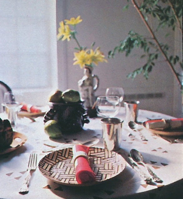
There seemed to be a lot of enthusiasm for last week's post on tablesettings, so if you'll indulge me, I've got one more for you. But the twist is that all of these photos feature "tableware at its finest in innovative settings by Interior Designer Mario Buatta"- to quote the November 1977 House Beautiful article from which these photos came.

This post seems especially timely, too, considering that Mario's work for Hilary and Wilbur Ross is featured in the July issue of Architectural Digest. Have you seen the article yet? All I can say is thank heaven for Mario Buatta!

And when you look at the photos below, I think you'll see plenty of the ol' Mario Magic.  Other than the quality of the photos (they were taken in 1977, after all), everything still looks fresh today.


In the photo above and at top: Interlude china and Castle Garden crystal by Lenox and Reed & Barton's classic Francis I flatware were set on a cloth made from China Seas' Ball fabric. (I don't think this print is in their current line-up.) The best part of this setting, though, has to be that beautiful bevy of blue and white porcelain.


This "English Country" table is set with Gorham's Minaret china and Chantilly sterling flatware and President crystal by Gorham. The grass green napkins are by Vera, while the cloth is Madeleine chintz from Clarence House. I wonder if the lettuce tureen and earthenware rabbit were part of Mario's collection. I also find the library setting very cozy.


The sweet ribbon print fabric is Brunschwig & Fils' Cecily Ribbon and the china is Indian Tree by Aynsley. The crystal is Eileen by Waterford and the flatware is French Empire.


A more subdued setting thanks to the neutral tones of Dragon Sorrell china by Royal Worcester and a tablecloth by Fabrications. The flatware is Grand Majesty by Oneida.


All photos from House Beautiful, November 1977; Feliciano photographer.

The Andrew Calhoun House

$
0
0


One of the most beloved houses in Atlanta is the Andrew Calhoun house, more commonly referred to as the "Pink Palace". Built in 1922-23 and designed by architect Philip Shutze, who was at that time an apprentice at Hentz, Reid, & Adler, the Italian Baroque-style house was inspired by Shutze's studies in Italy.  When the house was originally built, one entered the drive from West Paces Ferry Road, through magnificent gates which gave visitors a stunning view of the house's garden facade (photo #2).  The entry was at the rear, where the view was rather austere though still quite dignified.  (Photo #1) 

Some of the more notable features of the house are the ornate plasterwork (just look at those door surrounds, below) as well as a few Allyn Cox murals, of which only one remains.  You might recall that another notable Atlanta house, the Goodrum house, also boasts an Allyn Cox mural.

The first seven photos of this post came from the September 1978 issue of House Beautiful. At that time, the interiors were the work of the well-respected Atlanta designer, T. Gordon Little. (Click here to see more of Little's work.) Little wisely chose quiet furnishings for the home, allowing the house's architecture to play the leading role. With plasterwork like this, who needs bold prints or bright colors?

To bring this story current, I am also including a few photos that appeared in the February 2012 issue of Atlanta Homes & Lifestyles. The magazine printed a really terrific article about the Calhoun House with recent photos by Atlanta architect Peter Block and comments by several other Atlanta architects. (Do click the link to read it; it's an intriguing read.) The house is currently on the market, although it very well could have sold recently and I'm just not aware of it. I sincerely hope that the future homeowners, as well as the designer of their choosing, will respect the house's architectural integrity and its stately Southern charm. The last thing this house needs is a makeover in the Belgian cum Southern rustic look or Hollywood Regency style.  Now that would be a crying shame.


One of three Allyn Cox murals originally executed for the house, the entry hall's Roman-themed mural is the only one that remains.


The living room as decorated by T. Gordon Little.


The dining room with its plaster medallion of Michelangelo, which is original to the house.


The doorway that leads to my favorite room of the house, the ballroom.


A detail shot of the house's front, or garden, facade.


This recent photo of the ballroom, taken by Peter Block, looks more or less as it did in the late 1970s.


The living room retains much of the furnishings that were selected decades ago by Little.


Photos #1-#7 from House Beautiful, September 1978, Peter Aaron photographer. Peter Block's photos, which appeared in the February 2012 issue of Atlanta Homes & Lifestyles were used with express permission from the magazine.

A Chance To Learn From The Master

$
0
0

Let's end the week with a history lesson.  Not just any old history lesson, but one given by the late educator and design historian, Stanley Barrows. 

Featured in the September 1978 issue of House Beautiful (yes, I am obviously stuck on this issue,) the article was comprised of three different room vignettes, each of which captured the look of a different era in 20th century design history.  There was the 1900: Turn-of-the-Century Opulence look, which can be seen above.  Following that was the 1950: Mid-Century Comfort room.  And after that, 1978: Contemporary Simplicity.  The background for all three vignettes remained the same: the drawing room of an early 20th century Georgian Revival townhouse, which had classic moldings, an elegant fireplace, and dark glossy walls.

So why should we care about these room settings that were concocted in 1978?  Because this is the closest most of us will ever get to being taught by the great Barrows, who counted Mario Buatta, Albert Hadley, Angelo Donghia, Thomas Britt, Edward Zajac, and many other great designers among his many students.  Considering those designers' talents, I think we should listen up and pay attention to Mr. Barrows.

The caption for the Edwardian-era room above read: "The drawing room in Edwardian times was always ready to receive callers. A formal space for 'at home' afternoons and evenings, it was filled with art and accessories. This room has an atmosphere of flowery fantasy, enhanced by the exuberant use of massed plants and flowers. A rose-and-lilac patterned chintz from Brunschwig & Fils carries out the floral theme on seating and stiffened valances and curtains. Alfred Maurer's striking full-length portrait shows the taste for dramatic poses during this era. A conscious diversity of forms associated with early 20th-century rooms is combined with a feeling of coziness."


1950-Mid-Century Comfort: "By mid-century, few families could afford the servants needed to maintain the Edwardian style. Room design, like life styles, is simpler, with an emphasis on personal comfort and relaxation. The treatment by the second generation of inhabitants reveals a more limited use of pattern, contrasted with larger areas of non-patterned textures. The concern for comfort is reflected in heavier upholstered chairs and sofas. A less complicated, balloon shade window treatment shows the generally softer look associated with interior design in mid-20th-century America. As in the earlier example, a conscious contrast of the lighter values of the fabrics is played against extremely dark porphyry-colored walls. This makes a dramatic background for the light and dark silhouettes of the furnishings. This is a timeless room. Its traditional look is as acceptable today as it was 30 years ago."


1978-Contemporary Simplicity: "Today, while some people seek to fill their lives with reminders of the past, others strive to unencumber themselves of objects. Room designs are based around a select few, or even one great piece. The modern generation in this house has achieved a present-day atmosphere through the elimination of all earlier furnishings and the selection of recently designed seating. A subtly-colored dhurri rug adds a restrained note of fantasy to this 'less is more' setting."


Photos and text from House Beautiful, September 1978, Ralph Bogertman photographer.

Remembering Joe Nye

$
0
0


I was heartbroken to learn that Joe Nye, a designer whom I considered to be a friend, died last week. I got to know Joe about six years ago when he gave my sister and me the grand tour of Los Angeles. It was then that I learned what a kind, gregarious, and generous person he was. I remember a day spent seeing the city's design hot-spots, chatting about Sister Parish and our favorite fabrics, and relaxing at his lovely, chic, jewel-box of an apartment in Beverly Hills. (You can see photos of his apartment, below.)  It was a day I won't forget.

Over the years, I enjoyed seeing his work featured in magazines such as House Beautiful, and I was thrilled when his first book, Flair: Exquisite Invitations, Lush Flowers, and Gorgeous Table Settings, was published. It seemed appropriate that Joe's book was about entertaining. After all, he was warm and hospitable and cared a great deal about creating beauty, both for himself and for others. He had great, effortless style, and he was a good old-fashioned decorator in the best sense of the profession. He loved Chinoiserie, antiques, modern art, books, Dodie Thayer lettuceware, Mottahedeh Blue Canton, and all of the other time-honored things that I also love. Perhaps that is why we always had so much to talk about.

I will miss visiting him, and my future trips to Los Angeles just won't be the same without our get-togethers.  At least we have his work, and his book, to remind us of what a talented man Joe Nye truly was.


Image of Joe from his book, Flair, Rizzoli 2010. Images of Joe's apartment from House Beautiful, August 2009, Roger Davies photographer.

The Bright Young Diana Mitford Guinness Mosley

$
0
0

I recently reread author D. J. Taylor's excellent book on the "Bright Young People", those 1920s-era young, upper-class whippersnappers of London whose antics were heavily chronicled by the British newspapers of the time. Cecil Beaton, Evelyn Waugh, Brian Howard, Nancy Mitford, and their ilk made up this tightly-knit group of revelers who pretty much partied their way through the decade. I have to say that after reading Taylor's book for the second time, I am left with conflicting opinions of this group. On the one hand, I admire the writers that Waugh and Mitford became. On the other hand, I think that as a whole, the Bright Young People were mostly vacuous, self-centered people who seemed incapable of understanding- and filtering into- the world outside of their clique. No matter whether one finds the bright young set obnoxious or dazzling, I believe most would agree that this group makes for interesting reading.

One Bright Young Person who was mentioned numerous times in Taylor's book was Nancy's sister, Diana Mitford, seen above as a young woman. Mitford married Brian Guinness during the 1920s, and they went on to become two of the leading lights of their social set. (Or, to use today's terminology, they were a "power couple" amongst their cohorts.)  As we know, Diana Mitford Guinness scandalized her family by throwing over Guinness for Oswald Mosley, the fascist politician who founded the British Union of Fascists and later, the New Party, which included the infamous Blackshirts.  Diana and Oswald would later marry in Germany at Joseph Goebbels' house (where Hitler was in attendance, no less,) espouse fascism, be interned during World War II, and eventually end up living in France.

Political persuasions aside, Diana and Oswald Mosley did have a pretty home in Orsay known rather grandly as Temple of Glory.  While the interiors seemed to reflect their French locale, the house also had a very British feel to it, cozy thanks to books and bibelots.  According to The Finest Houses in Paris, in which these photos appeared, the house had few rooms, prompting one guest, the Duchess of Windsor, to query, "It's a charming place, but where do you actually live?"  Pale blue, Diana's favorite color, made appearances throughout the house, especially via walls and fabrics.  An enthusiastic entertainer, Diana often invited guests to Sunday lunches, where her Irish butler prepared the meals.  For her table settings, Diana preferred to use her rare Saxon porcelain china, placing it directly on the table sans place mats.  And candied fruit (see below) was frequently served after dinner. 

All in all, the Mosley house was very elegant and inviting.  It's too bad the same thing can't be said for their politics.


All photos from The Finest Houses in Paris by Christiane de Nicolay-Mazery, I. B. Tauris publisher, 2000.

A Night on the Town

$
0
0


How do you get ready for a night on the town?  Do you wear a silk dressing gown while making up? Or do you sit in front of the mirror in your underwear?  Do you spritz yourself with fragrance from Hermès? Or Chanel? And do you indulge in a little nip while getting ready? Or do you wait until you arrive at your destination to imbibe?

You may not give your going-out preparation much thought, but one who did was writer Beverley Nichols.  In his book, All I Could Never Be, he described in detail how he dressed for a night out in 1920s London.  This was a man who obviously thought highly of his Boucheron cuff links as well as his Fortnum & Mason shoes.  And while the label-dropping might come across as a tad bit pretentious, the vivid description, brand names and all, paints a very stylish picture of a time when going out meant tails and top hat, not dirty jeans and dirtier flip-flops.

"tails by Lesley and Roberts in Hanover Square, waistcoat by Hawes and Curtis of the Piccadilly Arcade, silk hat by Lock in St. James's Street, monk shoes by Fortnum and Mason of Piccadilly, crystal and diamond links by Boucheron of the Rue de la Paix, gold cigarette case by Asprey of Bond Street, a drop of rose geranium on my handkerchief from the ancient shop of Floris in Jermyn Street. And on the dressing-table, waiting to be sipped, an ice-cold "sidecar," complete with its crimson cherry."
-excerpt from All I Could Never Be by Beverley Nichols (1949)


A 1926 tailcoat, not by Lesley and Roberts but rather Anderson & Sheppard. (via Savvy Row website.)


A vintage Silk Top Hat from Lock & Co.


Rock crystal, diamond, and black enamel cuff links from Boucheron, Paris, c. 1920. Available through Wartski.


Circa 1927 gold cigarette case (left) from Asprey, sold with a silver gilt case (right) at Christie's


Rose Geranium bath essence from the venerable Floris.


Photo of Nichols, at top, from "Bright Young People" by D. J. Taylor. Sidecar recipe from Vogue Cocktails by Henry McNulty

Have a Happy Independence Day

$
0
0
Stars...


...and Stripes


Stars...


...and Stripes


Stars and Stripes...


...Forever!


Rooms and designers featured from top to bottom: Rose Cumming; Madeleine Castaing; Syrie Maugham; Dorothy Draper; Hobe Erwin.

Putting a Space with a Name

$
0
0

I always get a kick out of finding an old article or book that features a home decorated by a friend or acquaintance.  Such was the case the other day when I pulled my copy of Architectural Digest California Interiors from the shelf.  When I first read the book a few years ago, I found the project that is seen here to be quite attractive and elegant.  I was especially taken with the gazebo, which was decorated with an array of blue and white fabrics, furnishings, and porcelain.  But at the time, I wasn't familiar with the home's designer, Jack Lowrance.  Fast forward to today, when I do know Jack.  Now that I can put a space to a name, I find the project even more interesting.  Personal connections have a way of making things more meaningful, don't they? 

The home (more of a cottage, really) was located in Woodside, California, close to San Francisco. Jack's longtime clients, who had spent years amassing a notable collection of porcelain and antiques, purchased the home as a place in which to enjoy their retirement. Accustomed to living in a formal manner, the homeowners were, at first, unsure of how to reconcile their treasures with a desire to live more simply.  Jack's approach was to decorate the cottage in the elegant and refined style that the homeowners had long enjoyed and appreciated, yet he did so in a way that was comfortable and easy to manage. It was the best of both worlds, one in which the couple could continue to enjoy their collections but in a more relaxed fashion.

But still, I have to go back to the Gazebo and patio of this home.  I think it's safe to say that the majority of us love blue and white, trellis, dining alfresco, garden seats, ceramics, and the like, so I think you'll especially enjoy the photos of these spaces. They were chic and snappy when they were decorated thirty-some-odd-years ago, and they're still chic and snappy today.


The focal point of the living room was the Edo Period screen behind the sofa. To the left of the sofa was a table upon which a Degas drawing and antique seals rested (seen in the top photo.)


Also in the living room was an 18th-century English lacquered secretary, which held the homeowners' collection of blanc-de-chine figures.


Another Edo Period screen could be found in the dining room, where the table was set with crystal, floral porcelain, and gilt figures.


The well-appointed master bedroom boasted a view of the home's swimming pool.


The Library had mahogany paneled walls, which, along with the blazing fireplace, created a cozy refuge.


Jack employed lattice to create two different living spaces outdoors. Off of the living and dining rooms, a Pergola was added to create an outdoor entertaining space.  Planted flowers helped to soften the edges of the space. (#2, #3, and #4 in the outdoor set of photos.)  A patio, notable for its painted, trompe l'oeil scene of the surrounding area, was used for alfresco dining. (#5)  The gazebo stood at one end of the pool, where it housed a collection of blue and white ceramicware as well as blue and white striped upholstered seating, blue and white planters, and fabulous grotto-like blue and white garden stools. (#1, #6, and #7) 


All photos from Architectural Digest California Interiors, Max Eckert photographer.
Seconds at Christopher Spitzmiller

$
0
0

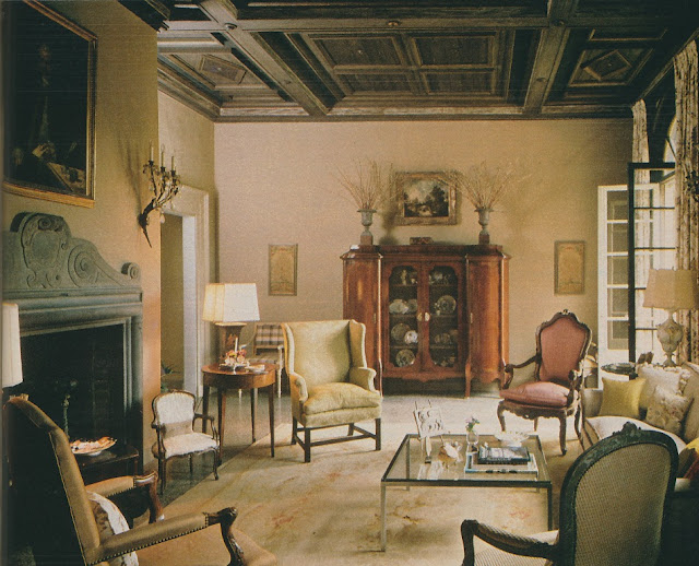
It's the moment many of you have been waiting for... the annual Seconds Sale at Christopher Spitzmiller, Inc.  The sale begins next Tuesday, July 16 and runs through Friday, July 19.

As if that colorful array of lamps, seen above, isn't enough to whet your appetite, there are even more lamps that will be part of the sale, and all up to 55% off retail price, too.  For a complete list of seconds lamps, email info@christopherspitzmiller.com to be added to their email distribution list.  The complete list will be emailed out on Monday.

Now I must decide which lamp to add to my collection of Christopher Spitzmiller lamps.  Decisions, decisions.


A Love Letter to the Bamboo Pen

$
0
0

While I was getting myself together the other morning, I was ruminating about bamboo-motif pens.  (Why, I haven't a clue.)  Not only do these pens have a very appealing Chinoiserie sensibility, but they also are ergonomically friendly.  Those knotty bamboo stalks seem made to be held firmly yet comfortably in one's hand.  What a happy coincidence that such pens look good and feel good, too.

Bamboo-motif pens have long been staples on stylishly appointed desks, and most of the major luxury purveyors have at one time or another sold sublime-looking bamboo pens. Cartier produced luxe fountain and ballpoint pens made of real bamboo and gold, while Tiffany & Co. was known for its classic sterling silver ballpoint version.  Both Verdura and Harry Winston made sleek gold examples that might possibly have made signing documents a dream.  And let's not forget how popular those imitation bamboo ballpoint pens were a few years ago, although I would argue that their popularity will never really wane.  The bamboo motif is eternally chic.

But my favorite pen of this genre is not technically a replica of bamboo, though in a way it does resemble it: Jean Schlumberger's gemstone-studded pen that looks like a cross between a worn bamboo stalk and a studded piece of coral.  Some of the versions that I have seen include a gold shaft with hematite, coral, or turquoise studs, while the more exotic rendition incorporated ivory and coral or turquoise studs. (I doubt that the ivory version is still made.)

As efficient as typing is, such luxurious pens make me pine for the days when people actually communicated through handwritten notes and letters, usually penned in cursive, too!

Photo at top: A vignette from the catalogue of the 2008 Christie's auction that featured the estate of the Monseigneur le Comte de Paris and Madame la Comtesse de Paris.  You can see a Cartier bamboo and gold ballpoint pen in the photo.


Another Cartier gold and bamboo pen, which was sold with a c. 1935 Cartier rock crystal fountain pen at a 2004 Christie's auction.


A vintage gold bamboo pen by Harry Winston


Two examples of the Schlumberger ivory writing implements, one with gold studs and the other with coral.


A gold and hematite pen by Schlumberger

Luke Honey

$
0
0


I first knew Luke Honey as the London-based blogger behind The Greasy Spoon, an always-interesting food blog that often includes posts on 1960s and 1970s-era cuisine and cookbooks. (As you can imagine, those posts are my very favorite.) However, Luke also recounts recipes and dishes that both he and his wife have prepared in their recently renovated London kitchen, something that might appeal to those of you who prefer to read about current cookery.

What I only learned somewhat recently is that Luke is also a noted antiquarian, whose background includes stints at such auction houses as Phillips, Phillips de Pury & Luxembourg, and Bonhams. Although Luke's specialty is antique chess sets, backgammon boards, and antique games, he recently ventured into other areas of decorative arts and fine art, all of which can be viewed on Luke's new website, Luke Honey.

On the website, you'll find all kinds of interesting things like the aforementioned chess sets, including a mid-19th c. Indian example carved from ivory.  There is also 18th century blue and white china, out-of-print books, vintage bibelots from Asprey, a screenprint by Martin Battersby, and many other treasures. And fortunately for those of us who live in the U.S., Luke ships internationally.

When you get a moment, do check out Luke's website. And be sure, too, to check out the website's blog, which includes recent posts about Phrenologist's busts, David Bowie's yen for chess, and the garden of David Hicks.

As frustrated as I sometimes get with the internet, the beauty of it is that you get to meet all kinds of interesting people, like Luke, who have unique and varied interests.


An Indian ivory chess set, c. 1840, Delhi


Martin Battersby, "Archaic Smile" screenprint


"The Hunt", mounted wooden lithographic figures, c. 1910.


An Asprey & Co. sea urchin match striker


Peter Coats at Albany

$
0
0

I wasn't familiar with Peter Coats until I recently saw a 1960s-era photo of his charming English country cottage. A little digging around on the internet turned up that he was once Gardening Editor of House & Garden (the British edition), an author of numerous gardening books plus two autobiographies, a garden designer, and a one-time paramour of Chips Channon. All of those roles combined make for one interesting character in the annals of design and gardening.

When I recently featured Coats's Essex country house drawing room on my blog, Luke Honey, antiquarian and blogger (see more about Luke in the post below), mentioned that Coats's set at Albany in London was once featured in an old House & Garden book by Robert Harling. I took a stab and purchased a copy of House & Garden Book of Interiors (by, yes, Harling and published in 1962), and sure enough, there were photos of Coats's city flat.

For those of you who are intrigued by Albany and its dwellers, you might be interested to know that Coats inhabited A1, which had once been the flat of Mr. William Stone. (The late Stone at one time owned almost half of Albany, if you can imagine.) Coats's set spanned three floors, with the hall, drawing room, study, and bath on the ground floor, the master bedroom and bathroom above that, and a dining room, kitchen, guest bedroom, and bathroom in the basement. All that said, though, the set was not terribly large. Only the drawing room was spacious.

From what I've read on the internet, Coats died in 1990 at age 80. Though it seems his achievements are little known here in the States (that's an assumption on my part), his legacy lives on in the books he penned, including Flowers in History, The Gardens of Buckingham Palace, and his two autobiographies, Of Generals and Gardens and Of Kings and Cabbages.  They might well be worth looking into. 


In the ground floor hall, both the walls and carpet were green, while the blue curtains were trimmed in yellow and black saddler's braid. The gilt wood chandelier was once located in William Pitt's study at Chatham House.


The largest room in the home, the drawing room was once part of Lord Melbourne's library. (It was Lord Melbourne who built Melbourne House, which, when it was later converted to flats, became known as Albany.)


The study, also on the ground floor, was more contemporary-looking in appearance. The walls, by the way, were raspberry red.


The basement floor dining room had an arched ceiling, a vestige of the room's former use as a cellarage. Coats had the walls and ceiling painted in faux marbre.


Coats hired artist Martin Newell to paint a trompe l'oeil classical doorway on the wall outside of the dining room window.

Dining with the Decorators

$
0
0


It seems a good time for another tablesetting post, especially considering that  these photos might be the closest I get to an elaborately set table for the next month or so.  Who knew that summer would turn out to be so busy and that I wouldn't have time for any proper entertaining?

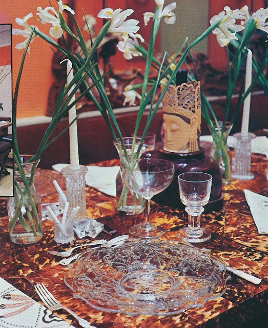
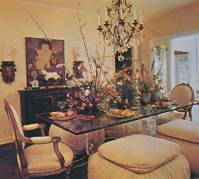
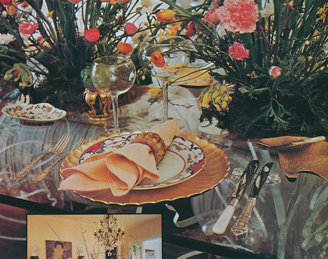
The photos seen here, which ran in the September 1977 issue of Architectural Digest, feature the stylishly-appointed dining tables of top designers including Angelo Donghia, Albert Hadley, Thomas Britt, and a few others.  Overlook the not-so-great photographic quality and study these tables, because I think you'll find that most of them look pretty swell even today. 

(I do hate to say it, but the exception might be the table set by J.P. Mathieu.  Those dining ottomans are best left in the late 1970s.)  

Photos at top: In the living room of Donghia's New York townhouse, a table was set with a Haitian cotton cloth and striped napkins, antique crystal soup bowls, Wedgwood plates, and Chinese pear boxes, which held condiments.  The table's undercloth was antique, while the raw silk slipper chairs were by Donghia/Martin Associates.  Donghia was a master editor, and I think this table sums up his style perfectly.


Los Angeles designer Val Arnold set a luncheon table on the patio. His table was set with a terracotta-colored felt cloth, 19th century crystal plates, antique salt shakers, and Gorham flatware.


Albert Hadley also set a luncheon table, this one located in his Manhattan apartment. The ceramic plates were custom made, while the French pitcher in the form of a female was 18th century. Note the classic Van Day Truex-designed Baccarat decanter.


Don't you just love Thomas Britt's tortoiseshell table? If any of you have a boring brown wood dining table (reproduction, not antique), consider having it decoratively painted in the spirit of Britt's table. Those crystal plates, by the way, were designed by Rose Cumming.


Photographed at the San Francisco home of designer Billy Gaylord, a table was set with guest trays wrapped in antique Chinese texts. My favorite accent is that mass of green onions, placed on a white platter.  That head of cabbage in the foreground is pretty chic, too.


The table that unfortunately didn't age as well as the others. In the home of Pepe Mathieu, an acrylic and glass table was adorned with Japanese gold lacquer chargers, Chinese Lowestoft plates, and French Richelieu flatware.


All photos from Architectural Digest, September 1977.

The Modern Venetian Style

$
0
0


I watched the movie Top Hat on Turner Classics the other night for what has to be the twentieth time.  Of all of the Fred and Ginger movies, this one has to be my favorite for two reasons.  First, there is that silly little Irving Berlin song, The Piccolino, with its catchy lyrics like "Dance with your bambino, To the strains of the catchy Piccolino, Drink your glass of vino, and when you've had your plate of Scallopino..."  (I swear, that song will get stuck in your head for days.)  And the other reason that I adore this movie is its fantasy Venetian setting with fanciful gondolas floating in glamorous canals, topped by bright white gingerbread bridges.  Yes, there is something about Venice that seems to inspire over the top, theatrical decor.

Take, for example, this Manhattan dining, which was in the home of Mr. and Mrs. Richmond Parry Kennard.  According to the 1934 House & Garden issue in which it was featured, the dining room, which had white walls and ceiling and a black and white linoleum floor, was decorated in the "modern Venetian" style. (No mention was made of the room's designer.)  So, what made it Venetian?  Well, a mirror-topped table, mirrored panels above each window, and a Venetian mirror all lent a shimmery note to the room.  Venetian glass sculptural pieces dotted the space, perhaps intended as a note of authenticity.  And the room's doors were supposedly Venetian, too.  They were painted brown with gold monograms and were fitted with old, wavy mirror.

But my favorite decoration in the room has to be its dado, which was painted with architectural motifs.  This touch of pastiche looks like it came straight out of the Venice featured in Top Hat.  I don't know if it's modern or if it's Venetian, but it looks like just the room in which to drink your vino and eat your Scallopino.


Up, Up and Away

$
0
0

So, what do we think of balloon shades?

I ask myself this question whenever I ride in a taxi down Park Avenue, because as you might have noticed, there are quite a few apartments that have windows festooned with balloon shades.  In fact, there was a time when balloon shades made appearances quite often in both homes and in shelter magazines. But today, they are rarities, perhaps owing to the fact that they require expensive fabric yardage and labor.  Then again, their scarcity might be explained by the gradual paring down in decor that has occurred over the past few decades.  Whatever the reason, I do think that there are some balloon shades that still have appeal today.  (Take a look at those by John Stefanidis, seen both above and below.  He did an excellent job designing balloon shades.)

So, what do you think? Blast from the past? Or classic window treatment?


The three photos above show rooms decorated by John Stefanidis.


In the home of Manuel Canovas


Room by Mark Hampton


David Mlinaric decorated the three rooms above.


A room by Keith Irvine. Appropriate that the chapter title reads, "Park Avenue Perfection".


Photos: #1-3, Rooms by John Stefanidis; #4 from The French Touch by daphne de Saint Sauveur; #5 from Mark Hampton by Duane Hampton; #6-8 from Mlinaric on Decorating by Mirabel Cecil and David Mlinaric; #9 from Keith Irivne: A Life in Decoration by Keith and Chippy Irvine.

Tiptoe Through the Tulips

$
0
0


Through the years, the classic Paule Marrot fabric, Les Tulipes, has made appearances in quite a few well-appointed residences. Take, for example, the home seen above. Located in Bermuda, the house was decorated in the mid-1940s by Ruby Ross Wood, who chose the orange colorway of Les Tulipes for the living room's sofas and slipper chairs.


Wood's protege, Billy Baldwin, was also a fan of Les Tulipes, having used it on at least two occasions.


And then there was Stephen Mallory of Mallory-Tillis, who, like Wood and Baldwin before him, favored Les Tulipes, although this time the fabric was used to vibrant effect in a bedroom. (That vivid orange-red background must have been like a jolt of caffeine when viewed upon waking.)


In the 1970s, Toronto designer Robert Dirstein selected the fabric for his cozy, jewel-box library. Les Tulipes looks less floral-y when surrounded by dark painted walls, chrome, and smoked glass, don't you think?


Paule Marrot's tulips also figured prominently in the living room of this Otto Zenke-designed home in County Clare, Ireland, although here they were joined by irises and daffodils.  This Marrot print is known as Guermantes, which is still available today through Brunschwig & Fils.


In fact, Guermantes' most recent appearance was in a home decorated by Miles Redd and David Kaihoi, which appears in the current issue of Architectural Digest.  This house was located in the Bahamas rather than Bermuda, but the effect was much like it was in the Ruby Ross Wood-decorated house.  Cheery, upbeat, and fresh as a, well, daisy.  (Bjorn Wallander, photographer.)

Everything is Coming Up Roses

$
0
0

I adore flowers, not to mention porcelain. And I'm particularly keen on porcelain flowers, especially those so delicately crafted by Pamela Tidwell of Vieuxtemps Porcelain. (I awake to her sublime grape hyacinth every morning.) But the little porcelain flowers that I'm featuring today lack pots. In fact, most of them lack stems, too. They beg to be cradled in one's hand, don't they?  And they seem to cry out for company, too, if the Christie's website is any indication.  Over the years, most of the 18th and 19th century flowers that they have auctioned off seem to be parts of great collections.  It's easy to understand how one ceramic floral bloom might lead to another, and another, and another.

While some of the most prominent examples of these stemless porcelain flowers were made by Sèvres (favorites of both Louis XV and Madame de Pompadour), others were made by Meissen, Chantilly, and other European porcelain makers. Even if porcelain isn't your thing, you have to admit that a profusion of these delicate flowers make for some really striking photos. They make for really striking bouquets, too.

Photo at top: An assortment of 18th and 19th century Continental porcelain flowers, which was auctioned off at Christie's last year.  The estimate was EUR 3,000 to 5,000, but the realized price was EUR 20,000.


Collection of fifty-one 18th and 19th century Continental porcelain flowers, sold at a 2012 Christie's auction.  Price realized, $8,750.


Photo via Wikimedia, source Patrick.charpiat


A collection of thirty-two 18th and 19th century Continental porcelain flowers, some with tole stems.  Sold at 2001 Christie's London auction.


Nineteen 20th century porcelain flowers, part of the Gutfreund collection that was sold at Christie's last June.
Viewing all 483 articles
Browse latest View live


Latest Images