Quantcast
Channel: The Peak of Chic®
Viewing all 483 articles
Browse latest View live

Super Model Rooms

$
0
0

Whenever I visit antiques shows, my attention is captured by all kinds of booths and displays.  But the booths that remain most memorable to me, even years after attending a show, are those where some amazing, unbelievable, one-of-a-kind find was displayed or those that were decorated to resemble chic living spaces.  I think that for those of us with a yen for decorating, we can't help but be drawn to exhibit spaces with strong decorative appeal, even if the wares being displayed aren't anything special.  True connoisseurs might cringe, but I think it's the truth.

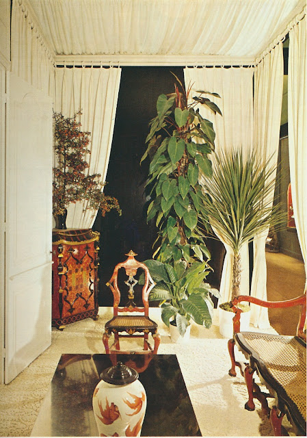
Had I attended the fifth Biennale des antiquaires in Paris back in 1970, the rooms seen here, which I believe were part of the show, would have been etched into my memory.  If my English translation is correct, these model rooms were decorated by Jean Dive of Galerie Maison et Jardin.  I'm not familiar with this show, so I don't know if model rooms were/are a regular feature.  No matter, because there is much to look at, namely richly upholstered seating mixed with sleek, contemporary brushed steel and lots of Chinese pieces thrown in for good measure.  It might be a bit much to absorb, but this cocktail of furnishings does require one to linger over these photos, just as the show's guests must have lingered in these super model spaces.


All photos from Decoration- Tradition et Renouveau

Southern Charm in London

$
0
0


I'm anxiously awaiting my copy House Beautiful's October issue, which is the annual "Guide to Global Style" edition.  Guest edited by Chesie Breen (the first of the magazine's series of "pop up" guest editors,) the magazine profiles stylish homes from England and Ireland to Morocco and India, just to name a few of the featured foreign locales.

One article of special interest to me is that which profiles this Rob Southern- designed townhouse in London's South Kensington neighborhood.  Built in 1860, the house is architecturally formal in style, and yet, the interiors convey a "21st century American sensibility", one which reflects the home's 21st century American owners. The home has great flair and style, and yet, it appears to be downright comfortable, too. 

Take a look below at just a few of the article's photos, but be sure to pick up a copy of the magazine to read the article in its entirety.  Oh, and by the way, I couldn't resist including a photo of the home's dining room.  The walls are covered in raspberry-colored flame stitch velvet. 


The dining room wall's are upholstered in Lee Jofa's Holland flame stitch velvet.


The living room features ample seating, including sofas covered in Ginger fabric by Donghia.


Also in the living room is this fabulous vintage Asian scroll table.


The conservatory is used for informal dining. The tablecloth is Sanderson's China Blue.


A vignette includes a Jane Austen reader.


Designer Rob Southern standing on the living room terrace.


All photos used with express permission of House Beautiful.  James Merrell, photographer.

Rubelli and "The Walls of Venice"

$
0
0


Rubelli, the venerable Italian textile company, has long been known for its sumptuous fabrics that are synonymous with Italian luxury. (Remember how Chuck Chewning, Creative Director of Donghia, recently used those gorgeous Rubelli fabrics in the refurbishment of the Gritti Palace?) But what you might not know is that Rubelli has recently introduced a new wallpaper collection called "The Walls of Venice".

What is notable about this new collection is that the wallpapers are reproductions of some of Rubelli's most storied fabrics, including their "San Marcos" damask and "Vendramino" silk. By using the latest technology, Rubelli has been able to duplicate the look of these fabrics onto sturdy, washable wallcoverings, which give the illusion of being made of fabric. So, a wallcovering might appear to have the sheen of its silk fabric counterpart or the texture and depth of the cut-velvet textile which inspired it. In a way, it's kind of like trompe l'oeil wallpaper. And by reproducing these mostly traditional fabrics onto wallcoverings, Rubelli has managed to make damask, for example, look thoroughly modern, something which is no easy feat.

I think it's exciting, not to mention reassuring, to see a veteran textile firm producing innovative fabrics and wallcoverings for the twenty-first century consumer. I believe that in a design industry that has unfortunately been turned upside over the past decade, such innovation will allow Rubelli to remain a viable company for years to come.

Take a look below at just some of the papers in the new collection. Scattered among the wallcovering photos are a few photos of fabrics that I scanned from the visually enticing book, Rubelli: A Story of Silk in Venice. (These fabric photos, which lack captions, are not part of the new wallpaper collection.) I think you'll get a sense of both Rubelli's old and new ways.

P.S.- The names of the wallcoverings are the same as those of the corresponding fabrics except that the word "wall" has been added to them.


Zecchinetta Wall from The Walls of Venice collection


Vendramin Wall from The Walls of Venice collection


Principessa Kocacin Wall from The Walls of Venice collection


Chiaroscuro Wall from The Walls of Venice collection


Superwong Wall from The Walls of Venice collection


Decoration Redux

$
0
0

A few of you have asked me to show more photos from Decoration: Tradition et Renouveau. I'm certainly happy to oblige because thus far, I haven't grown weary of looking through this book. I just hope that you don't grow weary of my frequent blogging about it.

Today's pictures are great examples of that early 1970s style of decor that is most closely identified with David Hicks. It was slick, daring, and cutting-edge...well, at least for that time. Actually, much of the furnishings in these rooms still look pretty good today.

Enjoy!

Image at top: Paris apartment decorated by French designer Jean Dive


The entry hall in Paris home designed by Dive. The doors remind me of the painted elevator doors on Bergdorf's 7th Floor.


Another dramatic looking entrance hall in Paris, this one decorated by Anita Bachmann.


A London home decorated by David Mlinaric.


A Milan apartment designed by Aldo Jacober.

Antiques Charm

$
0
0


In addition to writing my book, I also styled many of its photos.  Not such an easy job, let me tell you.  When envisioning what a shot might look like on paper, I had to run through a mental check-list of considerations.  Was there enough color or contrast to give a shot depth?  Was there the right amount of visual interest so that a photo didn't die on the vine, so to speak?  And did anything look out of scale or, worse, wonky?  For the stylists out there who deal with such things on a daily basis, I express my admiration.

In one of the book's photos, my acrylic cocktail table appears with a cachepot of flowers, a red lacquered tray, and a tidy stack of magazines.  It was that stack of magazines that posed a bit of a problem.  I did not want to place a magazine on top that looked too busy or that had too much verbiage floating around on its cover.  On the other hand, the top magazine needed to have some kind of pizazz.  Otherwise, it would just look boring.

The solution?  My October 1933 issue of The Magazine Antiques.  Now tell me, how fabulous is that blue and white Staffordshire plate cover?  Not only did this magazine add an interesting note of pattern to my acrylic table, but it also spoke to my passion for vintage magazines.  In fact, go to the magazine's website and you'll find an archive which shows all of the magazine's covers throughout the decades.  Prepare to fall in love with many of the charming covers, especially those from the 1930s and 40s.  When you do, then head to eBay to find that particular issue. 

And, because I really shouldn't value a book or magazine on its cover alone, I will add that the vintage issues of The Magazine Antiques are really very interesting.  There are some terrific and informative articles, not to mention great old advertisements too.

*To pre-order my book, In with the Old: Classic Decor from A to Z, please visit one of the following websites:  Amazon; Barnes & Noble; IndieBound.


April 1932 issue, available here


July 1931 issue here


June 1934 available here


March 1932 issue here


March 1933, here


May 1933 issue


November 1931 here


September 1932, here


A True Connoisseur

$
0
0


"A Choice Chateau for a Renowned Connoisseur". That was the title of a 1975 House Beautiful article on the French vacation home of the late Peter Wilson, former Chairman of the Board of Sotheby's.  The article's title really stated the obvious, because upon first glance at the accompanying photos (which you can see here,) one immediately understands that this home was indeed that of a connoisseur.  The photos capture the range and depth of Wilson's collections, which included 17th and 18th century paintings, blue and white porcelains and Imari urns, antique furniture, and many other choice pieces. 

The article made me think about the term "connoisseur".  There was a time when a number of men and women strove to be connoisseurs in such areas as food, wine, antiques, books, and art, just to name a few subjects.  There was once a much lauded magazine whose title was simply Connoisseur. (Yes, it was geared to connoisseurs.)  In my hometown department store, the late, lamented Rich's, there was the Connoisseur Gallery, which was known for its exquisite furnishings.  In fact, many Atlantans still mourn the loss of the Connoisseur Gallery. 

But, in the 21st century, are connoisseurs a dying breed?  How many people take the time to learn- really learn- about antiques or art?  Unfortunately, I think the answer is not many.  And at a time when many homeowners want their houses to be decorated instantly and with furnishings assembled entirely by somebody else, are there still people who might possess the patience and fortitude to assemble collections over years, if not decades?  And finally, would a shop like the Connoisseur Gallery be viable in today's age?  (I think we sadly the know the answer to that one!) 

Well, anyway, it's something to ponder.


Peter Wilson's chateau was built in 1790 by a leader of the French Revolution. During the 1920s, the chateau's then-owners entertained such artistic guests as Diaghilev, Cocteau, and Picasso, who created the entrance hall's mosaic floor. Also note the stone slab console table by Emilio Terry.


The drawing room featured an amalgam of 17th and 18th century paintings, 19th-century Anglo-Indian chairs, a Directoire backgammon table, and a bookcase painted in the faux bois style.


The dining room walls were painted in faux marbre. The Sheraton table boasted intricately matched wood grain.


In the study, the checked upholstery invigorated the surrounding furnishings. I also think that vignette is very handsome.

Arbiters of Style: Anthony Hail and Charles Posey

$
0
0

Thanks to my friends Dennis and Mattie, I recently learned of an exciting upcoming auction at Christie's New York. Titled "Arbiters of Style", the October 8th auction features the collection of the late designer Anthony Hail and his partner, Charles Posey.

Hail, about whom I have written before, was an impeccable designer. His interiors, which were both elegant and immaculate, were often appointed with antiques of storied pedigrees. One of my favorite Hail-decorated houses was that of the designer himself. Located in San Francisco, the house was a rather restrained backdrop for the grand furnishings that he collected, many of which are featured in this auction.

I plan to order a catalogue of the sale as I think it will be an important addition to my design library. Even if you don't anticipate bidding on any of the lots, I think you'll still appreciate the catalogue's many photos of Hail and Posey's exquisite home.

Anthony Hail, seated to the left, with his partner, Charles Posey.


A Swedish gilt-metal and cranberry glass chandelier, late 18th c./ early 19th c.


A Louis XIV ormolu-mounted engraved brass and tortoiseshell traveling box


A North European white painted and parcel-gilt table, early 18th century.


Two Vuitton suitcases with Hail's last name and initials painted on them.  Now that's stylish.


All photos courtesy of Christie's.

Thank You Bunny!

$
0
0


Thank you Bunny Williams Home!  I was very happy to learn that I was one of three winners in their Tote Debris contest.  In order to enter the contest, I had to take a photo of a spot in my home where I could use a Tote Debris wastebasket from Bunny Williams Home.  I decided that Bunny's brass shopping tote-shaped bin would be the perfect spot to hide hold my mess of needlepoint canvases and thread, hence my photo of my wing chair and needlepoint supplies (see top right.)

Although I didn't have time to take a photo of my new Tote Debris in situ, trust me when I say that my study, not to mention my needlepoint mess, has vastly improved!

Inspired by Gavin Houghton

$
0
0


Much to Alfie's chagrin, I often spend my Sundays doing a little decorating and fluffing of my apartment.  You see, Alfie hates change, and anytime I move something around, he stops in his tracks and starts to bark at whatever it is that is new or different.  Perhaps it's not change that he doesn't like.  Maybe he simply doesn't like my decorating.

Anyway, last weekend I hit the internet in search of decorating inspiration, and I fortuitously found the website of British designer, art director, and furniture designer Gavin Houghton. Houghton is clearly a talented designer who is adept at mixing that classic British country house style with vibrant color and modern-minded pattern. For those of us who like this "mix" (a term that I realize is getting really tiresome,) there are lots of great ideas that we can take from Houghton's interiors.

So, in case you're looking for inspiration for your weekend decorating projects, do take a look at Houghton's site. I don't think you'll be disappointed. I only wish there were more photos of his work.


In with the Old: Bookplates

$
0
0


Before I started to write In with the Old: Classic Decor from A to Z, I compiled a list of "things"- fabrics, styles, motifs, objects- that I considered to be great examples of classic design and timeless style.  One of the criteria for making the list- the main criterion, in fact- was whether that decorative element was something that I would be proud to have in my own home.  And one decorative element that can be found throughout my home (specifically, in my library) is the bookplate.  In fact, I'm so crazy for bookplates that not only did we photograph one for my book, but we also incorporated an illustrated bookplate, which was drawn by my sister, inside the front of the book.  That way, you can add your name to the plate to mark your copy's ownership. (The photos seen above offer a few glimpses inside my book.) 

I own all kinds of bookplates, which I apply to all kinds of books.  My floral motif bookplates are used for books on flowers and gardening, while those that depict antique Chippendale chairs can be found in my furniture and decorative arts-related books.  (Both of these versions, by the way, are the fill-in types on which I must write my name.)  I also have custom bookplates, purchased on Etsy, which feature a pagoda with my name printed below.  Considering my fondness for all things Chinoiserie, I choose to use these pagoda plates in some of my very favorite design books.

Of course, the ultimate luxury is to have custom engraved bookplates that have been printed by some fabulous stationer.  Perhaps one of these days, I will have those ultimate bookplates.  Until then, though, I will continue to mark my books with my current stash of plates, which give me joy every time I open my books.

P.S.- I would like to thank Atlanta Homes & Lifestyles for featuring my book in their October issue as well as Southern Living and Zoe Gowen for including my book in their The Top Design Books You Need Now feature.  Also, thanks to Margot Shaw, editor-in-chief of the fabulous flower magazine, for mentioning my book in an interview with StyleBlueprint.

Order In with the Old: Classic Decor from A to Z at Amazon, Barnes & Noble, and IndieBound.


In gardening books like Peter Marston's Garden Room Style, I use these peony letterpress bookplates from Jonathan Wright and Company.


For my architecture books, including my copy of New Classicism by Elizabeth Dowling, I chose these Palladian Capital bookplates from Ars Antigua.  You can see my Ars Antigua Chippendale Chair bookplate in the photo at the top of this post.


And this is my Pagoda plate, which I purchased on Etsy.  Looks good against that pink background, don't you think?

Photo at top from In with the Old: Classic Decor from A to Z by Jennifer Boles, Erica George Dines photographer.

Mario Buatta: Fifty Years of Fabulous

$
0
0

Over the years, there have been certain sentiments that I hear expressed time and time again. One of those sentiments is, "When is Mario Buatta going to do a book?" Well, thankfully for us, that question has been answered in a really grand way.

Written by Mario Buatta with Emily Evans Eerdmans, Mario Buatta: Fifty Years of American Decoration is a hefty tome (seriously, you need to use both hands to pick it up) that covers the decades-long career of the great designer. Thanks to beautiful color photos of numerous projects, the reader can witness the evolution of Mario's career from young designer of the 1960s to the legendary Prince of Chintz of today. But the sense that the reader will likely get, I think, is that Buatta's evolution as a designer has been incredibly subtle. Mario obviously knew what he liked from a young age and stuck with the chintz, dog paintings, porcelain, and English antiques, even when these furnishings weren't always the rage. (I would argue, though, that these furnishings never really go out of style. They're too classic to do so.) And what is also quite impressive is that the same client names appear in the book over and over again. Mario's clients are very loyal to their designer, and their repeat business must be a testament to Mario's talent, not to mention his charm and sense of humor.

And speaking of that legendary sense of humor, Buatta's comic relief is evident throughout the book. (You would be disappointed if it wasn't there, wouldn't you?) When you get your copy of the book, you must read Mario's introduction. It is laugh-out-loud funny and off the wall, too. All in all, this is a book that you'll thoroughly enjoy. You'll also be glad that you added this soon-to-be classic to your design library.


I first saw this photo as a child in the 1980s. I didn't know who Mario was back then, but I remember thinking that whoever he was, I wanted to know him. He looked like a lot of fun.


You'll notice that most of the photos I chose to use here show bedrooms. Mario is a champ at decorating bedrooms, which always look so feminine and so comfy.


Mario also has a wonderful sense of color.


One of Mario's more recent projects: the Manhattan apartment of Hilary and Wilbur Ross.


I'm predicting that the pennant valance is going to make a comeback.


All images from © Mario Buatta: Fifty Years of American Decoration, Rizzoli New York, 2013.

Join Me in High Point

$
0
0


If you plan to be at High Point Market on Tuesday, October 22, I invite you to join me at the Currey & Co. showroom (IHFC M110 on Main Street, Street Level) for the debut of my new book.

I will be signing copies from 3 to 5pm.  Books will be available for purchase.  While there, you can browse the Currey & Co. showroom to see their exciting new products.  And at 5pm, there will be a champagne toast in honor of Currey & Co.'s 25th anniversary.

I do hope that you can join me and the Currey & Co. team for a fun afternoon at High Point!

Mr. Hadley Goes to Washington

$
0
0

I think that I'm familiar with most of Parish-Hadley's projects, probably due to the fact that I have read both Adam Lewis's Albert Hadley:The Story of America's Preeminent Interior Designer and Christopher Petkanas's Parish-Hadley: Sixty Years of American Design roughly half a dozen times each. However, until I obtained the March/ April 1975 issue of Architectural Digest, I was not familiar with the work that Albert Hadley did for the noted Washington hostess Buffy Cafritz and her husband, William.

Hadley decorated the Cafritz's suburban Washington house in a manner that was in keeping with the house's suburban locale. As Hadley noted, the house "could be in the English countryside, but it is American with strong continental overtones." Also, the house was "sparsely furnished" in order to give it "scale and scope", something that had been lacking in the house that had once been deemed too small.  Because the house was minimally furnished, it seems that each piece was chosen with great care, especially considering that the furnishings were given such prominent roles.  By the way, my favorite decorations in the Cafritz house have to be that flame-stitch rug in the living room and the dining room's blue and white dhurrie rug.

The house was certainly attractive, not to mention well-mannered in appearance, something which was probably appropriate for Cafritz's frequent entertaining.  I can just imagine the Washington power-brokering that went on in these Albert Hadley-decorated rooms.


All photos from Architectural Digest, March/April 1975, Richard Champion photographer.

Creative Cooking

$
0
0


I can easily spend hours looking through decades-old issues of Gourmet. I don't necessarily look through them searching for recipes, although many of them do seem quite appetizing. Rather, I enjoy looking at the magazine's photos. Whoever styled those old food photos, which are so staged-looking and yet so charming, must have had one heck of a good time doing so.  I know that I would have.

Take, for example, that photo seen above.  When I first glanced at it, I thought that whatever creamy food was nestled within that puffed pastry must be something good.  Well, it's not.  Or at least, I don't find Brains to be something good.  But the styling of that photo certainly made what seems to me a vile dish look downright delicious.

Then there's the Swordfish Mirabeau.  Yes, the plated dish looks a little too man-handled, but those strips of anchovies and sliced olives do create an interesting-looking pattern.  And check out the photos of Boeuf à la Mode en Gelée and Leg of Lamb in Aspic.  A little too precious?  Perhaps.  But both dishes, especially the lamb in aspic with that herb and vegetable garnish, took skill and artistry.

Now, I doubt that many of us are going to start decorating our food with floral-motif garnishes, strips of anchovies and sliced olives, and peas in aspic, but I do think that these old Gourmet photos are great examples of how design can enhance food immeasurably.


Steven Stolman at Discover ADAC

$
0
0


I hope that by the time this post publishes, I am rested and full of energy.  You see, I have a busy week ahead of me.  This week is Discover ADAC, and the stars of the decorating world are alighting on Atlanta.  Mario Buatta, Ellie Cullman, Michael S. Smith, Jan Showers, Chuck Chewning, and many, many others will be speaking at ADAC this week.

Also at ADAC will be Steven Stolman, style provocateur and president of Scalamandre, who will be interviewed by yours truly this Thursday, October 17 at 1:00 in ADAC's Presentation Room.  Our on-stage chat should be lively and fun, especially considering that we will be discussing Steven's new book, Scalamandre Haute Decor.

We hope to see you on Thursday!

Marie Warren and Michael Greer

$
0
0

Marie Warren is not only one of the grandes dames of Atlanta decorating, but she is also a neighbor of mine.  Everybody knows Marie and respects her decades-long contribution to the Atlanta design community, so it was only natural that she be featured in the debut issue of Milieu.

Milieu's article included Marie's thoughts and opinions on decorating, but what really struck a chord with me was her emphasis on the importance of being familiar with the work of other designers, especially past greats like Sister Parish and Dorothy Draper.  "The people I work with are aware of the work of the designers of the twentieth century," said Marie.  That is obviously music to my ears.  And one design great who got honorable mention by Marie was the late Michael Greer, someone who Marie deemed "my personal favorite".

So, in honor of both Marie and Michael Greer, I thought that I would show just a few photos from Greer's classic design tome, Inside Design.  This book, a personal favorite of mine, is also a favorite of Marie, who says that she refers to it often.  That's high praise indeed.


Photo of Marie Warren and quotations from Milieu, Fall 2013, written by Timothy E. Revis, David Schilling photographer.

Indore Garden Collection by No. 9 Thompson

$
0
0


I am very excited to announce that my book's Atlanta launch party will be held on Tuesday, October 29 from 5:00-7:00 pm at the still-under-construction-but-soon-to-be-open Jim Thompson showroom at ADAC Atlanta, Third Floor Atrium.  I will post more info about the party soon, but in the meantime, mark it on your calendars.  I would love for you to join me in celebrating my new book at my hometown design center.  For more information and to RSVP, please email info@jimthompsonatlanta.com

I'm especially anxious for the new Jim Thompson showroom to open as I want to see the new No. 9 Thompson Indore Garden Collection in person.  I always intrigued by what inspires Richard Smith, Design Director for No. 9 Thompson, and this time, it is his memory of a trip to Udaipur in Rajasthan, India that seasons his designs.  There is the collection's namesake, Indore Garden, which features trailing flowers against a background of a "Jali" screen, and Calicut, which was named for the Indian city in which calico originated.  But my favorite print of the collection has to be Wedding Parade, which you can see above.  Smith was inspired to create this print after seeing an 1850's painting that depicted a wedding celebration.  (I predict that Wedding Parade is going to be a huge hit.)

Take a look below to see a glimpse of the striking new collection.


Wedding Parade


Two colorways of Indore Garden


Ikat Vase


Various colorways of Rambagh Stripe


Calicut


Rag Rug


Painted Paisley

All photos used with express permission of Jim Thompson Fabrics

Henry McIlhenny and Glenveagh Castle

$
0
0

I think that it's fair to say that twenty-seven years after his death, Henry McIlhenny is still considered to be one of America's great aesthetes.   McIlhenny was a bon vivant, an inveterate host, a connoisseur, and the former chairman and decorative arts curator of the Philadelphia Museum of Art.  Andy Warhol once stated that McIlhenny was "the only person in Philadelphia with glamour." (I find this hard to believe as my Philadelphia acquaintances are very chic.) And, as the January 1975 issue of House Beautiful proclaimed, McIlhenny was "an 18th-century gentleman transposed to the 20th century."  Obviously, McIlhenny was quite a man.

One of McIlhenny's two domiciles that is still gushed over today was Glenveagh Castle in County Donegal, Ireland. (His other residence was at Rittenhouse Square, Philadelphia.)  Built in the 1870s for an American couple, Glenveagh Castle was purchaseed by McIlhenny in the late 1930s.  At that time, he was the castle's third owner. Through the years, McIlhenny amassed a great deal of land surrounding the castle, and he eventually left the land and the castle to the Republic of Ireland.

As you can see, the interiors of Glenveagh Castle were brimming with antiques and elegant furnishings.  I have read that Denning & Fourcade assisted McIlhenny with the decorating of his Philadelphia home, so I wonder if the design duo were responsible for any of the decor seen here.  I guess that I'll just have to leave that research for another day.

Image at top: McIlhenny seated in Glenveagh Castle's Gothic-style orangerie, which was designed by Philippe Jullian. You can see the full structure below.


The castle's entrance hall, seen right, was decorated in coquillage, with its walls covered in mussel shells.


The Salon, above, was made lively by a French toile that covered Irish/English Chippendale chairs and sofas.  The painting over the fireplace was by George Stubbs.


The Dining Room curtains were made of Donegal tweed.  The furniture was mostly English Regency.


McIlhenny's red studio was filled with books and personal mementos.


English cretonne fabric was used for the sofa and chairs, while the Greek needlepoint rug offered up another note of pattern.  Part of McIlhenny's collection of Imari porcelain can be seen here.


The main staircase was striking with its large-scale wallpaper by Coles.


The music room had curving falls that were covered in tartan plaid.


All photos from House Beautiful, January 1975, Feliciano photographer.

A Little of This and A Little of That

$
0
0


I'm currently in High Point, so you probably won't see me blogging until later this week.  In the meantime, though:

If you're in High Point tomorrow, please come visit me at the Currey & Co. showroom from 3 to 5pm, when I'll be signing copies of my new book.  And speaking of which...

Tomorrow is the big day!  My book will be released tomorrow, October 22, and I couldn't be more thrilled.  After so much hard work, it will be very satisfying, not to mention a great relief, to actually see copies of my book on the bookstore shelves.  Thank you for all of your support for and enthusiasm about my book.  It really means a lot to me.

And a special thank you to House Beautiful, which featured my book in its November issue. Thank you, thank you!


And one last thing- I'll be having a Tastemaker Tag Sale on One Kings Lane this Friday, October 25 at 11am EST/ 8am PST.  The sale will feature items that I have curated, all of which are in the spirit of my new book.  For those of you looking for classic furnishings for your home, this is your sale.


Whew! See you later this week.

Sneak a "Peak"

$
0
0


I hope that you'll join me for my Atlanta book launch next Tuesday, October 29.  Atlanta is, after all, my hometown, so I hope to see lots of familiar faces.  The party will take place at ADAC in the 3rd floor atrium, right outside of the new Jim Thompson Showroom.  It should be a fun, festive soiree, and I would love to see you there.  (If you do plan to come, please RSVP to info@jimthompsonatlanta.com)


I'd also like for you to check out my One Kings Lane Tastemaker Tag Sale this Friday, October 25.  The sale is inspired by all of the various entries in my book, so expect to see Malachite, Toile, Chinoiserie, and many other classic decorations. (I got a peek at the lineup, and there are so many items that I want for my own home.  Trust me, this will be a good sale.)  You'll also be able to buy signed copies of my new book.  The sale starts at 11am EST. 
Viewing all 483 articles
Browse latest View live


Latest Images